Five best practices for your pricing page
Whether you sell handmade candles online or monthly subscriptions to your fitness programme, your pricing page is crucial to the success of your business. It represents the point at which a visitor is getting very, very close to making the leap from prospect to customer.
Get it right and your visitors won’t think too long before they take action, and buy your product or service or sign up for a free trial.
But get it wrong and they’ll doubt whether they should go through with it or immediately hit the back button and look elsewhere.
Put simply, if your pricing page is weak, you can lose a lot of potential revenue.
Want to prevent that from happening? Read on as we share a few best practices for your pricing page to entice visitors to buy from you, even if your product or service costs a bit more than they expected.
1. Don’t hide your pricing
There are companies that choose not to include pricing on their website, and instead require the prospect to fill out a form or to call for a quote. This is usually the case for companies that sell Enterprise or complex solutions that require a demo and lots of explanations.
The reasoning behind this is understandable. They don’t want to drive prospects away before they have the opportunity to demonstrate the value of the product or service.
Now, if you own a small business, you have no reason to hide pricing on your website. Even if your pricing depends on a case-by-case basis or requires an assessment, you should still give prospects some ballpark figures so they get a sense of your rates before making them take the time to fill out a form or give you a call.
Why? Because people look for pricing information when deciding which option is best for them and within their budget. If that information is nowhere to be found, they may hit the back button and go to your competitors instead.
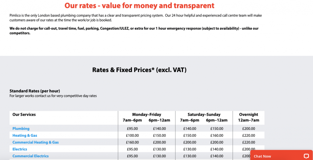
Consider this scenario: you’re looking for an emergency plumber and none of the websites you visit reveals their pricing. They all ask you to call or to fill out a form for an estimate.
It’s time-consuming and a hassle to have to call three-four-five or more businesses just to get the rates.
As a business, you’re more likely to book a customer if you reveal your pricing, like in this example:
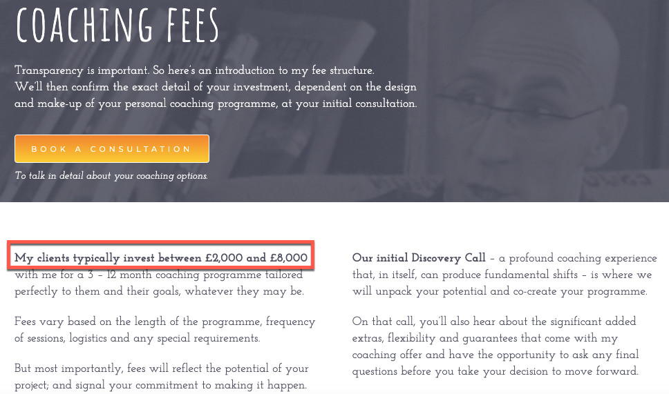
If that’s not possible, then at least give prospects some ballpark figures so they get an idea on how much your products or services cost.
Here’s an example of how you can do that:
2. Simplify the design and language
When it comes to designing any page on a site, simplicity is always the best approach.
How you do you keep your page simple? By only keeping the elements and information that are absolutely necessary to answer this one big question: “How much does it cost?”.
This means removing sidebars, pop-ups or any other elements that might distract the visitor.
Here’s an example from the Dollar Shave Club where the pricing page for the product is so simple that it’s easy to know what you’re buying, what’s included in the box, how much it costs and what to do next.
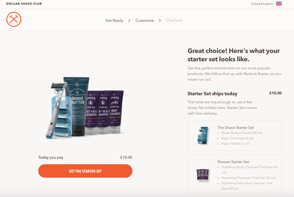
Bottom line, keep your pricing page simple in terms of design and copy, and only include the essential information such as:
- The product name
- A picture or video presenting it
- How much it costs
- A description of what they’ll get
- A prominent call-to-action button to move them to the next step.
If you need to add more information, make sure it comes after everything that’s listed above. Otherwise, it can be overwhelming or confusing and your visitors won’t know what they’re supposed to do next.
3. If you have pricing levels, help visitors find the right fit
If you offer various pricing plans for different categories of customers, one thing you can do is to present them so that visitors can instantly tell which one’s right for them.
For example, if you sell career coaching programmes, you can offer different pricing depending on who your prospects are and their specific goals.
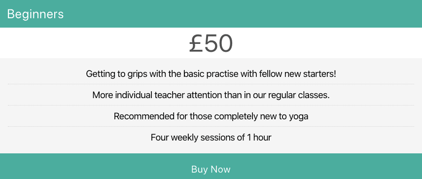
If you sell fitness or yoga classes online, you can have different plans for every fitness level (beginner, intermediate and advanced), gender or main goal.
Here’s an example:
To get your plans right, you need to know your target audience well. When you understand who they are and what they need from you, you’ll be able to create plans and packages that meet their needs.
Need some help? Start by reading this post on buyer personas and how to create yours.
4. Address their questions or concerns
Your visitors may still have questions or uncertainties that prevent them from taking that next step and buying from you.
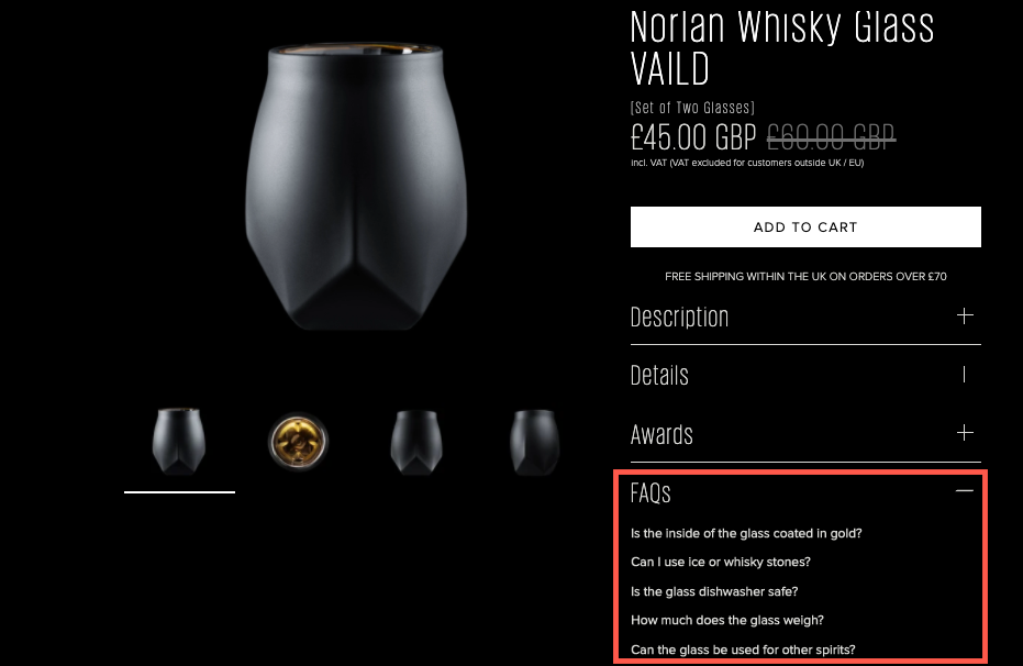
An effective way to deal with any potential objections is to include an FAQ section under your pricing. This gives you the opportunity to list the most common questions that potential buyers ask and answer them directly on your pricing page.
Not sure what questions to include in your FAQ? Simply go through your emails, social networks and any other channels where you’ve received questions from people looking to buy your products or services. Make a list with the most frequent questions and answer them in this dedicated section on your pricing page.
Here’s an example of how it looks:
5. Reassure their decision
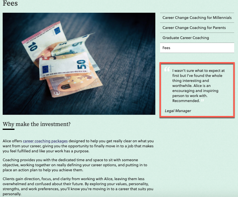
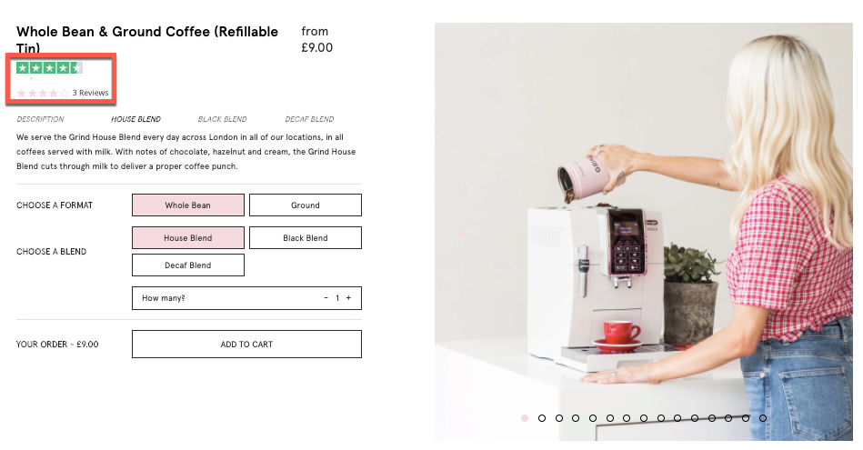
One thing that successful pricing pages have in common is that they integrate social proof or trust builders that assure the visitor that they’re making the best decision to buy from you.
So, make sure your pricing page also includes things like:
- A money-back or other guarantee
- Testimonials and reviews from other customers
- Awards and mentions in the press or well-known blogs and magazines
- Trust seals that show their data is secure
Here are a couple of examples:
Wrapping up
The most successful pricing pages walk a fine line between giving visitors all the information they need to make a decision, while also removing anything that might confuse, discourage or dissuade them from clicking that “Buy now” button.
As with anything online, you have to test and see what works for your small business and target audience. You can try changing the text on the call-to-action, the pictures, the description, and more.
Hopefully, these best practices provide you with the guidelines to help you decide what to include on your pricing page (as well as what to remove) to entice more visitors to buy from you.
For more tips, read our post on seven ways to drive more sales using pricing psychology.
