Thinking about selling products online? Setting up your ecommerce site where customers can browse through your products is just the first step toward success.
It takes more than that to grow your online business. You’ll also need to make sure your website has all the essential features that users value and expect to find on an online shop.
In this post, we’ll share a checklist of ten key elements that your first ecommerce site needs to have to provide a great experience to visitors and compel them to buy from you.
1. Clear navigation menu
When customers visit your store, one of the first features they’ll interact with is your navigation. It’s where they’ll be able see what products you sell and where to go to find the ones they’re interested in. That’s why it’s important to get it right.
Make sure you have a clear navigation menu on your ecommerce site where you list the main categories of products you sell. There’s no need to get creative here. Stick with what’s familiar and common knowledge to users when it comes to navigation and how you name your product categories.
For example, if you sell clothing, you can have different categories for Men, Women and Kids. You can then categorise them further by type of product like dresses, skirts, jeans, etc.
Here’s an example from Asos:
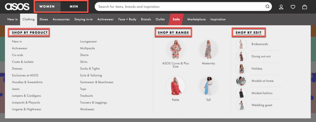
So, what makes a good navigation?
It’s visible, usually located in the header and/ or on the right or left side of the page but always at the top of the page so it’s easy to find.
It’s also well-organised so that customers can see exactly what products you’re selling and where they can click to go to the specific category of products they’re interested in.
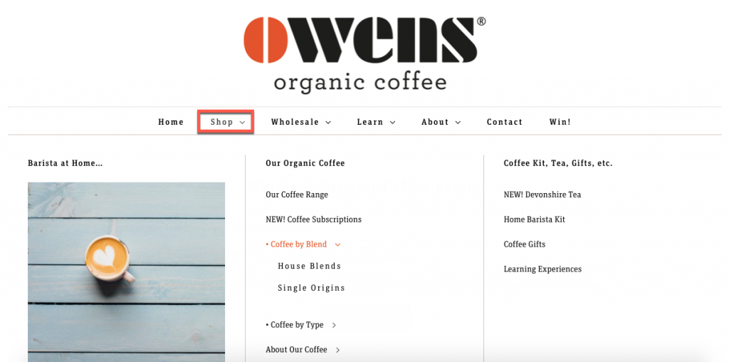
Take a look at this example from an online shop that sells coffee. Clicking on “Shop” in the menu displays a second menu that lists all the products customers can buy: subscriptions, coffee by blend, coffee by type, and more.
2. Prominent search bar on every page
Some visitors on your site might not use your navigation to get around. Instead, they might prefer to run a search for the product they’re looking to buy. To make it easier for them to find what they’re looking for, make sure you have a search bar at the top of every page on your site.
If you take a look at any ecommerce website, you’ll notice most have a search bar at the top of every page.
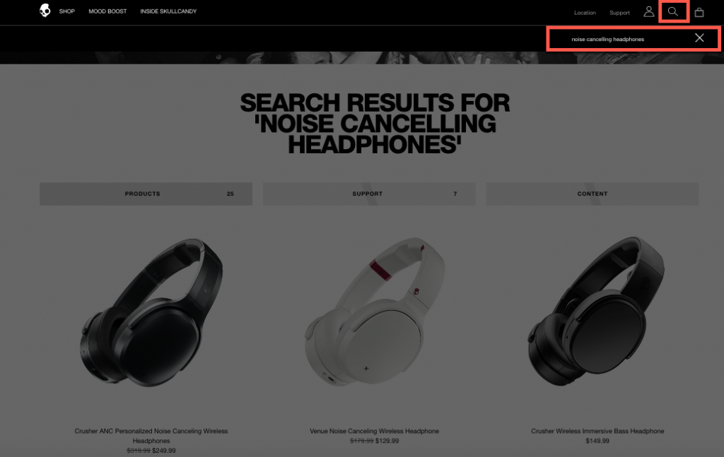
Why is this useful? Because it gives visitors a quick way to find a specific product no matter where they are on your site.
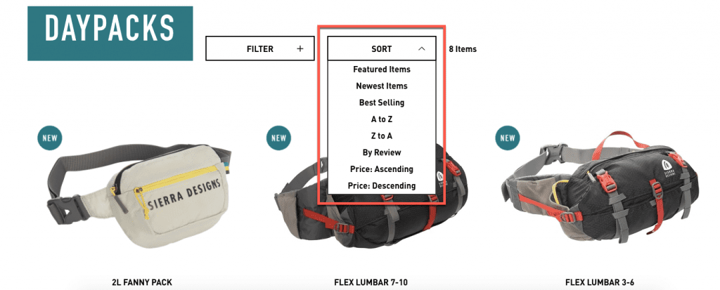
You can also take it one step further and provide users with options to filter and sort products by options (e.g. low price to high price, featured).
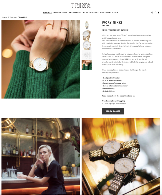
Why is this important? Because shoppers want to see multiple angles and people using the product. They want to be able to zoom in and get a feel for the product so they can imagine what it would be like to use or wear it.
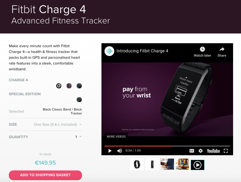
If you can also add a video presenting the product, like in this example from FitBit, that’s even better.
4. Frequently Asked Questions (FAQ)
FAQ sections are very useful because it’s where you can provide additional information about the product. This helps to reassure the customer that what they’re buying is high-quality and exactly what they want.
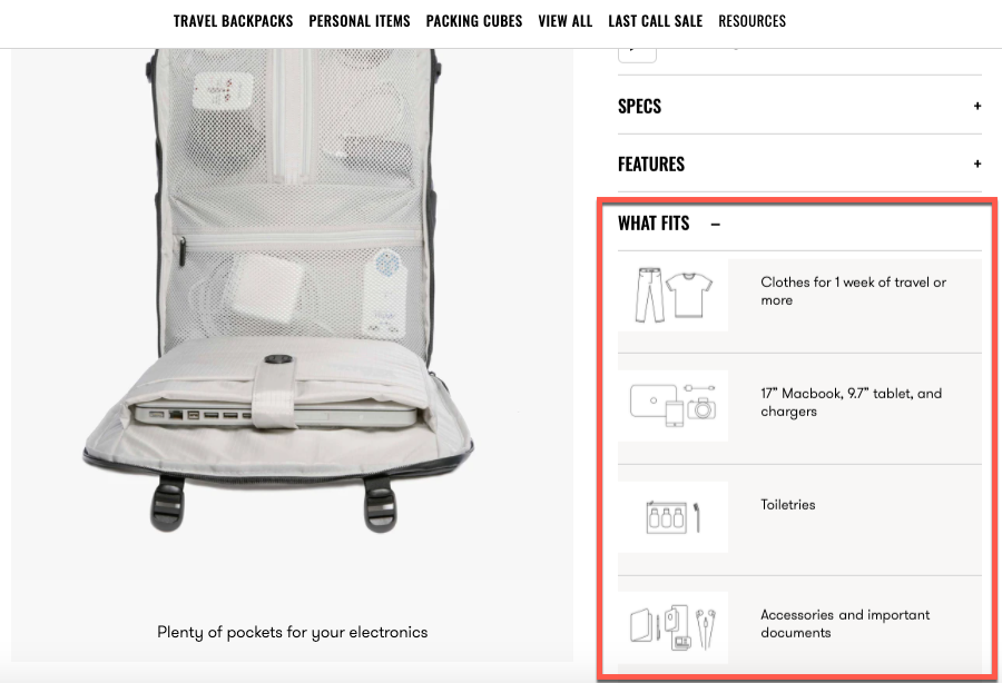
You don’t even need to name it “FAQ”. For example, this online shop has a section called “What fits” where they list what you can fit inside their backpack.
An FAQ section can also function like a self-help area where you address common customer questions and concerns about things like your return policy, delivery fees, and anything else you can think of that can reassure customers they’re making the right decision to buy from you.
6. A related items section
Once a customer makes their way to a product page, you hope they’ll add it to their cart. But what if that specific product is not to their liking?
Adding a section like “Related items” or “You may also like” under the product detail information can prevent them from leaving your site and instead, entice them to check out other products and hopefully buy one of them.
Here’s an example of how you can do that:
7. Variety of payment options
As an online shop, you need to consider the people who are buying from you. If you only provide checkout via PayPal, are you sure all your customers have a PayPal account? Or are you going to lose sales because you’re only offering a single option to pay for the purchase?
There are many popular online payment options you can add to your site. The key is understanding who your customers are and making sure your ecommerce site gives them the option to checkout using their preferred payment option.
8. Visible contact info
Having your contact information visible on every page is critical because it helps to reduce buyer anxiety. It gives customers added reassurance that they’re able to contact you should they have any questions, concerns or problems with their order.
So, make sure your contact information – email address, physical address, phone number, social media profiles – are visible and easy to find on every page on your site.

9. Mobile-friendly checkout
With more devices being able to connect to the internet than ever before, you don’t want to have an online shop that doesn’t display properly or allow your customers to easily make a purchase via their smartphone.
It doesn’t matter if you have five or a hundred product pages. Creating a mobile-friendly experience for your shoppers is critical to your ecommerce site’s success.
Fortunately, with the Online Shop package from 123 Reg that’s one less thing you need to worry about. That’s because your ecommerce site will not only look and function great on your customers’ devices but it’ll also provide them with a hassle-free checkout process.
10. Security features
Ecommerce sites can be a target for cybercriminals, and your customers know it. That’s why it’s crucial that you take the necessary steps to protect your customers’ sensitive information.
With an SSL certificate, you can reassure customers that all the information they share with you on your site is safe and secure. If you need SSL to secure your site, head here.
Also read this post to learn more about what makes a website secure.
Wrapping up
There are lots of elements to consider when launching your first ecommerce site. But we believe that the checklist above includes the must-have features that customers value most and expect to find on all the online shops they visit. Make sure they’ll find them on yours too.

