Seven tips to optimise your shopping cart checkout
The most important part of your ecommerce website is your checkout page. It’s where visitors become customers. In other words, it’s where you make money.
But creating a seamless checkout experience isn’t easy and few businesses get it right. In fact, research from the Baymard Institute revealed that the average cart abandonment rate is close to 70%.
This means that seven people out of ten who add an item to their shopping cart don’t end up buying it. That’s money you can’t afford to lose, especially if you’re a small business.
Here’s the thing: prospects coming to your site expect their shopping experience to be seamless, transparent and hassle-free. If your checkout page doesn’t meet their expectations, they’ll hit the back button and go to your competitors instead.
So what can you do to improve their shopping experience and get as many visitors as possible to complete their purchase?
You need to optimise your ecommerce shopping cart checkout. In this post we’ll share seven simple tips to help you do that and win more sales.
1. Make the call-to-action visible
This might sound obvious but you’d be surprised how many ecommerce sites get it wrong. An effective call-to-action (CTA) needs to be visible on your checkout page so users know what to do next to complete their order.
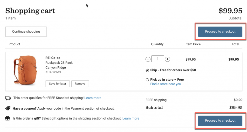
So, first of all, make sure your CTA button is a button. Next, it should have a contrasting colour and be placed above the fold and, why not, below the fold as well.
There are lots of ecommerce sites that have two checkout buttons to ensure customers don’t miss it and take the next step to complete the order.
Here’s an example from Rei:
Read this post to learn more about CTAs and how to use them to entice more visitors to take the action you want them to take.
2. Create urgency
You know those “low stock” alert messages that you usually see on product pages? Well, why not use them on your checkout page as well, like in this example from Amazon?

These alerts where you show how many items you have left in stock are a fantastic way to create urgency and motivate prospects to take action and buy now, rather than later.
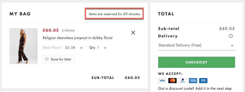
Another effective strategy to create urgency is to add a notification where you let customers know that the item is reserved for a limited-time only.
Asos, for example, reserves items for 60 minutes:
3. Give them the option to checkout as guests
The second most common reason people abandon checkout is due to the site requiring users to create an account to be able to buy.
Here’s the thing: creating an account may be too much of a commitment for first-time buyers. So if that’s the only way they can buy from you, don’t be surprised if they decide to leave.
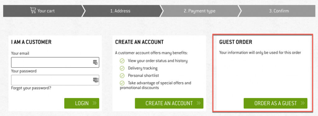
If you decide that making a sale is more important to you than getting a customer to create a profile on your site, then make sure you give them the option to checkout as guests.
Some people just want to buy a product quickly without having to fill out forms and information about themselves. So let them do that, otherwise they’ll go elsewhere.
Here’s how Bergfreunde.eu does it:
4. Stop hiding those additional fees and charges
There’s nothing more frustrating than adding an item to your shopping cart, clicking that “buy now” button only to see some additional fees you need to pay.
Hidden shipping fees, credit card charges and other unexpected costs are the number one reason why people abandon a shopping cart.
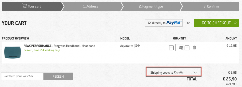
Fortunately, this is an easy fix – just be transparent about all the costs that a customer has to pay. It’s a key factor to boosting sales and gaining customers’ trust.
For example, Bergfreunde.eu has a dropdown menu on their checkout page that allows customers to choose their country so it can calculate shipping costs directly on the page.
5. Display customer ratings and reviews
Nothing helps to boost confidence and entice customers to complete an order like ratings and reviews from previous customers.
Shoppers want to know if the item is true to size, if it’s high quality, if it breaks easily, or if it works as advertised. Don’t let them abandon their cart to search for reviews elsewhere because they might forget to come back to your site.
A better, more effective option is to display those customer reviews and ratings directly on the checkout page.
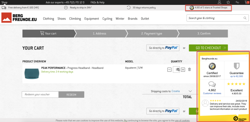
On the Bergfreunde.eu checkout page, for example, they display a box with their rating that, when clicked, shares more information on their customers’ experience with the brand:
Read our post to learn how to gather customer testimonials so you can then use them to convince people to spend their cash on your products.
You can also find lots of useful tips in this post about social proof and ways to use it to influence shoppers and boost sales.
6. Help customers convert in real-time using live chat
Lots of shoppers have questions or concerns during checkout. In fact, this is typically the page that brings up the most questions and uncertainty.
Some may need help with an error on your form field, others a quick answer to a question about choosing the right product or about delivery estimates.
Having a live chat or a “click to call” option right on the shopping cart page is a great tactic to quickly provide them with the answers they need so they can complete their order. This means an extra sale for you.
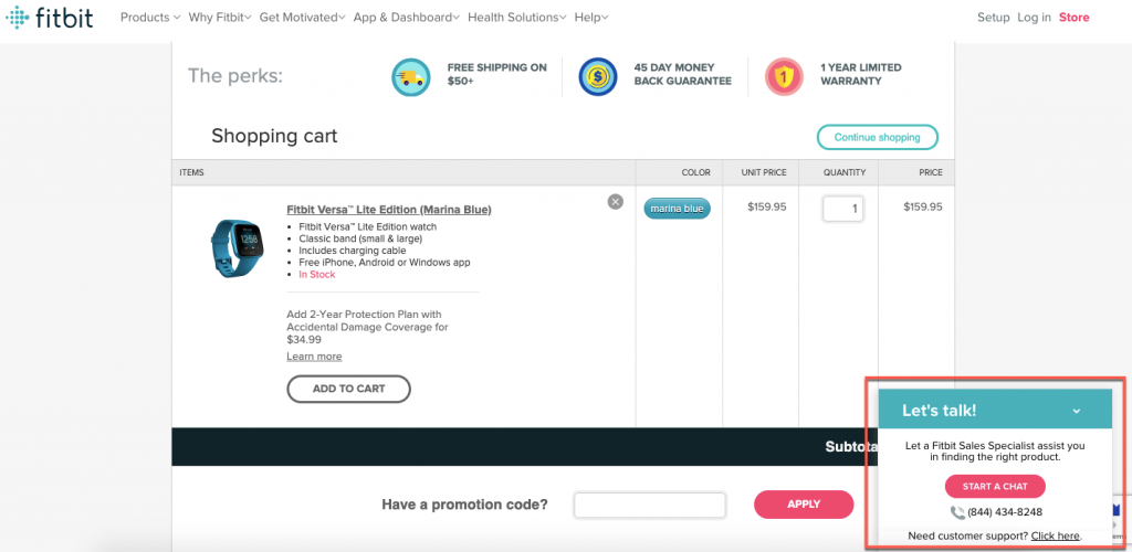
Check out this example from FitBit where a live chat window pops up on the checkout page:
7. Display trust signals on the checkout page
The checkout page is when customers really start to think about security. It’s usually when they need to add their information and credit card details that they’re on guard in terms of how secure that page is.
So of course they’ll look at the presence (or absence) of trust badges and indicators before feeling confident enough to sharing their credit card details and other sensitive information.
This is where you need to reassure them that their data is safe with you, and that they can trust buying from you.
How?
Consider displaying the following on your shopping cart checkout page:
- Customer reviews and ratings
- SSL certificate and a mention of secure shopping experience. You can learn more about it and get your own SSL certificate from 123 Reg.
- Logos of available payment options (and ideally payment certification – e.g. verified by Visa)
- Very clear customer service. This not only includes your contact information but also links to your FAQ or help section, return policy, privacy policy and terms and conditions.
Wrapping up
As you can see, optimising your shopping cart checkout page isn’t that difficult. It just takes a little effort.
Once you implement these changes, you’ll be one step closer to providing shoppers with a memorable checkout experience that’ll make them want to come back and buy from you again.
If you’re just getting started with selling products online, make sure to read this post on the essential shopping cart features that can help you to boost customer confidence and sales.
