Six mobile optimisation tips for ecommerce sites
The world is rapidly going mobile.
According to Statista, the share of mobile phone website traffic worldwide has grown from 0.7% in 2009 to 52.2% in 2018. And, according to data from Google Analytics, from June to September 2017, over 40% of online transactions were made on mobile devices.
What’s more, by 2021, mobile ecommerce sales are expected to account for close to 73% of all ecommerce sales.
So what does this mean for your ecommerce site?
It means that if your site isn’t mobile-friendly, then your competitors will gladly take care of this part for you… by taking your mobile visitors and prospects away from you.
But even if you do have a mobile-friendly site, you should constantly take further steps to improve the user experience in order to boost sales from mobile device users.
Don’t know how to get started? In this post we’ll share six mobile optimisation tips to ensure your ecommerce site’s mobile experience is designed to delight prospects and turn them into customers.
1. Review and fix your site’s mobile issues
The first thing you need to do is to check and see whether there are any issues with your website when a visitor tries to access it from a mobile device.
So, head on over to Google’s Mobile-Friendly Test tool, enter your website’s URL and click “Run test”. The tool will return any issues that Googlebot is having while crawling your ecommerce site.
If the tool can’t find any issues with your site, you’ll see a message that says “Page is mobile-friendly”, like this one below:
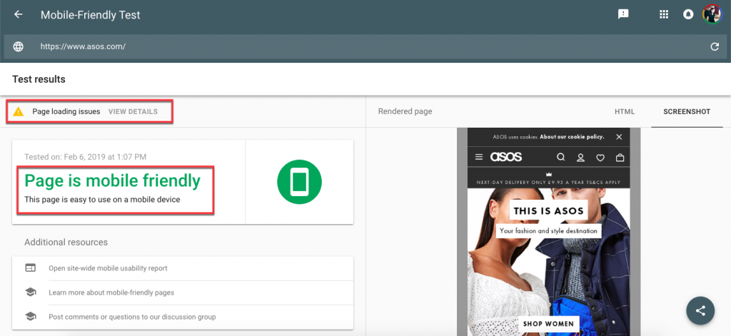
You may also see a message that says “Page loading issues”. Click on it to get detailed information about those issues and see what’s preventing the page from loading correctly.
Now, if you’re using Google’s Search Console, make sure to review the Mobile Usability report and check if there are any other mobile usability issues that Google has detected on your entire ecommerce site.
If you’re not familiar with this tool, read our beginner’s guide to Google Search Console to learn what you can do with it and how to set it up. You’ll find it very useful in identifying issues with your site as well as opportunities to tweak certain pages, improve your site’s performance and boost website traffic.
2. Simplify the checkout process
If you want to boost sales from mobile devices, you’ll need to speed up the checkout process. This means that a mobile user should be able to buy from your website quickly and in as few steps as possible.
In addition, you should consider the “clickability” of your ecommerce site. On traditional desktop sites, call-to-action (CTA) buttons can be small since people rely on a mouse to click them. But on mobile devices, these buttons need to be large and easy to click with a clumsy finger.
Here are a few tips to improve and speed up the checkout process to prevent prospects from abandoning their carts:
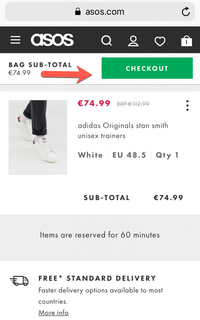
- Place the CTA button at the top of the screen to ensure maximum visibility, like in this example from Asos:
- Use a clear and catchy CTA text that tells prospects exactly what they need to do next, whether that’s to“buy now”, “add to cart”, “watch video” or “see how it works”.
- Keep distractions to a minimum, or remove them altogether from the checkout process.
- Integrate digital wallets like Amazon Pay, PayPal, or Apple Pay into your store to speed up the process and to make it convenient for shoppers to pay for their order.
- Give prospects the option to make a purchase as a guest instead of making it compulsory to create an account just to buy a pen.
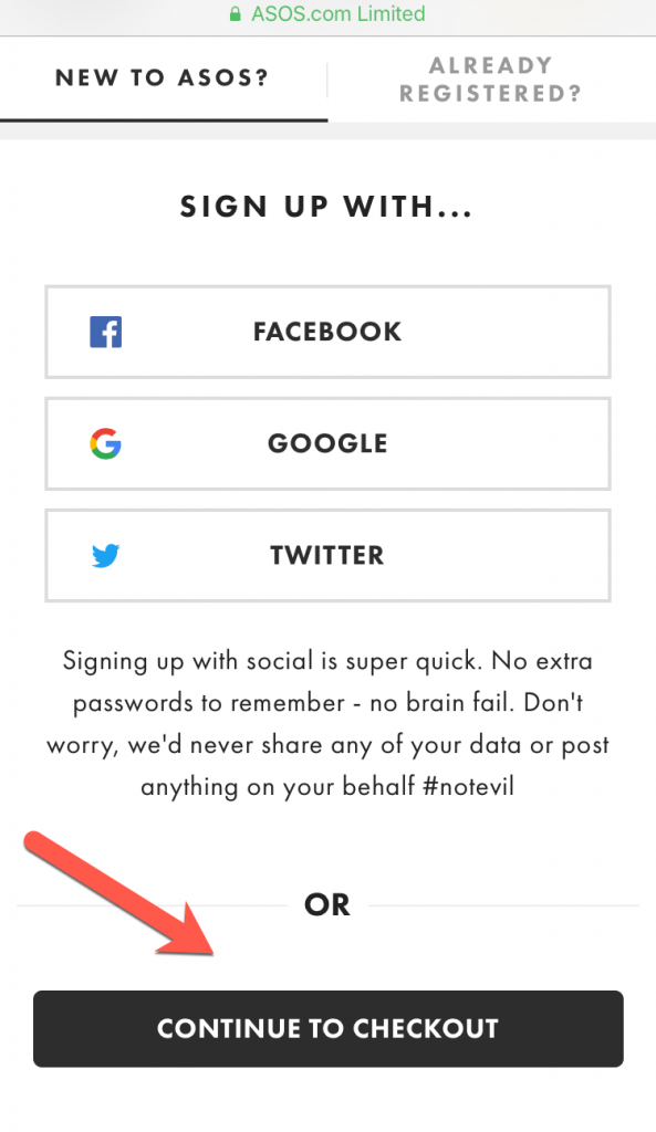
- Only ask for information you really need to complete the sale.
- Use security seals and trust symbols to reassure prospects that your site and their information is safe and secure.
3. Optimise your navigation menu
For ecommerce sites, it’s necessary to use a top navigation menu as this makes it easier for visitors to browse through your site, no matter what page they’re on.
Another thing to consider is that dropdown menus are a bit harder to work on a mobile device. This means that you’ll need to customise your layout so that it’s easy for visitor to scroll through the options and select one.
Here’s a good example from Asos where they also highlight special offers right in the menu:

4. Give users the option to search through your site
Some users may land on your site to search for specific products while others may just want to browse around to see what you’ve got available that they might be interested in buying.
This means that some users will want to use the search box to find the product they’re looking for while others will likely use the menu to browse through your products.
Make sure you have both options available on your mobile ecommerce site.
5. Add rich snippets to your site
Want to entice users to click through to your site from Google? Then you need to make your listing as attracting as possible.
How can you do that?
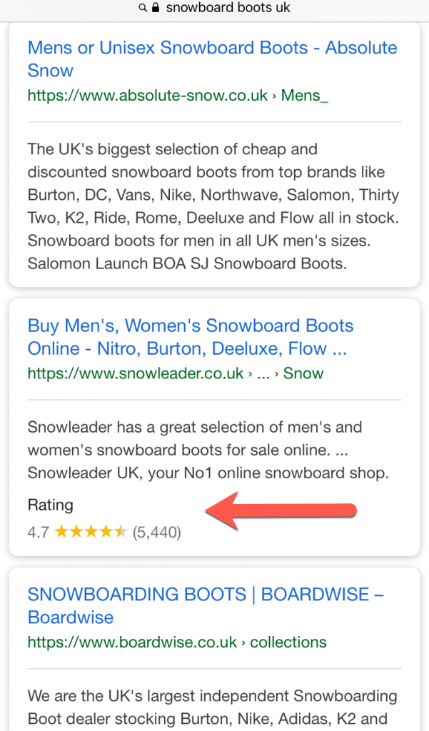
Simple: use rich snippets to make your product pages stand out in the search results. By marking up your products you can show ratings, prices and offers directly into the search results thus having a better chance of getting a click from a user.
Check out this example:
A simple way to add rich snippets to your site is to use the Structured Data Markup Helper.
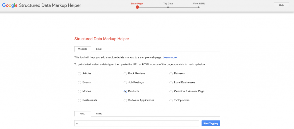
Choose “Products” from the list and then follow the steps to markup your products. Once you have the code, make sure you test it using the Structured Data Testing Tool. If the code works, then simply add it to your website.
For more tips and advice, read our post on how to make your organic listing stand out in the SERPs.
6. Speed up your website
Users today have little to no patience for sites that seem to take ages to load. So if you don’t want to drive prospects away, make sure you improve your site speed.
The first step is to test your site’s speed using Google’s PageSpeed Insights tool. Marks are out of 100 and anything over 90 is ideal, while a score under 80 indicates you have speed issues that you’ll need to fix as soon as possible.
The great thing about this tool is that it will also make suggestions on what you should fix in order to speed up your ecommerce site.
For more information, read our article on why site speed matters and what you can do to speed up your website.
Google has also been pushing site owners to make pages using their Accelerated Mobile Pages (AMP) design standard, which is a framework for creating fast-loading mobile web pages.
The following resources explain what AMP is, how it works and how you can mark up your mobile pages for a better mobile user experience:
- Everything you need to know about Accelerated Mobile Pages (AMP)
- Getting started with AMP for ecommerce
Wrapping up
Mobile optimisation isn’t a fad. It’s a necessity considering that by 2021, mobile ecommerce sales are expected to account for close to 73% of all ecommerce sales.
So if you want to provide your prospects with a pleasant mobile user experience, one where they can check out your products and make purchases without getting frustrated or stressed out, start by following the six tips in this post. Even if you only implement two or three of them, you should still see a significant boost in sales on mobile.
