30 minutes to a better website: Cleaning up your homepage
In this, the first in a new series of posts, we’ll look at quick changes that you can make to your website which will give it greater appeal to potential customers. You don’t have to be a web design genius to make these changes, especially if your site uses a simple content management system such as WordPress. Over the coming months, we’ll consider different aspects of what makes a good website, but we’ll start at the beginning; your homepage.
Identifying the purpose of your homepage
Getting people to your homepage is easy – if you’ve got the money, AdWords can send you a steady stream of visitors in an instant. But what will those people do when they get to your homepage? If you can’t answer that simple question with any degree of confidence, then you may have a problem. If your homepage lacks focus, the chances are visitors will leave as quickly as they arrived. For that reason, it pays to assess what you want from your homepage and then work out if it’s delivering for you.
So take a few minutes to jot down the main purpose of your site. Exactly what you write will depend on the nature of your business. For example, if you sell a product the ultimate aim is to get visitors from your homepage to the checkout. If you offer a service, the aim may be to encourage people to ask for a quote or consultation.
Once you’ve briefly outlined the purpose of your site go to your homepage and spend a little time assessing whether it’s likely to help you meet those goals.
Here are a couple of common mistakes that you should be on the lookout for.
Information overload
You don’t have to be a design guru to see what’s wrong with this example:
The sheer amount of information on offer makes the site a nightmare to navigate and decreases the chances that someone will delve deeper into the site.
Information overload is a particular problem for news and blog sites. The solution is simple – prioritise.
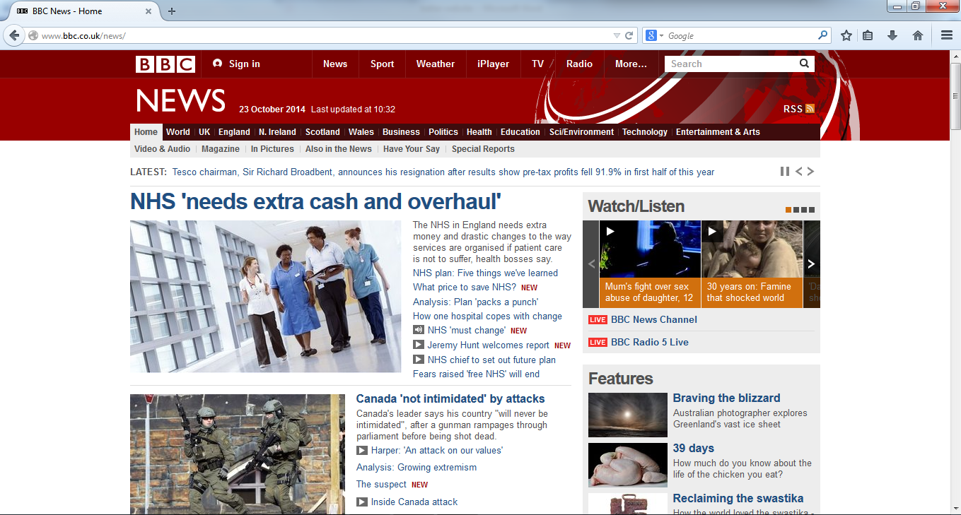
A good example of this is the BBC News homepage:

It provides a lot of focus on the biggest stories of the moment, with users having to scroll down for older, or less important news. Crucially, it also provides a comprehensive navigation bar, meaning anyone who is specifically interested in news from Scotland, for example, can find that section quickly and easily.
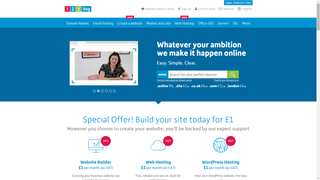
Information overload can also be a problem for business sites that sell a wide selection of products, or sell complex products. Take 123 Reg. We sell domain names, email hosting, UK web hosting, SSL certificates and more. If we were to try to and fit every piece of information about each of our products on our homepage, it would end up looking like the Haven Works page above.
Instead, we’ve opted for drop down boxes, which reduce clutter while still allowing people to find the information they’re looking for, as you can see here:

Too little information and/or the wrong kind of information
Just as overloading visitors can be off putting to potential customers, providing insufficient or the wrong kind of information can be just as bad.
At one extreme we have this kind of page:
Splash pages like this were once common, but they should be avoided. The user has no incentive to further explore the site and is likely to hit the back button on their browser in order to find a site that seems more likely to provide the product or service they’re looking for. (Incidentally, anyone who does venture beyond the splash page in the above example will find a very strong portfolio, making it even more unfortunate that the “welcome” to the site is so poor.)
Then we have the kind of site that uses its homepage as an about page, like this:
The problem here is that the “about us” text, actually distracts from the main purpose of the page – to get people to take the free pedigree check with a view to registering the horse with the association. To make matters worse, the text has pushed the page’s call to action and navigation below the fold, so visitors have to scroll down to see it, something many people simply won’t do. If your page is distracting people from your products, then your sales will suffer.
Although it’s important people should be able to tell what your business does from your homepage, it can be done in just a few words. Look back at the screenshot of 123 Reg above – the words “Search for your perfect domain” make it clear exactly what we do, but don’t distract from the rest of the page. If someone wants more information, they can head to the about us page.
Planning a better homepage
Once you’ve honestly assessed the current state of your homepage, you need to plan the changes you’re going to make. Focus on the following.
1) Prioritise your main product(s) and/or service(s)
2) Cut out all unnecessary clutter
3) Make sure people won’t have to scroll down to see important content
Once you’ve done that, you’ll have the outline of a new homepage which you can either build yourself or ask a web designer to implement for you. WordPress users can experiment with their current theme to see if its options can be adjusted to fit the planned changes, or they can opt for a new theme. If you’re worried about the possibility that the change may have an adverse impact on customer numbers, make sure you back up your site so you can revert to the old one if need be. Then track the situation through Google Analytics to see if there’s an improvement. Remember to give the new version of the site a fair crack of the whip and don’t forget to account for season changes when you make the comparison. Look at conversions, bounce rate, time on site and pages visited to see if the switch had a positive impact. If you haven’t yet got to grips with Google Analytics, use this guide to get started.


