Does your website pass the five-second test?
How would you feel if you were to find out that only 5% of your first-time visitors can understand what your website is about?
Whether your visitors come to your site from Google’s search engine results, social networks or pay-per-click ads, if they can’t understand what your site is about in under five seconds, you won’t stand a chance of getting them to buy from you.
First impressions matter, and a successful combination of powerful images, clear copy, simple navigation and a clean design can all greatly influence whether a visitor will stay or leave.
Curious to know if your site can pass the five-second test? Read on as we walk you through what this usability test entails, the steps to run it on your website, and how to use the results to improve and ensure you make a great first impression.
What is the five-second test?
It’s a test that’s used to assess the impact and clarity of a web page.
The idea is simple: you show a test subject a web page for five seconds, then hide it and ask them what that page is about. It’s a very effective way to gauge the focus of a web page, and to see whether users can quickly figure out what you’re offering.
Why is this important?
Because your visitors are all busy people with lots of important things to do. They don’t have time to stick around, scroll down, browse through your site to figure out what your site is about and how they’ll benefit from it.
Your visitors need to know in the blink of an eye if:
- Your website is the one they hoped to get to
- The content of the page matches what they saw in the ad/ Google search result/ social media post
- It’s clear what your business does
If this isn’t obvious right away, and if they can’t quickly see that you have what they want, they’ll move right to your competitors.
The five second test is that important.
To pass this test you want to make it crystal clear to your visitors where they are and what you have to offer.
So, how can you ace the five-second test?
Start by looking at your homepage and see if you can answer these vital questions:
- What is this website about? – Is this made obvious by your website name, logo or tagline?
- What can I do here? – What products or services do you provide?
- Why should I care? – What’s in it for me?
- What I am supposed to do first? – Is the primary call-to-action clear and enticing?
- Can I trust this website? – Does the site look professional?
The idea is to grab visitors’ attention within seconds so they’ll want to stay on your site and find out more about what you have to offer.
Skype’s homepage is a good example. The text and image stand out and clearly communicate what they have to offer.
Lynda’s homepage is another good example. Thanks to the headline and the imagery you can quickly tell what they’re offering.
So, when should you run the test?
Whenever you want. And as many times as you feel necessary.
Here are a few situations when a five-second test can come in handy:
- After a website redesign. It’s a good way to find out if your new design and copy are effective at communicating your message.
- When you’re weighing the benefits of a complete redesign versus making a few changes to improve your website.
- When the bounce rate of your web page is high. A bounce occurs when someone visits your website, views a single page, and leaves. This can help you figure out whether it’s the design or the copy (or both?) that’s missing the mark.
- When click throughs from a page are very low. Users arrive on that page but they don’t click on your call-to-action button.
- When you’re confident in your website but know there’s always room for improvement.
How to run a five-second test
One of the difficult things about optimising your website is the fact that visitors don’t tell you why they leave within seconds of arriving on your site. Maybe your headline didn’t work for them, or maybe they just hated your design or images.
That’s where a five-second test can help as you can get a ton of insight into what is and isn’t working on a specific page.
UsabilityHub is a popular tool for this:
To use it, follow these steps:
Choose the page you’d like to test. It’s a good idea to start with your homepage, as that’s often the page that receives the highest amount of traffic, has the highest bounce rate, and is also the most important page for communicating what your business is about. However, you can choose to evaluate any page you like, such as a product page, a campaign-specific landing page, about or contact pages, and more.
Capture and upload an image of the page you’d like to evaluate. You can either upload a capture from your computer or add the URL of the page and they’ll do a screen capture for you.
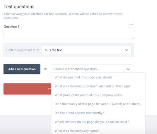
Add instructions and questions. If you want users to look for a specific design element, like a call-to-action button, or perform a specific task like book a consultation, you can add this in the Instructions box. You’ll also be able to add questions that you’d like testers to answer after viewing your page. You can either add your own questions, or choose from the list of predefined questions.
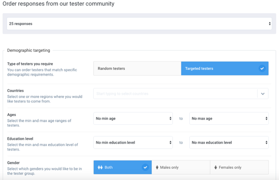
Select your testers. In this step you get to choose your testers depending on country, age, gender and education level.
No need to be overly focused on your specific target audience as the goal is to figure out whether people can clearly understand what that page is about, and not whether they’ll buy your products or services.
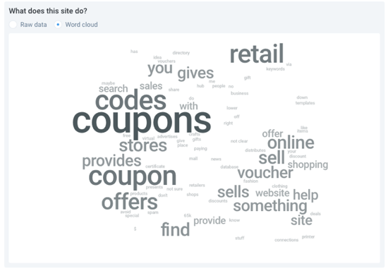
Next you’ll need to start the test and wait for the results. Here’s a sample report so you know what to expect.
Analyse the results. Now comes the fun part!
The report should reveal where there are opportunities for improvement. Depending on your questions, you might discover that your headline is unclear or missing, your logo is difficult to see or the design is too complicated with too many different elements or fonts that are distracting and/ or confusing.
Ways to improve the clarity of your web pages
So how do you pass the five-second test with flying colours? Here are a few areas to focus on:
Tagline
A tagline is a catchphrase that accompanies your business name and it’s meant to define and differentiate your core brand message. Use it to clearly spell out exactly what it is you have to offer to your visitors.
Here are a few examples of memorable taglines:
- Nike: “Just Do It”
- California Milk Processor Board: “Got Milk?”
- De Beers: “A Diamond is Forever”
- Dunkin’ Donuts: “America Runs on Dunkin”
Headline
“On the average, five times as many people read the headline as read the body copy. When you have written your headline, you have spent eighty cents out of your dollar.” -David Ogilvy
If you’re going to be perfect in only one place, do it here.
Why? Because they’re the first lines of your copy that visitors read, and they can either draw in or push visitors away. So it doesn’t matter how amazing the rest of the copy on a page is, or how nicely designed it is, if the headline is boring, confusing or generic, they won’t keep reading.
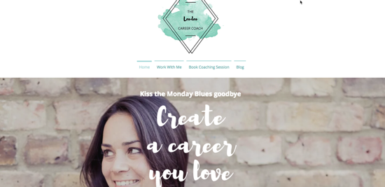
So make sure you write a strong headline that clearly explains what the page is about and what you have to offer.
Here’s a nice example from a career coach in London:
A clear goal
Every page on your site needs to have a clear objective. Do you want to sell a product or a service, get users to watch a video or to give you a call? Whatever it is, make sure your copy and design work together to support this goal.
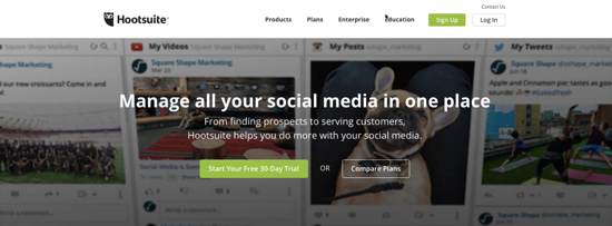
Check out this example from Hootsuite:
Can you tell what the goal of the page is?
Keep the noise down
What you don’t want is a page that has too many design elements or too much imagery. Common mistakes include lots of pictures, animations, different sized and typed fonts, multiple colour schemes. What your website needs is what users expect to see, so keep it simple.
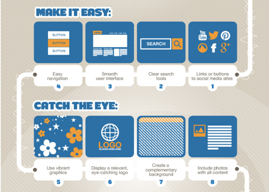
This infographic includes more useful tips to make a website stand out in an engaging way.
Wrapping up
With less than five seconds to impress your visitors, it’s imperative that you make what you do crystal clear. Hopefully this short guide will help you run your own tests with ease so you can determine the effectiveness and clarity of your web pages, and improve where necessary.


