Mobile Matters: Why You Need a Mobile-Friendly Website (and How to Get One)
A mobile-friendly website is one that’s been designed to work just as well on smartphones as it does on desktops. The idea is simple: visitors should have a great experience, wherever they are.
More people browse on their phones than ever before. Be it searching for information, shopping, or booking services, smartphones are the go-to device for most of us today. That means any business website needs to be as easy to use on a mobile screen as it is on a desktop—or even more so.
Mobile-Friendly
What is a mobile-friendly website?
More people browse on their phones than ever before. Be it for shopping, searching for information, or paying for services, smartphones are the go-to device for most of us today. That means a website needs to work just as well on a mobile screen as it does on a desktop.
One way to do it might be to create separate websites for each device. But this approach is bound to take up more time and resources. And today’s visitors expect a smoother ride.
A smarter way is to create a website that knows “where it’s at” and can adapt itself to fit a mobile device. This is achieved using a technique known as responsive design.
What’s the difference between being mobile-friendly and mobile-ready?
“Mobile-friendly” and “mobile-ready” are often used interchangeably to talk about the same basic idea — and that’s fine. For geeks, there is however a slight technical difference:
☐ A mobile-friendly website is one that can adjust its layout and elements (like buttons and menus) to fit mobile screens. Images resize, text reflows, but the site itself doesn’t change; only the way it appears on different devices does.
☐ A mobile-ready website is an entirely separate site with its own web address or subdomain (think “m.example.com”). This approach has been going out of fashion in recent years because of the added costs and headaches involved in running separate sites.
So then, what’s responsive design? The answer is that responsive websites can try to change their layout and elements to fit all different screens — not only mobile, but other devices.
In short: all responsive websites should be mobile-friendly, but not all mobile-friendly websites are responsive.
Why mobile-friendliness matters
Responsive websites adjust their layout on the fly, making them work across a range of devices—not just tablets, but also smartwatches, TVs, and even the whole internet of things. But mobile matters most.
Over half of all internet searches now happen on phones. The share is even bigger for online shopping. Google prefers mobile, too, giving higher search rankings to pages optimised for smartphones.
So while a smooth mobile experience is important for all website owners, it’s essential if you run an online business. Luckily, there are platforms that take care of everything for you.
How do they make websites mobile-friendly?
Think about how users browse on phones — limited screen space and often on the go. When a website is mobile-friendly, the aim is to bring a smooth and easy user experience to smartphones, and generally to tablets as well.
Content needs to be presented in a way that’s easy for mobile visitors to make sense of. That means readable text, clear and concise info, and easy-to-navigate menus with clear buttons and menus, so users can find what they’re looking for.
Fast loading times are important for any website, but even more so on mobile. Images can be compressed and resized, cutting out the waiting times that could cause visitors to bounce.
Mobile-friendliness also means putting the most important things, like contact information, special offers, and clear menus, right at the top for quick access. This way, users can find what they need fast and easily.
✔ Font size and readability: Large, clear text for ease of reading on small screens.
✔ Simple layout: No clutter, easy to navigate, simplified menus.
✔ Fast loading: Quick page views for impatient users, with condensed images.
✔ Tap and scroll friendly: For easy interaction with touchscreens.
✔ Big CTAs and CTCs: Extra-prominent ‘Call to Action’ and ‘Click-to-Call’ buttons.

Why do I need a mobile-friendly website?
1. Web Browsing and Online Shopping Trends
Almost 8 billion people use smartphones worldwide. That’s reflected in web traffic, with over 60% of hits coming on mobile devices. The slice is bigger when it comes to online shopping purchases, and even more so during holidays like Christmas, when consumers tend to use their smartphones for last-minute deals and on-the-go info.
In the UK, over 93% of the population uses mobile internet. That’s just over 63 million mobile internet users, according to Statista. With more and more customers doing their browsing and shopping on smartphones, British mobile commerce sales are predicted to surpass £100 billion by 2025.
2. Improved User Experience
The internet is increasingly mobile-centric. There’s been a shift in how people consume content, with a preference for bite-sized, easily digestible information. Modern consumers expect a smooth and user-friendly experience when browsing products or services. In fact, 57% of internet users say they wouldn’t recommend an online business with a poorly designed mobile website. Mobile optimisation brings users the experience they need.
Speed matters fo all websites, but it’s especially important for on-the-go visitors who might have slower connections. 47% of users today expect a site to load in no more than 2 seconds.
3. Lower Bounce Rates, Higher Conversion Rates
Mobile optimisation helps reduce bounce rates and leads to higher conversion rates. Studies suggest online shoppers are 67% more likely to make a purchase from a site optimised for smartphones. If your homepage isn’t easy to use on a phone, they’ll go somewhere else!
Mobile-friendliness can give your online business a competitive edge, with potentially up to 40% higher conversion rates than non-optimised sites. Users are more likely to stay on a site that is easy to navigate and provides a positive experience, driving conversions.
Mobile-readiness can all help generally for brand perception. It shows that you’re modern, professional, attentive to needs — rather than turning away those customers who can’t navigate your site from a PC. By contrast, a poor mobile experience might see a 60% bounce rate, while 61% of visitors are unlikely to return to a site that they’ve previously had trouble with on mobile!
4. Lower Costs, Fewer Headaches
In the past, online businesses needed separate websites for desktop and mobile. This meant double the development work, double the maintenance needs, and double the hosting fees. There’s no need for this with a responsive, mobile-friendly website. Everything’s in one place, and this one base covers all — freeing up resources so you can focus on what you do best.
5. Better Social Media Integration
Why mobile-friendly? Because social media itself is mobile! 92% of social media users access these platforms via their mobile devices — the vast majority of social media interactions happen on mobile phones. Imagine the frustration if your website isn’t optimised for mobile. Click, frustration, exit. Not the conversion you want. Social media platforms understand this, and they’ve built mobile browsing directly into their apps.
6. Better Search Engine Optimisation (SEO)
Modern search engines prefer sites that deliver a smooth user experience on mobile devices. This translates to better rankings and more website traffic. To put that another way: if you’re not mobile optimised, you might not get found online.
Google started to shift towards mobile-friendly sites in its search results way back in 2015. Since 2019, they’ve switched completely to prioritise mobile versions of pages in their indexing. As they put it: “If you haven’t already, create a mobile-friendly website so your users visiting your site through a mobile phone can have a stellar experience.”
See also: Local SEO in 10 – How Do I Get My Business Found Online?
How can I get a mobile-friendly website?
Building a mobile-friendly website might sound technical, but it’s easy with the right tools. Actually, you can get it all done for you.
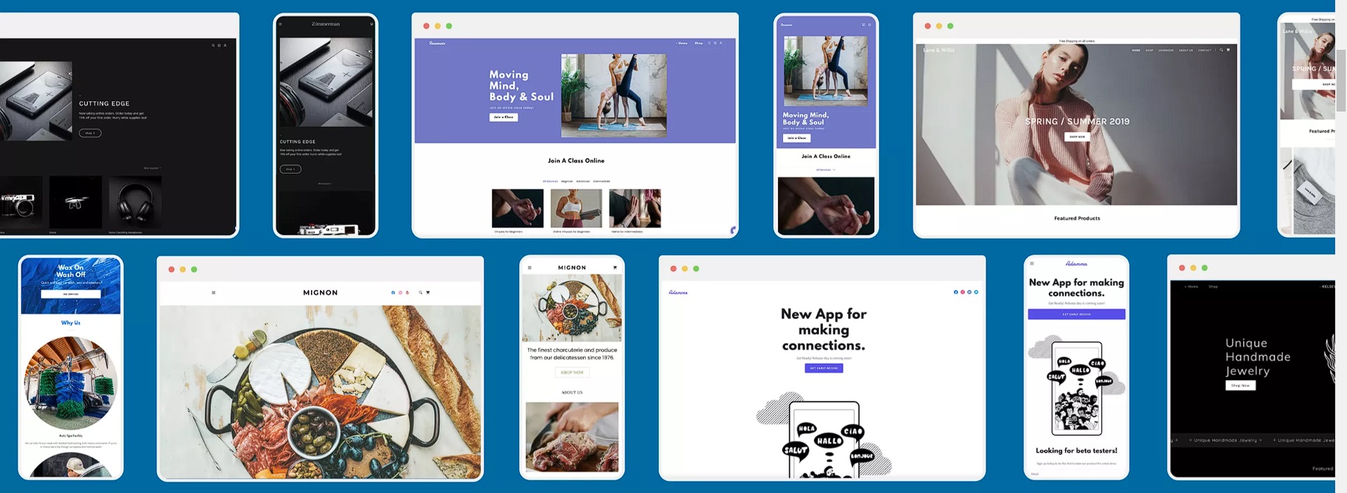
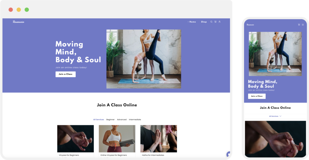
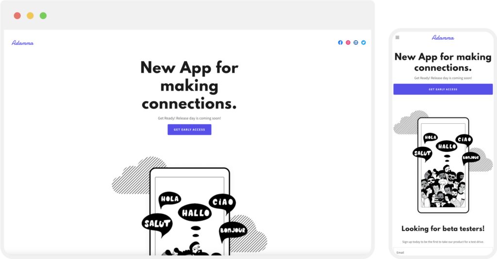
Website Builder features responsive design as standard, so when you create your website, it then automatically adjusts its layout for mobile. The platform does the trick behind the scenes, and your website’s text, images, and buttons resize and rearrange themselves for the best possible mobile viewing experience.
You don’t need coding skills — just pick a template, customise it, add all your content, and you’re good to go. Your website will look great no matter how visitors view it.
Templates have been crafted by professionals for maximum appeal and impact on different screen sizes. You can easily tweak elements and see the changes in real-time, so you can feel confident that your site will look and perform well.
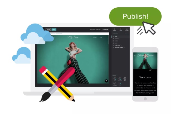
Simply hit the preview button to see how it’s going to look. When ready, hit publish.
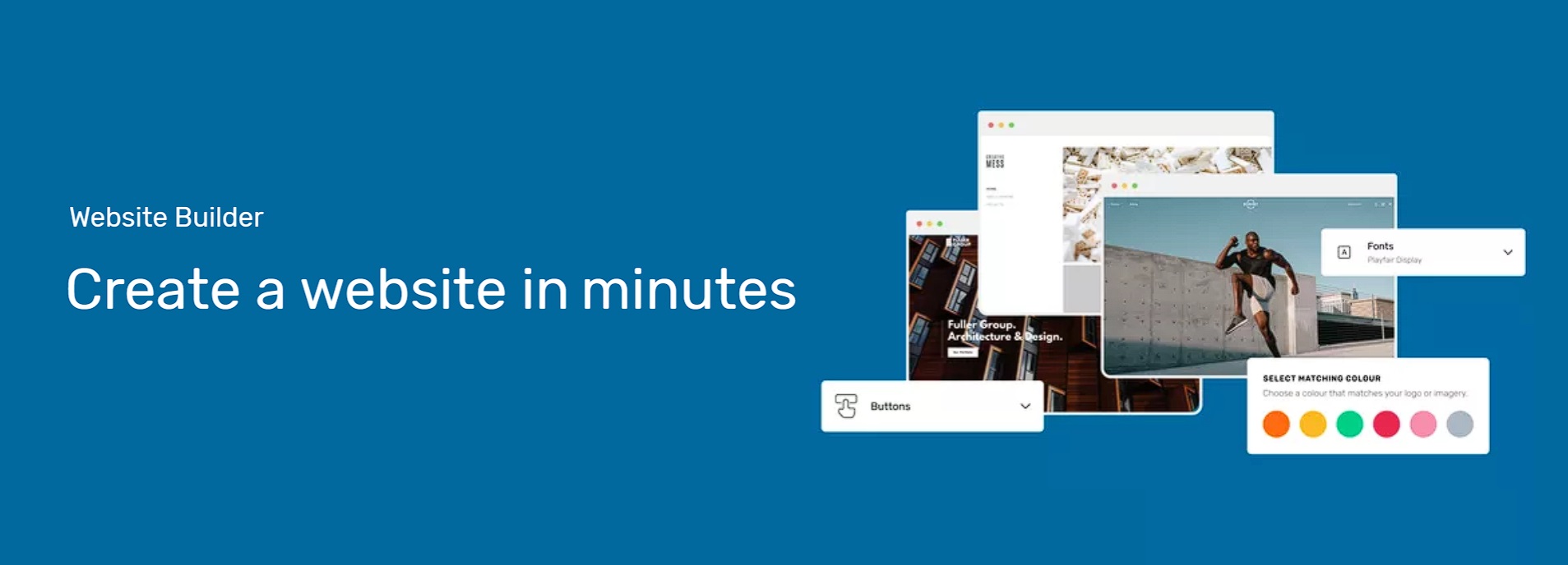
Website Builder – Everything You Need to Create a Website in Minutes
How do responsive websites work?
Ideally, everything should work well and look great no matter the device we’ve used to access the web. But before responsive design came along, things were very different. In the early days, devices simply couldn’t handle pages meant for big monitors: tiny text, slow loading, clunky menus — like serving an English breakfast on a postage stamp.
Mobile internet started to take off in the early 2000s when 3G networks came out, paving the way for a smartphone revolution. The iPhone launched in 2007, while Android arrived shortly after. Dedicated mobile browsers (and other apps) then led the way to the modern age, where today, websites are accessed more on mobile than by desktop.
The term “responsive design” is quite new, but the tech behind has for the most part been around for ages. The three main ingredients are: HTML, CSS, and JavaScript.
As you might know, HTML is the backbone of webpage code and contains the basic structure. CSS can be used to add more advanced visual style and layouts that can’t be done in HTML. Finally, JavaScript is used to add animations or menus (or animated menus).
Besides the three main ingredients, responsive design usually relies on two main things that make the magic happen:
✔ The Viewport Meta Tag. This is a snippet of code in the head section that tells the browser on how to control the size and scaling of the page.
✔ CSS media queries. These instructions can work as conditional statements, applying different styles based on screen size (eg., “if the resolution is less than this, make that menu vertical”).
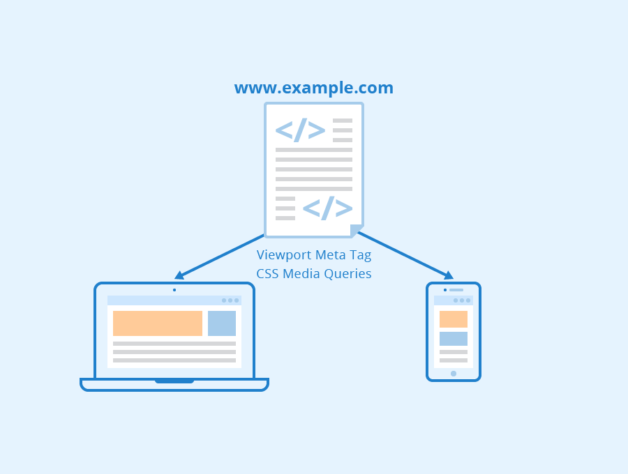
Responsive Web Design – Author: Seobility – Licence: CC BY-SA 4.0
New devices with new screen sizes are coming out all the time. Some are landscape, others portrait, and most need to switch between the two. Luckily, responsive websites don’t need to know the exact screen size of the device they’re on. Rather, they can use “breakpoints” based on resolutions. These act like dividers. The website can use these to adjust for different screens.
Web devs can then go to work on optimisation: Images can shrink, text can reflow, and buttons can grow bigger – all to ensure a frustration-free experience for the user, on any device. On big screens, that might mean placing elements side-by-side, while on phones, getting them to stack neatly, instead.
When it comes to design, be aware that it’ll never be perfect. You can only make a website that works well across the majority of devices, not 100% of them. Unwieldy screen shapes and odd resolutions make life tricky. Then, there’s also the evolving landscape of smartwatches and the internet-of-things to contend with.
Look at it as a spectrum. Responsive design aims for a sweet spot across a range of devices, but there will always be edge cases where tweaks are needed. For that reason, website owners still need to test across devices to check everything works well.
How do I know if my website is optimised for mobile?
Are you using Website Builder? If so, it is. Next!
For websites hosted using Managed WordPress, the key factor is the theme you choose. Most themes available on the official WordPress directory and reputable marketplaces are designed to be responsive. You’ll need to double check and make tweaks as needed. There are also plugins out there that can improve mobile optimisation.
Remember that your text and business info should be the same on desktop as it is for mobile. That’s important both for visitors and in terms of how you show up on search engines. As mentioned, Google prefers mobile content for indexing and ranking. If you’d like a deep dive on best SEO practices for mobile, you’ll find that here.
It’s always a good idea to check your website on as many different devices as possible. Open your site on your own (and your mate’s) mobile phone or tablet. Try browsing different sections, clicking buttons, and filling out forms. Look for any issues like text being too small to read, buttons being too close together, or elements that don’t fit the screen properly.
One advantage of using Website Builder is that the themes and templates have already been rigorously tested. There’s hundreds of responsive, mobile-friendly templates, and you can easily switch between desktop and mobile views to preview in real-time.
If you’re looking for a quick and easy way of creating a professional website, there’s no better place to start than with Website Builder. Explore a range of responsive, mobile-friendly templates and find your perfect fit.