Why calls to action are the most important words on your small business website
Isn’t it frustrating when you go into a coffee shop you’ve never been before and don’t know what the expected protocol is? Are you supposed to seat yourself? Should you order at the counter? Can you pay by credit card?
You wouldn’t have to ask yourself all these questions if only there were a sign at the entrance asking you to wait to be seated. Or one in plain sight, like above the counter, instructing you to order and pay at the counter.
You know why that’s necessary? Because it makes customers’ lives easier as they don’t have to ask a bunch of questions before placing an order. They immediately know what to do because you tell them what to do. Simple!
Our brains are always on the lookout for instructions and signs – where to order, where to take a left to reach our destination or what key to press to get transferred to a customer support representative. We’re instinctively looking to be told what to do next.
It’s the same with the visitors on your website. Once they’re there, they’ll be looking for instructions on their next step. Should they sign up for your newsletter, download your ebook, buy your product or give you a call? If you don’t have calls-to-action that make it clear what you want them to do next, they will most likely do… nothing.
So in this article we’ll be talking about calls-to-action (CTAs), their vital role in helping your site to turn visitors into customers, as well as how to create powerful CTAs to entice more visitors to take the action you want them to take.
What is a call-to-action?
A call to action (CTA) can refer to any ask or request that you make of a visitor while on your website. It’s a key element on a web page, acting as a signpost that lets a user know what to do next.
Here are some of the most common examples of CTAs:
- Buy now
- Try it now
- Find out more
- Request a quote
- Subscribe to our newsletter
- Download our ebook
- Read testimonials
- Get in touch with us today
When there’s no CTA, the user may not know what they’re supposed to do next or what the next step is to making a purchase or signing up for a newsletter. And what happens when they don’t know how to move forward? They most likely leave the site without taking the action you want them to take.
Why you can’t win without a call-to-action
What’s the main goal of your site? To sell products? Get visitors to sign up for your newsletter or to give you call?
If you want users to take a specific action, you can’t achieve that without a persuasive call-to-action.
Imagine a homepage or a landing page with an attention-grabbing headline, persuasive copy and a compelling offer. But with no CTA in sight. No “buy now”, no “sign up for a free trial”, no “give us a call today”. So what should the visitor do next?
While the action may seem obvious to you, if there’s no next step or a button to click, don’t be surprised if users leave without taking further action.
In other words, no CTA means you have slim chances of closing the deal. You’re simply “leaving money on the table”, and who wants to do that?
Bottom line: you can’t be successful online without having calls-to-action on every page of your website. That’s right – every page, because every page is an opportunity to turn visitors into customers.
So next we’re going to explain what makes a powerful CTA and the steps to follow to create yours.
How to create a powerful call-to-action
There’s no universal template that works for every site. But there are guiding principles that you can follow to determine what works best for your audience and business website.
So next we’ll break down the six characteristics of a persuasive call-to-action button.
It’s a button
If you want your calls-to-action to get noticed and clicked, they need to be buttons. Not text or hyperlinks but buttons.
Look at these two examples:

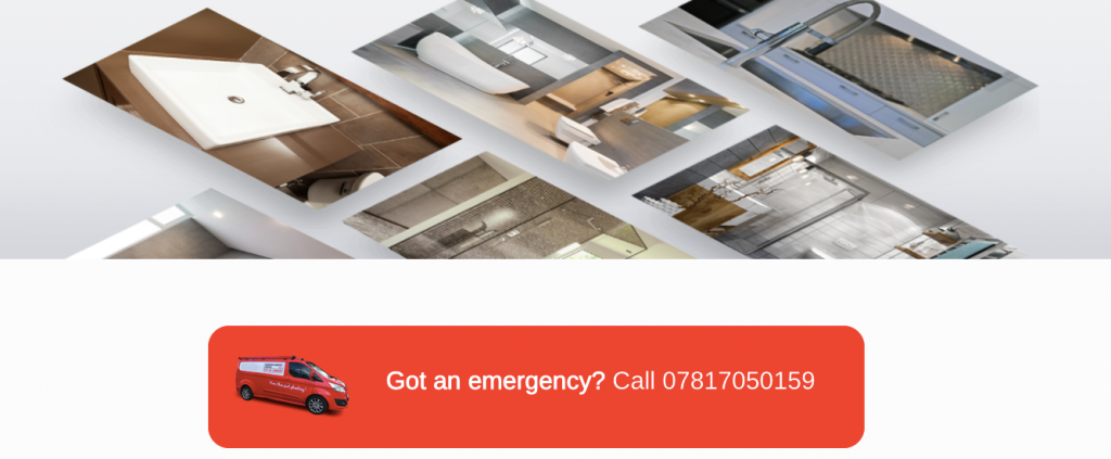
On which site are you most likely to notice the CTA? And which is persuasive enough to get you to act?
Version two, no doubt. That’s because we’ve become accustomed to the online experience so when we see a button, we know what to do next.
Take this example from Capgemini:
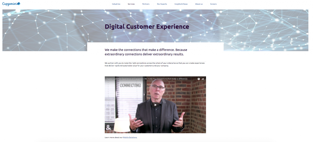
This is a page where they present one of the services they’re offering called “Digital Marketing Experience”. Below the video there’s a short “Learn more about our Mobile Solutions” hyperlink and that’s about it. No button, no contact form, no next step. So what is a user supposed to do now?
Now take a look at this example from Coursera:
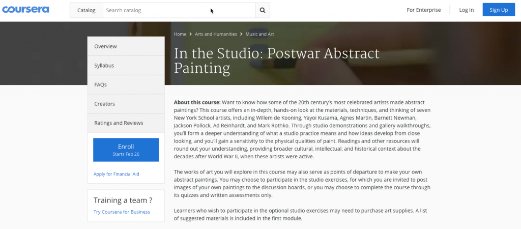
Is it clear what you’re expected to do next? Sure it is. The CTA is big. It’s blue. And it’s in-your-face obvious.
Bottom line: don’t reinvent the wheel. Make your CTA a button.
It stands out from the rest of the page
Look at the homepage of FreshBooks. Where should you click?
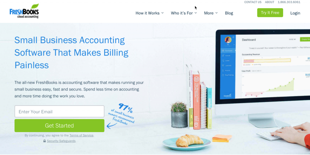
Or at the JBL homepage. Where are you supposed to click?

In both cases, it’s clear where you should click. The design of the button and how it contrasts with the page helps to catch the users’ attention. It stands out from the rest of the page and acts as a visual cue to help answer this vital question: Where should I click?
Now, while designers are always looking for the highest converting colours, the truth is there’s no universal colour that’s converts the best. Instead, visitors are more likely to notice something that stands out from everything else surrounding it.
So, to grab users’ attention you need to use a colour that contrasts with the rest of the page, while still fitting in with the overall colour scheme.
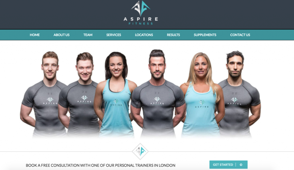
Check out this example from Aspire Fitness:
And this one from a life coach:
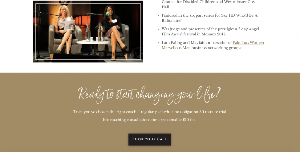
As you can see, both CTA buttons use contrasting colours to draw the user’s eye to it so they know where they should click. But, at the same time, the buttons fit right in with the colour scheme of the pages.
It uses compelling copy
While colour directs users to where they should click, it’s copy that’s the deciding factor on whether they’ll take action or not.
The copy on the CTA button helps visitors to make up their mind about why they should click on the button. In addition, it gives them an idea about what’s going to happen next.
This button from Netflix is a great example of a short, straightforward and action-oriented approach.
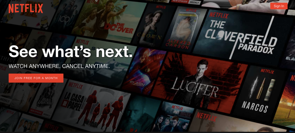
But here’s the thing: it’s not just the copy on the CTA button. It’s also how the copy on the button goes together with the other copy surrounding it.
Take another look at Netflix’s homepage. Yes, the call-to-action is visible and clear. But what about the copy around the button?
“See what’s next” – Sounds great.
“Watch anywhere” – Even better.
“Cancel anytime” – Still good.
So what do I have to do now? “Join free for a month”. Sign me up!
Let’s take another example from Basecamp:
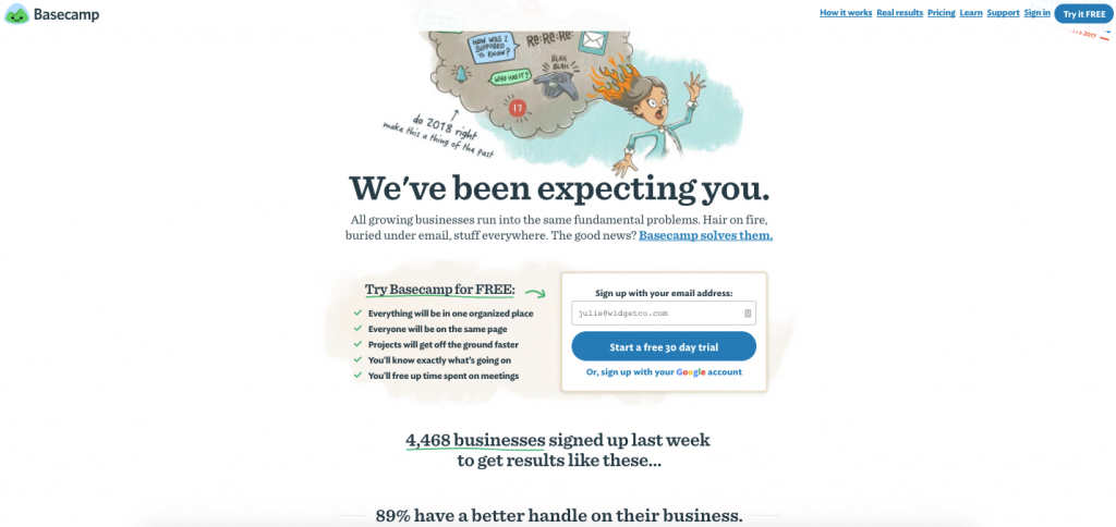
Basecamp is hugely popular. But there are so many other project management tools that you could try. So why should you choose this one?
Because they’re confident you’ve already tried others and you’ll soon realise this is the only tool for you. Because a huge number of companies are already using it and have a better handle on their business. And because you can try it for free for 30 days!
So it’s not just the copy on the CTA button that makes a difference in how many users take action. But also in the copy surrounding the button. Think testimonials, money-back guarantee, benefits like free shipping or no credit card required.
It’s impossible to miss
There’s no point in crafting a persuasive CTA button if no can see it. If the copy on your page is compelling enough that the user wants to take the next step, the worst thing you can do is to make them hunt to find your CTA button.
Your CTA button should be impossible to miss. It should be visible and in the path of a user.
So if a user fills out a form to download a free ebook from you, then the CTA button should be right next the form. This is a logical placement.
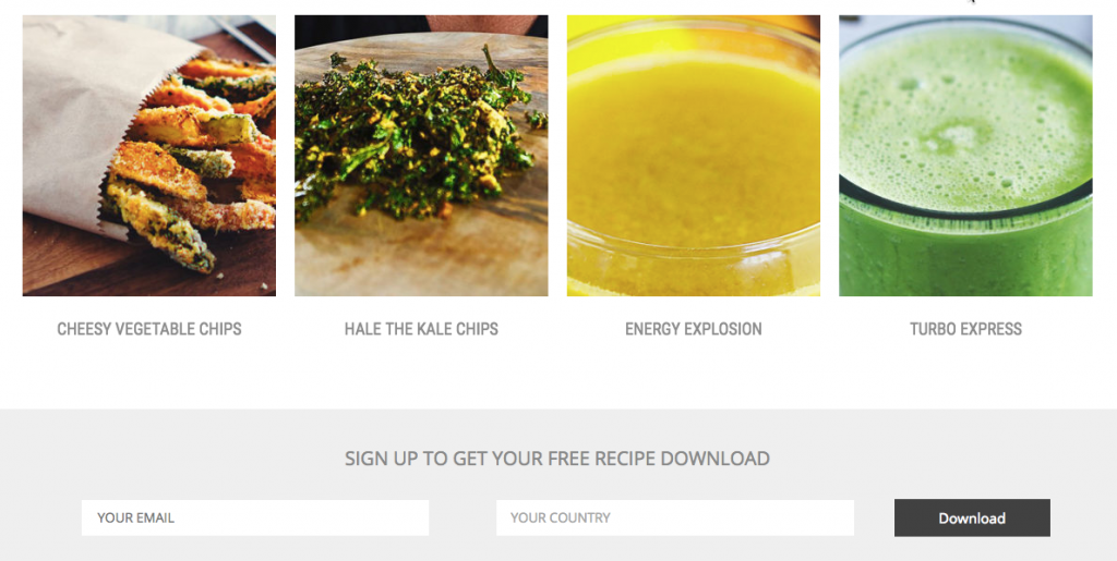
Now take a look at this example:

Not only is the copy simple yet compelling, but the CTA stays in place as the user scrolls up and down the page. You can’t miss it. Plus, it makes it clear to the user what the next step is for them
It doesn’t compete with other CTAs
What happens when you give users too many choices? They most likely get stuck as they have to evaluate each option before making a decision. That takes time and mental effort, which is why most people just choose the easier route. And nothing is easier than choosing nothing and moving on to something else.
This is also known as choice overload, and it makes people less likely to take action when they’re presented with multiple choices.
This applies to your CTA as well. When you have more than one call-to-action on a page, you’re making it difficult for users to take action, which can cause them to leave your site without taking any action.
So, the best thing you can do is to look at every page on your site and ask yourself: what’s the most important thing you want to achieve with that page? What’s the one specific action you want users to take while on that page?
Take a look at this example where there are three different calls-to-action on the page:
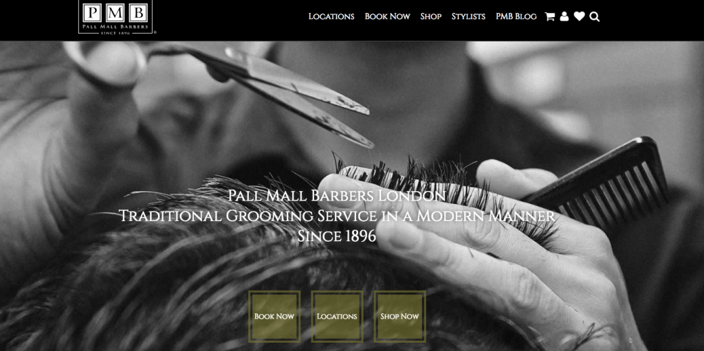
Which do you click?
Now look at this example:
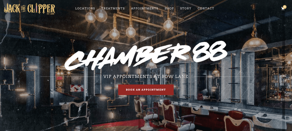
There’s no difficult choice to be made as there’s only one CTA so you immediately know what the next step is.
But what if you need to offer multiple calls-to-action?
There may be situations where need to include more than a CTA on a page. For example, you may have a page where you have one button for signing up new users, and another one for signing in existing users, like Netflix has:
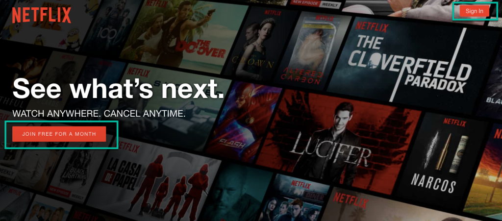
The idea is to prioritise and to use visual hierarchy to give weight to the most important elements that can help you achieve your goal for that page.
When you look at Netflix’s page, it’s obvious what the most important task on the page is: to entice new visitors to sign up. While there’s also a “Sign in” CTA in the top right corner, that doesn’t demand the user’s attention quite as boldly.
The key point is this: if you want a page to convert, you need to make sure you main CTA is always the most visually striking element on the page.
You test and optimise it regularly
Feel like a specific page on your site isn’t doing a good enough job at converting visitors into leads or customers? Is it possible that your CTA isn’t persuasive enough?
The only way to know is to A/B test it and see whether a call-to-action with a different style, colour, copy or location can produce better results. To get started with A/B testing, we recommend you take our free course on understanding your website visitors.
Wrapping up
There is no perfect CTA or a universal recipe that can lead you to craft the right buttons for your website. But if you follow the advice in this article, you’ll be a step closer to creating calls-to-action that get your visitors to take that next step.
Have any other suggestions for creating killer CTAs? Tweet us yours @123Reg.
