Five key visual elements your business blog needs to succeed
Your business’s blog is a staple for driving awareness and attracting prospects to your site who seek answers to the questions they have and solutions to their problems.
But while purposeful content is crucial to getting more people to your blog and website so they can learn about your business, content alone isn’t enough for you to make that great first impression.
You also need to make it aesthetically pleasing. This means using visual elements throughout the blog that can help draw customers into headlines, make your content easier to read and understand, encourage interaction and create a lasting impression.
In this post we’ll walk you through the five most important visual elements that your blog should have to succeed.
1. Powerful images
Blogging is an increasingly visual medium. While in the past adding images to blog posts used to be merely a recommendation, these days it’s mandatory.
Even if your writing is top-notch, if you’re omitting images from your articles, people might find it difficult to read your content or might choose to ignore it from the beginning.
Why? Because:
- Readers look at the images and judge the quality of your content before they even read your article
- Images are an effective way to break up the content and make it easier to consume.
- They add some context or extra information to the written content.
- They’re engaging and entice readers to keep reading.
It’s no wonder that articles with images get 94% more views than articles with no images.
Depending on how long your blog posts are, you can use one or several images to set the tone for your post or to break down chunks of text or different sections of your article.
Let’s look at some of the most effective uses of images in blogging:
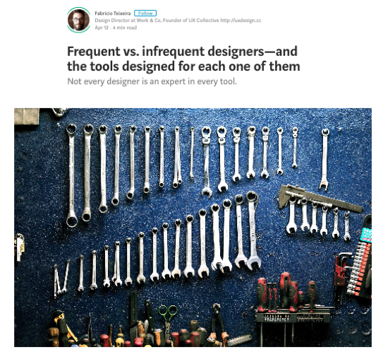
Medium, for example, uses a high-resolution, featured image at the top to help connect the user to the article before reading anything beyond the author bio and the title. This is also known as “hero image” and it helps set the tone for the post. Plus, it looks great on mobile as well.
Flipsnack, for example, feature their main image at the top, above the title. And not only that, but they also create their own custom images.

And so do Moz:
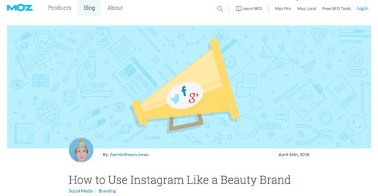
While including a full-width hero image at the top of a blog post is becoming a trend, it’s not a rule. So feel free to play around and see what works best for your business blog.
Now, whenever you use images in your blog posts, make sure they are:
- High-resolution
- Relevant to the content
- Descriptive of what’s next
- Original! People have seen so many stock photos that they often doubt the authenticity and quality of the piece when they see yet another generic image that elicits zero emotion and is being used by everyone else.
In our post on how to use images to get the biggest bang out of a blog post you can learn about other types of images you can use to elicit real emotions in your readers and entice them to read on.
2. Captivating intros
When people land on your blog homepage, they scan the page to decide whether they’re interested and want to read further, or whether their time would be better spent on some other blog.
So, how do you entice them to click to read your articles? How do you turn scanners into readers?
Aside from including attractive images, the title and the opening paragraph are the perfect places to grab those readers you so desperately want. So make sure you pay attention because if your intros are boring, they’ll assume your entire article is too, so they’ll probably not stick around to find out. But if your intros have a hook, if they’re exciting and compelling, they’ll want to click and keep reading to the end.
So, the main goal is to use that intro to sell the reader on clicking and continuing to read your articles. You need to craft it in a way that engages users and makes them feel like they’re gaining something valuable from investing their time in reading your content.
Let’s look at some examples so you get a better understanding of what a strong intro should look and feel like.
This one from CoSchedule tells you exactly what information you’ll gain by reading the article. It starts with a question to draw you in and then it makes a promise, letting you know you’ll find the answer to that question inside the article, an answer that is backed up by 23 studies.
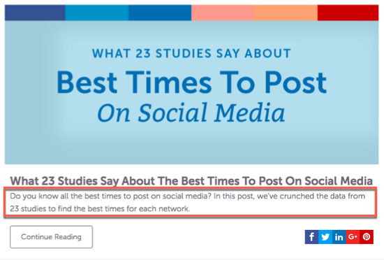
In this example, the caption is not the same as the opening paragraph of the article.
However, there are blogs where the caption is the same as the intro of the article, like in this example from Webheads:
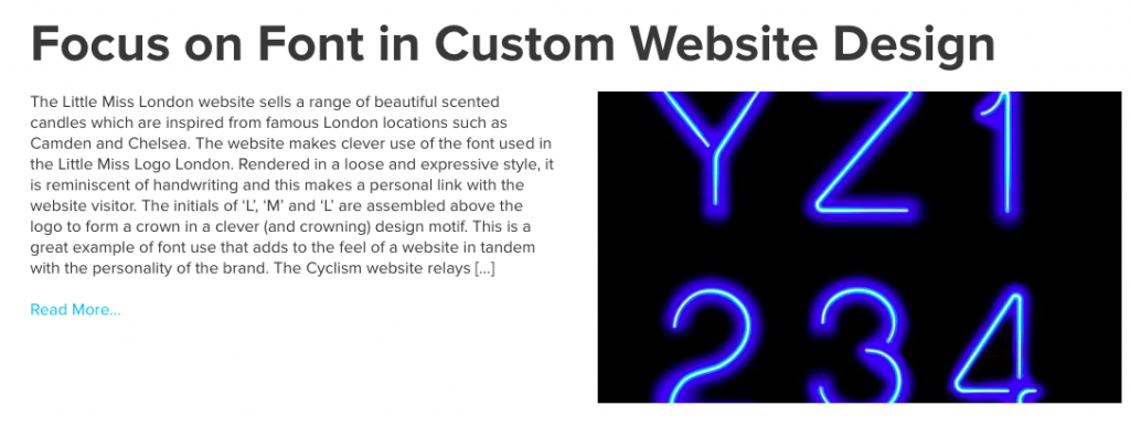
While you can use whichever option you prefer, if you use the second one make sure your intro is powerful enough to grab users’ attention and entice them to click and read more.
3. Email sign-up form
If you don’t have an email sign-up form on your blog, create one now. Otherwise, you’re missing out on a huge opportunity to grow your mailing list and further educate, nurture and update prospects on what’s happening with your business.
Email marketing is still one of the most affordable and effective ways to turn blog readers into customers, so make sure you get that sign-up form on your blog as soon as possible. Just keep in mind that, with the General Data Protection Regulation coming into force on May 25th, you’ll need to clearly tell people what they’re agreeing to when they opt in to receive emails from you.
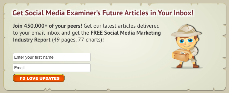
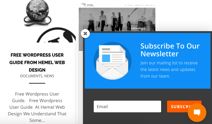
Here are a few examples of how and where you can add that email sign-up form on your blog.
At the top of your sidebar:

After each blog post:
In a popup box as they’re about to leave the blog:
In the footer:

Make sure to test out various locations on your business blog so you can determine which ones get you the most subscribers.
For more tips and advice, read our post to learn how to optimise your email sign-up forms to entice more people to subscribe.
4. Social proof
If you want to gain users’ trust and entice them to read your blog content and subscribe to it, you need to show proof that your blog matters. You need to show proof that lots of other people value your content and are interested in what you have to say.
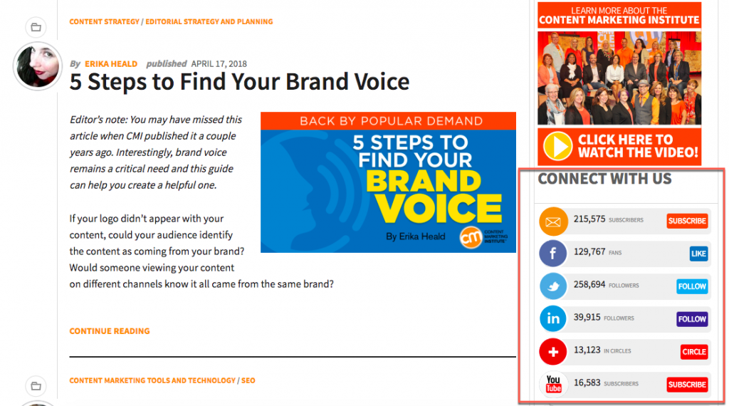
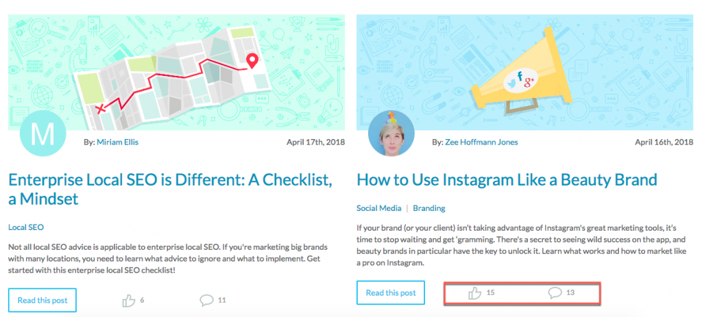
And what better way to do that than by showing how big your social community is or how many shares your blog posts attract on social media? So get those social icons on your blog and let users know just how engaged your community is by your knowledge and expertise.
Here are two simple examples of how you can do that on your business blog:
5. Consistent and legible typography across all devices
A blog is part of your brand so make sure it shows. This means using the same colour schemes and typography that you’re using on your main business website. When the look and feel is consistent across the web, including your website, blog and social media accounts, users will instantly recognise your brand and also feel more connected to it.
In addition to being consistent with design elements, you should also pay attention to legibility and readability. You don’t want people coming to your blog and having to zoom in to 130% just to read the title or the intro of an article, do you? In fact, that should be the last thing users are complaining about.
So, make sure that whatever fonts and sizes you’re using on your blog, they’re not preventing users from reading your content with ease on whichever device they’re using.
This article explains why you should go with bigger font sizes if you want to avoid visitors becoming frustrated and leaving your blog. In it you’ll also find a full chart with some of the most common sizes used for headings and body content from desktop and down to mobile.
Wrapping up
So, there you have it – the visual elements that your business blog shouldn’t be without.
No matter what changes you’re planning to make to your blog, always keep in mind that you have a higher chance of keeping readers engaged and coming back for more with a blog that is clean, simple and focused.
