How and when to use pop-ups on your website and blog
Are you considering adding pop-ups to your site or blog, but aren’t sure whether they’ll work or, on the contrary, annoy and drive visitors away?
Here’s the thing: when done right, pop-ups work. They can motivate users to buy or to opt into your email list and hear from you.
But if done incorrectly, they will provide your visitors with a bad experience that’ll prevent them from taking any further action or from visiting your site anytime soon.
What do we mean by “incorrectly”? Well, if you display a pop-up the second a visitor arrives on your site with no obvious or simple way to close it, and without providing anything relevant and of value, then you can’t be surprised they’ll get frustrated and leave.
Want to get it right? In this post, we’ll share a few examples and tips on how and when to use pop-ups on your website and blog so they work for you.
But first…
What is a pop-up?
A pop-up is also called a “modal window”. It’s defined as “any type of window that is secondary to a parent window that usurps the parent’s control”.
In simpler words, it’s a window that pops up on a page upon a certain trigger and stops the visitor from interacting with the page until they complete a certain action, whether it’s to fill in some information, click a button or click to close the pop-up.
Here’s how it looks:
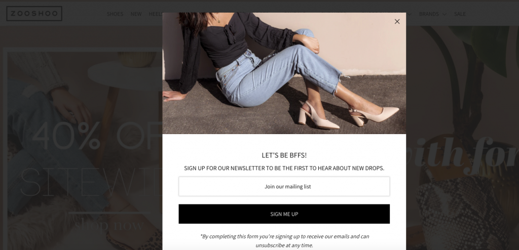
There are many types of pop-ups you can use on your site and blog to accomplish specific goals such as: increasing sales, building your email list, keeping your audience updated about changes to your business, and more. And if you pay attention to a few best practices when you create your pop-ups, you’ll see just how effective they can be at helping you to connect with your visitors and enticing them to take action.
So, next, let’s look at a few examples and best practices so you get a better understanding of when and how to use them to your advantage.
Motivate visitors to take action
If you sell products or services, your number one goal is to turn as many visitors as possible into customers and increase your revenue.
Well-timed and catchy pop-ups can help you to achieve this goal by giving potential customers an extra reason to buy from you.
One of the most popular and widely-used types of pop-ups is the one where visitors are offered a discount or some other incentive to motivate them to buy.
Here’s an example of such a pop-up offer that you’ve surely come across several times before:
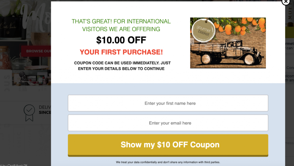
Now, if you’re a small business and can’t afford or aren’t comfortable offering a discount at this stage, there are other types of incentives you can offer such as free shipping on first-time orders or orders above a certain amount.
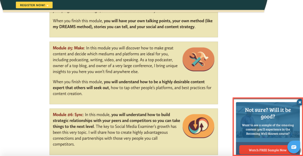
In this example from Social Media Examiner, they chose to give out a sample from the course they’re selling:
Build your email list
Many people who visit your site aren’t ready to buy right there and then, and that’s ok. But that doesn’t mean you can’t persuade them that you have something of value that they might be interested in buying at a later stage.
To do that, you not only need some time but also their contact information, specifically their email address.
This is where a pop-up can come in handy. Here is some inspiration on how you can use pop-ups to entice visitors to sign up to hear from you.
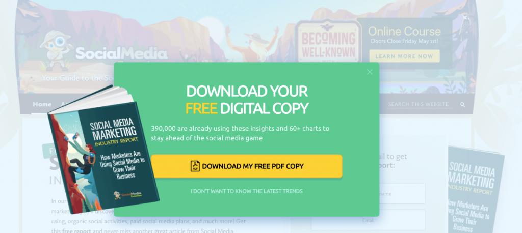
A popular option is to offer a free resource like an ebook like in this example from Social Media Examiner:
Another widely-used option is to offer a discount or free shipping like in this example from MOO:
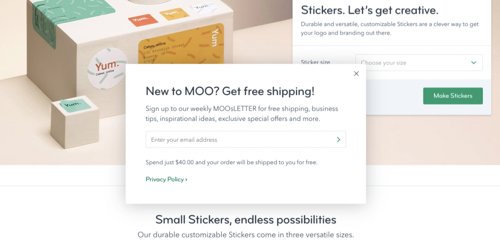
When they provide real value, pop-ups like these can be effective at helping you to build an email list that you can then use to engage, delight and finally, sell to your subscribers.
Read this post to learn more about how to build meaningful relationships with customers using email marketing.
Reduce cart abandonment
Shopping cart abandonment happens on every ecommerce site out there. In fact, almost 70% of online shopping carts are abandoned.
That’s a lot of potential revenue lost.
But no need to throw in the towel just yet, because even though you can’t eliminate cart abandonment, you can try to prevent visitors from leaving after they’ve added items to their cart.
How? With a pop-up like this one:
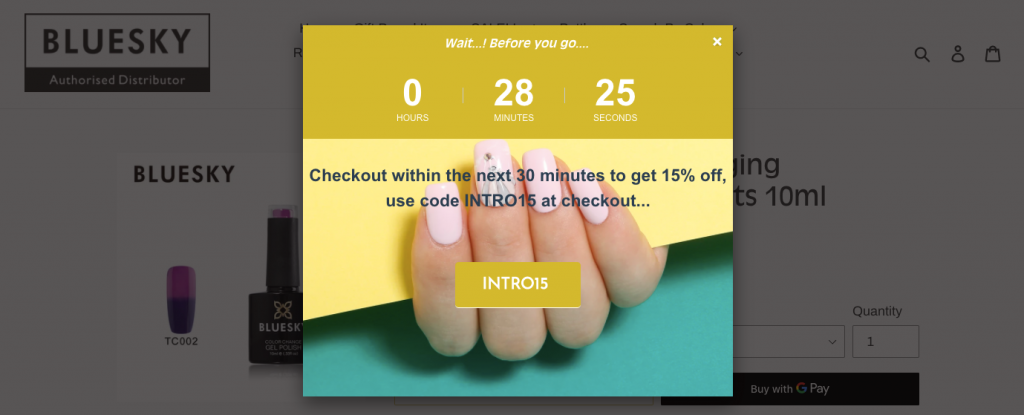
So, if you’re noticing lots of visitors adding items to their cart and then leaving without finalising their purchase, you might want to try adding a pop-up like the one above. Offering an incentive like free shipping or a discount can increase your chances for immediate purchase.
Keep them informed
Pop-ups are also often used to communicate with visitors about changes to the site or business.
For example, you could use pop-ups to inform visitors about things like: your website or blog redesign, a new product or service release, an ebook launch, a privacy policy or delivery fees change, an award you’ve received, and more.
Here is some inspiration on how you can use pop-ups to communicate with your visitors:
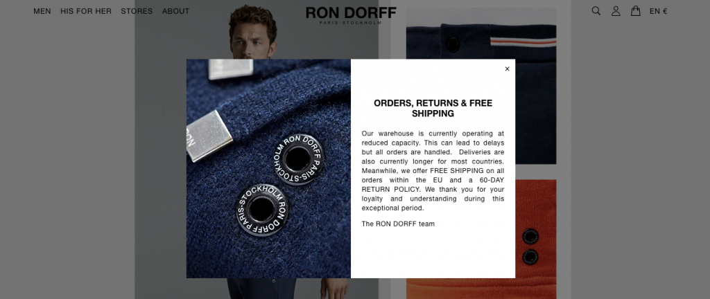

Source
Ask for feedback
Who better to give you honest feedback and help you improve than your visitors and customers?
Pop-ups can be a great tool to ask for feedback you can then use to create a better experience for anyone who visits your site or buys from you.
Want to find out why visitors aren’t buying from you? Ask them in a pop-up like in this example:
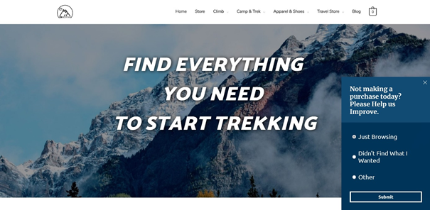
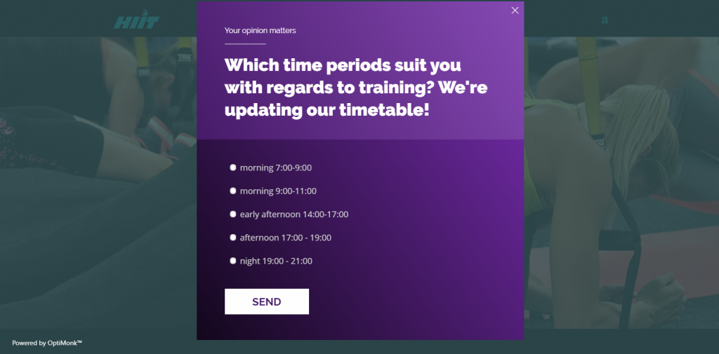
Need ideas or suggestions to provide a better product or service? Here’s an example of how you can let your visitors and customers tell you exactly what they want.
Final tips and best practices
Pop-ups can be effective at helping you to achieve your goals. That is if you use them the right way.
Here are a few quick tips and best practices to keep in mind when adding a pop-up to your site or blog:
- Don’t use pop-ups if you have nothing important to communicate or something valuable to offer.
- Keep the message short and to the point.
- Make sure you give visitor an easy way to close the pop-up, either by clicking outside of it or an “X” button in the top right corner of the pop-up.
- If you want visitors to subscribe to your email list, avoid showing the pop-up the second they land on your site or blog. Give them the chance to browse for a bit and read a paragraph or two first.
Hopefully, you find these examples and tips useful as you experiment with adding pop-ups on your site or blog.
