How to optimise your product pages to sell more
You’re doing a great job at getting visitors to your site. But then they leave without buying from you. Why is that and how can you fix it?
Here’s the thing: a product page has a single goal for your business – to drive the visitor into the cart to purchase the product in question. And when will a visitor add something to their cart? When they’re convinced that buying that product is going to work out for them, that it’s going to help make their lives more fun, enjoyable, or efficient.
How can you convince them of that? By optimising your product page so that every element on that page speaks to their aspirations, wants and needs.
In this post, we’ll look at six specific things to keep in mind when you’re working on levelling up your product page game.
Do you have a clear, attention-grabbing call-to-action?
You have one goal on a product page: get visitors to hit that “Buy now”, “Add to Cart” or however you label your call-to-action (CTA) button.
The CTA button is the most important element on the product page, which is why it’s the first thing you should review, change or build from scratch if you want to boost sales.
Here are a few things you can do to optimise and improve your CTA:
- Make it clear. If you want people to buy, a simple, direct “Buy now” or “Add to Cart” message will do. This is no place to be clever because clever usually creates confusion. You want to make it clear to prospects what the next step is: buy.
- Make it immediately visible when a visitor first lands on the page. Don’t hide it somewhere in the footer or in an unnoticeable text link. Make it a button, make it big and make it visible.
Take this example from Triwa:
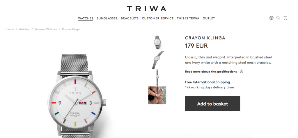
- Make it stand out from the surrounding content. When everything looks the same, it’s difficult to figure out what the next step is. So use a high-contrasting colour for your CTA button to grab visitors’ attention. The higher the contrast of the colour, the more noticeable your button is and the more likely it is to be clicked.
Check out this example from FitBit:
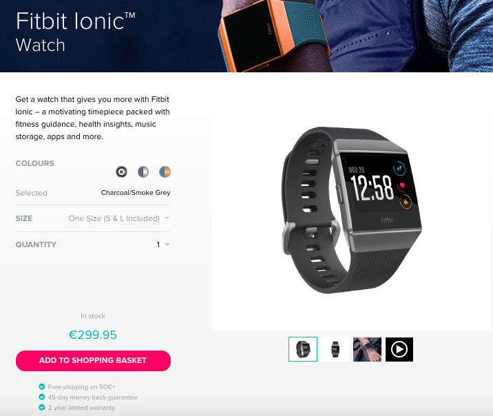
For more tips and advice, read this article on why calls to action are the most important words on your website and how to create a persuasive CTA.
Are you using high-quality product photography?
One of the biggest challenges to selling products online is that prospects can’t see, touch, taste or try your product before they buy. That’s why photography plays such a major role on a product page.
When prospects land on your page, their attention gravitates to your images first. Images grab and hold customers’ attention, forming their first impressions so make sure they’re unique and high-quality. In fact, the higher the quality, the higher the perceived value of your product and the more desirable it is.
Apart from quality, you also need to make sure that your images speak to your target audience and communicate your brand’s unique personality.
A great example of slick and enticing product photography is Triwa. Their images are simple but uniform and in tune with the brand’s elegant yet minimalistic designs.
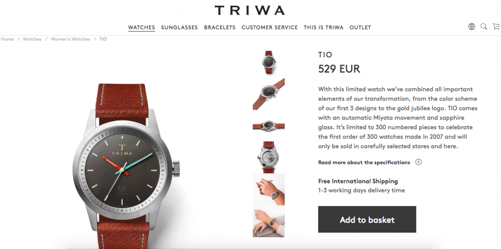
Bottom line: your images are like windows into your store. The more representative and high-quality they are, the more visitors will trust to buy from you.
What’s your story?
People buy a product because it can help them solve a problem, make them better, healthier, happier, more productive.
Use your product descriptions to make prospects see how your product can help them do something or achieve a goal.
Take FitBit as an example. They promote a healthy, active, happy lifestyle and they make their products part of the solution.
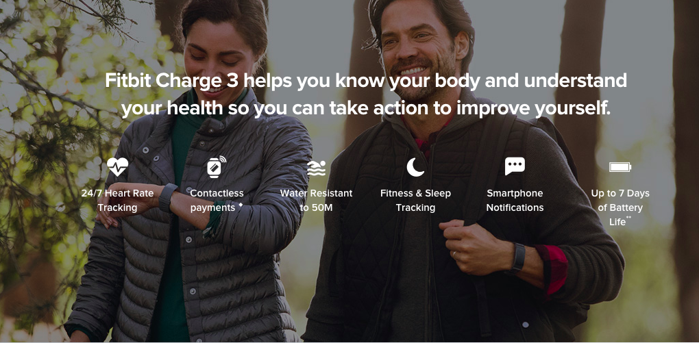
So, for anyone who’s looking to keep motivated and improve their health, FitBit offers the products to help them achieve their goals.
Think about your target audience and how your product can help make their lives better, more fun, enjoyable or efficient.
For example, if you’re selling bikes, how can they make your prospects better riders? If you’re selling a money-saving app, how will it help them feel like they’re more in control of their finances and future?
Selling a product is all about the story that you tell around your audience’s needs, wants and aspirations. So make sure it’s a good one.
Does your content sound human?
Sure, it’s important to get all your product’s features onto the page but do you need to copy and paste them into boring bullet points and uninspired, jargon filled paragraphs of text?
No, you don’t. That’s what lazy people do. And lazy doesn’t get you the sale.
A better, more effective approach is to do your research and to listen to what and how people are talking about your product. Then say their words back to them.
Here’s the trick: great copy that translates into sales comes from your customers, not you. So use tools like customer surveys, pop-up surveys on your site, review sites and platforms like TrustPilot, Google+ and Facebook, to see how your visitors and customers talk about your business and products. Then take those exact words and phrases and feed them back to them in your product descriptions.
Here is a great example from Firebox:
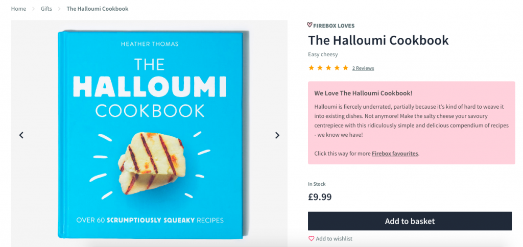
Their brand voice is fun and friendly and you can see that in every word on the page, including the product features.
A word of advice though. While in Firebox’s case, this playful, fun language is on brand, it may not be authentic for your brand as well so don’t try to make it work. Instead, look at the words your target audience uses when talking about your products and then come up with a description that resonates with your own audience.
Are you answering your prospects’ questions?
You know your products well but visitors landing on a product page for the first time surely don’t. They’ll have questions and it’s your job to provide them with the answers they need.
But instead of asking them to email you or to chat with you, which they probably won’t, why not have the answers to those questions already available on your product page?
It’s not so difficult to anticipate the questions your target audience will have. Simply look at your previous conversations with them, where they asked questions about specific products. Look at emails, support tickets, chats, Facebook or Twitter questions.
Make a list with the most commonly asked questions and then create content that answers those questions. This content can be in any form – from a dedicated FAQ section to product guides and videos.
Do you have social proof?
A surefire way to add credibility and boost sales is by adding social proof onto your product pages. Photos, reviews and first-person testimonials are an effective way to entice prospects to buy from you.
Here are two simple ways to do that:
- Add excerpts of testimonials and reviews to your product page:
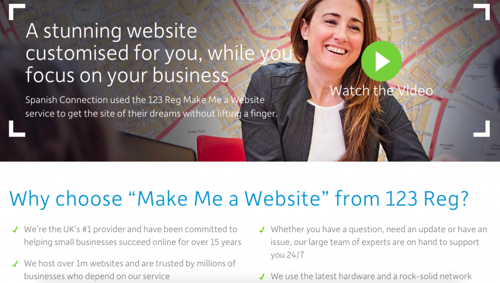
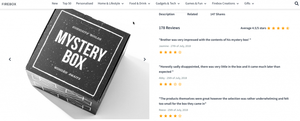
- Allow customers to rate the product or write a review directly onto the product page:
If you need help gathering testimonials and reviews, read our guide to learn how to convince customers to give you testimonials.
Wrapping up
This may seem like a lot of work so take your time. You don’t have to make all these changes immediately if you lack the time or the resources to optimise your product pages. Start this month with your CTAs. Next month, add a testimonial onto the page. The following month, tweak your product descriptions so they’re more enticing, and so on. In less than a year, your product pages could be performing twice as well.
