How to turn more visitors into prospects with lead generation forms
So many business owners lose sales because they don’t take the time to build trust and a relationship with visitors. They assume that if someone visits their site and doesn’t buy anything, it’s because they’re not interested. So, there’s nothing else they can do, right?
Wrong.
There are many reasons why people don’t buy right away. First-time visitors who aren’t familiar with your business might be browsing around to learn more about what you do and what you have to offer. Returning visitors might be looking for some extra proof and reassurance that you’re an expert that they can trust to buy from.
If you only care about the immediate sale, you’ll be losing lots of potential revenue. But if you take the time to engage and prove your expertise to every person who visits your site, then you’ll be able to generate lots more leads and sales.
How? With lead generation forms.
In this post, we’ll explain what lead generation forms are. We’ll also share some tips and advice on how to use them to entice more visitors to sign up to hear from you and trust to buy whatever it is you’re selling.
What is a lead generation form?
A lead generation form is a popular and effective marketing tool that serves one specific goal: to gain contact information from the people visiting your website.
Lead generation forms typically include an offer like a discount, a free trial or a valuable resource. To get access to the offer, visitors need to share their information, usually their name and email address.
You’ve likely seen these types of forms before. You might’ve even filled out your information in exchange for a resource like an ebook.
Here’s an example of how it looks:
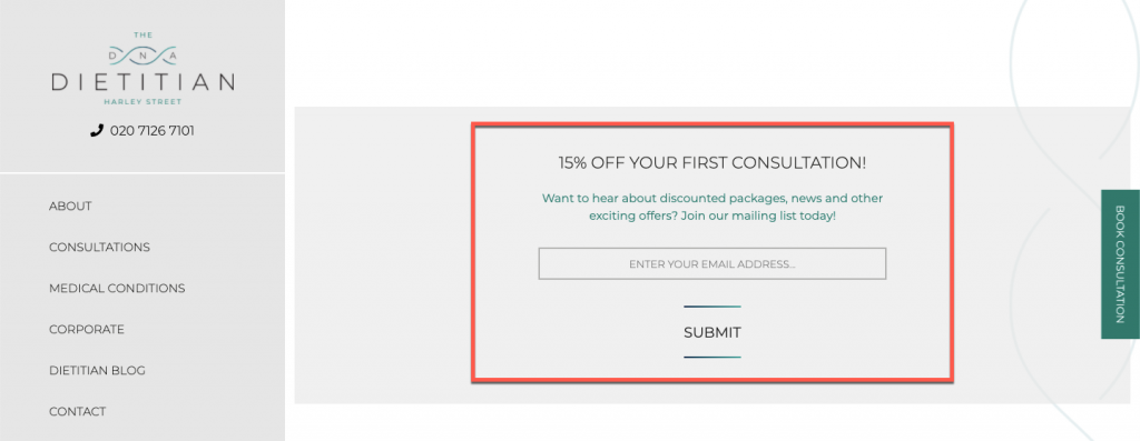
You can usually find these forms on landing pages but also on other website pages such as homepages, product pages, blog pages, and more.
Why (and how to) add a lead generation form to your site
A lead generation form can be a powerful marketing tool for building trust and a relationship with your visitors. If it’s appealing enough to entice them to sign up to hear from you, it means they’re interested.
Next, all you need to do is to keep in touch with your subscribers and send them purposeful content that shows off your expertise and a genuine interest in helping them to achieve their goals. Read this post for some useful tips on how to build meaningful relationships with your subscribers.
So, how do you add a form to your site? Easy. If you’ve bought a domain with 123 Reg, you can use our new Website Builder Starter package to get your one-page site live and start generating leads. All for just £1 a month.
(If you don’t yet have a domain registered with 123 Reg, there’s no better time like now to search for a domain name.)
To add a lead generation form, all you need to do is to drag-and-drop one onto your website or add a pop-up version to entice visitors to sign up to hear from you.
You can also easily add a contact form to any site created with our full-featured Website Builder, or by using a contact form plugin if you’re using WordPress hosting.
Next, let’s look at a few examples and best practices for creating forms that turn more visitors into prospects.
Come up with an attractive offer
This is also known as “lead magnet” and it’s an offer that you make to your visitors to entice them to opt in to your email list. It can be anything from a discount to a valuable piece of content that you’re willing to giving away for free.
Here are some things you can offer to your visitors to entice them to sign up for your mailing list:
- Useful resources like checklists or a list of resources like “free ebooks to learn web design” or “top wine tasting mini-courses”.
- Ebooks
- Invites to webinars
- Discounts and coupons
- Free shipping
- Free trials
- Free samples or a gift with their first order
- Quizzes
- Mini-courses
- Tutorials
- Access to a private Facebook or LinkedIn group
What makes your offer attractive is that it’s created exclusively for people joining your email list. This means it’s not available anywhere else on your site or blog.
Here are a few examples of how your offer could look:
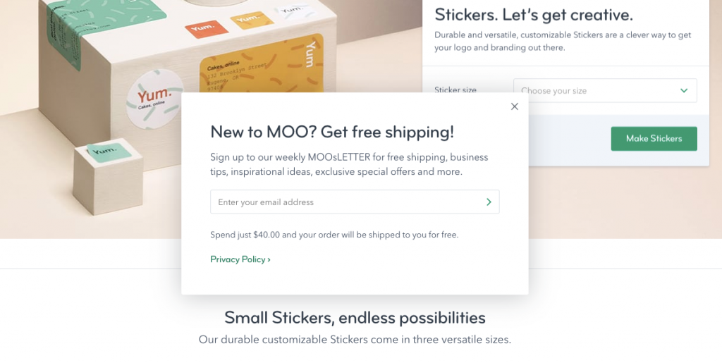
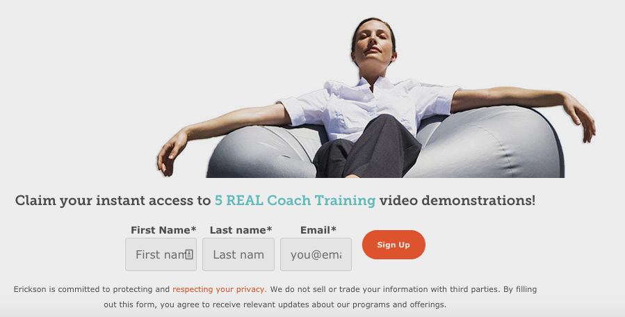
Make sure it’s highly visible on your site or blog
As we mentioned earlier, your lead generation form can take many forms.
For example, if you have a one-page website or a dedicated landing page where you give away access to an ebook, a webinar or a mini-course, your form can take up the entire page.
You can also have your form show up in a pop-up, like in this example:
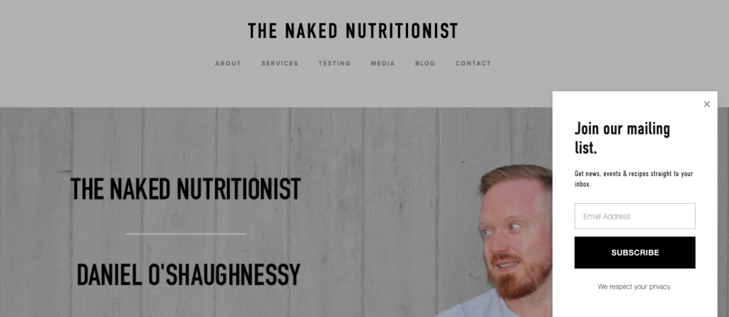
Or you can place it in your site’s header, footer or sidebar.
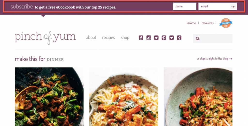
Regardless of where you place it, make sure it’s highly visible and easy to distinguish so visitors can’t miss it.
Be specific about what they’ll get
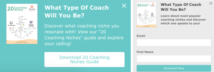
Avoid creating a lead magnet about something general. It’s less likely to be appealing or to grab people’s attention. But when it’s specific in terms of what they’ll receive the moment they give you their email address, you’ll have a higher chance to entice them to sign up.
Here’s an example of a specific offer where even the call-to-action button tells you what you’ll receive in exchange for your contact information:
Only ask for information you need
How much information do you really need to keep in touch with your subscribers via email? Do you really need their home address or date of birth, or do a name and an email address suffice?
Long forms that ask for too much information can prevent visitors from filling out your form for two key reasons:
- It’s too much personal information in the hands of someone that they don’t know or trust.
- It’s time-consuming.
Here’s an example of a lead generation form that only asks for an email address:
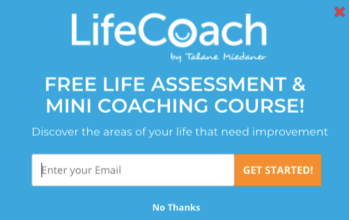
Bottom line: keep your forms short and only ask for information you need. Once you’ve gained their trust, your subscribers will become more open to sharing other information about themselves if you just ask.
You also need to make sure that any information you request is gathered, stored and processed in a manner which complies to relevant data protection regulations.
Include a privacy policy message
Every lead generation form you create should also include a privacy policy message. This message reassures visitors that you won’t be sharing or selling their personal information.
A simple, short message will do fine. If you like, you can also link to your privacy policy.
Add some social proof
If you’ve created a dedicated page for your offer, use the space to also include some testimonials, reviews and ratings from former and current customers and subscribers.
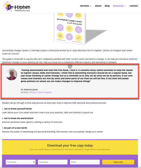
Social proof can help to build trust and reassure visitors that giving you their contact information in exchange for such a valuable resource is a no-brainer.
Wrapping up
Lead generation forms can be a powerful marketing tool for turning your site’s visitors into prospects. If you’ve decided they’re worth a try, make sure to use the best practices and examples in this post to optimise your forms and ensure they entice as many visitors as possible to subscribe to your mailing list.
