The simple guide to getting started with A/B testing
Should your call to action (CTA) say “Find out more” or “Click here for more info”? If you run a sale, will “20% discount” result in more sales than “20% off”? Would you receive more enquiries from prospects if you were to reduce the number of fields in your contact form?
The only way to know for sure is to experiment with your website. The easiest and most common way to do this is to run an A/B split test.
This simple guide will walk you through the basics of effective A/B testing so you can begin to see exactly what works best for your site.
What is A/B testing?
It’s an experiment where you divide your site’s visitors into two groups and show them two different versions of the same piece of content simultaneously to see which one produces the best outcome. The content you change and your preferred outcome depend on what you’re trying to achieve. You might want to make more sales, in which case you might experiment with different wordings for your “checkout” button. Alternatively, you might want more signups for your newsletter, in which case you could experiment the length of your signup form.
These tests can help reach your goals by providing insightful data on what attracts and converts your visitors. Running A/B tests correctly will bring you far better results than making changes based onyour instincts about what works, which can often be wrong when put to the test against the numbers.
Without A/B Testing, you can only guess what will catch your visitors’ attention and what will convince them to click, sign-up, download or buy from you.
How does it work?
To run a split test, you need:
- Two versions – A and B – that need to be tested simultaneously. Both are identical except for one variation.
- Version A or the control – which is usually the current version of the content you want to test.
- Version B or the treatment – which is usually the modified version of the content you want to test.
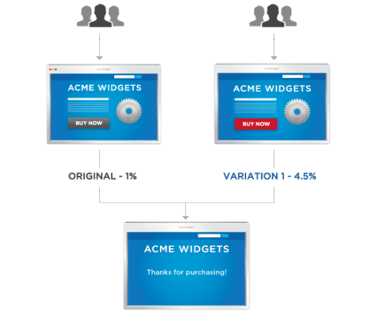
Here’s a simple visualisation of A/B testing from Optimizely, a popular split testing tool:
In the above test you can see that they’re only testing one element – the colour of the “Buy Now” button.
In version A (the original version or the control) the button is grey. In version B (the treatment) the button is red. The split test revealed that using the red button increased sales by 4.5%. As you can see, even the smallest changes can have good results.
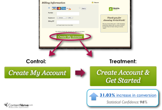
Now let’s look at a real example from ContentVerve’s Michael Aagaard, a copywriter and test junkie who is constantly sharing the results of his interesting experiments.
In this example, he ran a test on the payment page for WriteWork – a subscription-based education website for college and university students. He only tweaked the button copy by adding “Get started” and this small change increased conversions by 31.03% at a 98% confidence level.*
*The confidence level shows how significant the results are from a statistical point of view. Significance is calculated using the total number of users who participated in each version of the test and the number of conversions for each version; if you don’t have enough users or conversions, you’ll need to test it for longer and on more users before confirming the winner.
This clearly shows that running A/B tests correctly will bring you far better results than making changes based on what you think would work best.
Ready to get started with your first A/B test? Here are some simple steps to follow to get started with your first test today.
1. Determine your goal
Think about your goals and what you want to achieve.
For example, if you’re running an ecommerce business, you might want to learn what you can do to increase sales. If you run a consulting business, you can set a goal of boosting the number of people contacting you to inquire about your services.
Your mission is to figure out what prevents visitors from contacting you or buying a product from your shop. Is the checkout process too complicated with too many steps? Are your visitors concerned about privacy or payment security issues? Is your lead generation form too lengthy? Is your contact information difficult to find? All of these questions can be answered one by one by testing specific elements of your site.
2. Decide what is worth testing
Now you need to decide which element you’re going to change to create the new page variant.
Even though every business is unique, here are a few suggestions of page elements you could try testing to get your started:
- The wording, size, colour or placement of the page’s call-to-action
- The primary value proposition or headline
- The main photo
- Your bullet points (features and benefits)
- The length of a form or the fields it includes
- How much text is on the page
Even though you might be tempted to make several changes at once (also known as multivariate testing) to ensure you get results, it’s best to make one change at a time. When you run a single test where you change one element, you get reliable data very quickly, as an A/B test doesn’t require a large amount of traffic to run. This is especially helpful if your site has a small number of daily visitors. In addition, you will know exactly which change had an effect on your site’s visitors. If you make more than one change, you can’t be sure which of them caused the difference without running further tests.
3. Form a hypothesis to test
This is the creative part as you now need to think about how to change elements to increase conversions. You will need to formulate a test hypothesis that encapsulates what you want to change on your web page and what impact you expect to see from making that change.
Before you start working on your test hypothesis, you need to:
- Determine your main goal
- Identify a problem and formulate the statement
For example, say you have a consulting business and your goal is to convince more people to contact you to enquire about your services.
The problem: Although you get a fair number of visitors to your site and many go to your contact page, only a small percentage end up filling the form on the page and submitting it to you.
Now you can move on to formulating your test hypothesis which consists of:
- A proposed solution
- The results you expect to get from making this change
You might not think that having four rather than five form fields could affect your conversion rate because it only takes a few minutes to fill them all out. But the truth is it does and for many reasons. People are busy and don’t want to spend a second more than they have to filling out lengthy forms. In addition, some get discouraged by the amount of personal information they are required to share with you.
The proposed solution: One thing you can do is to test your form’s length. Try to reduce the fields in your forms to only include the information you need: name, email address and their message.
Your test hypothesis would be: “By reducing the number of form fields to address the ‘time and privacy issues’ I can encourage more visitors to contact me.”
4. Determine the sample size
Before you start testing, you have to decide on the sample size and determine how many visitors need to interact with your pages for the results of your A/B test to be accurate. You don’t want to run a test and then stop it too early before the results are relevant.
Only when you have sufficient evidence that one of the two versions is a clear winner should you start making changes on your site.
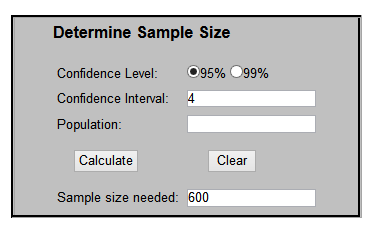
For example, by using a calculator like this one you can determine the sample size you need for your A/B test results to be accurate:
The confidence level tells you how sure you can be of the results. Most researchers use the 95% confidence level and a confidence interval (or margin of error) of four.
This is a more general calculator but there are many more you can use, such as VWO’s A/B Split Test Significance Calculator and Get Data Driven’s A/B Significance Test.
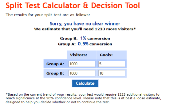
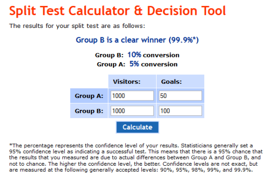
Let’s look at another tool – usereffect’s Split Test Calculator and Decision Tool – which lets you determine your sample size depending on the number of conversion or goals.
Say you have 2,000 weekly visitors on your consulting business website and your goal is to double or even triple the number of enquiries. Since you will split test the two versions of the contact page simultaneously, you will test version A on 1,000 visitors and version B on the same amount of visitors.
This tool will give you an idea of the sample size you need for the A/B test results to be statistically accurate.
Example #1:
As you can see in the screenshot above, in this case there is no clear winner. The sample size was the same – 1,000 visitors – and for version A (the control) the test resulted in five forms filled out while for version B it was ten forms.
Although version B had double the forms filled out, there is no clear winner because there is not enough data available to draw an accurate conclusion. The test would’ve required an additional 1,223 visitors for significant and accurate results. In this case, it means that you should run the test for an extra week.
Example #2:
Here we have the same sample size but with many more conversions. This is statistically significant and you can be 95% sure that version B will get double the conversion rate of version A. At this point you can implement the change on your site.
5. Decide which software to use
This is the technical part as you get to decide which technology to use in order to deliver each variation to your visitors.
Don’t be intimidated by this step as the tools available make it super easy to create and run split tests.
There are many testing tools available such as:
- Google Website Optimizer – Free. It requires coding changes to run an experiment.
- Monetate – Monthly fee. Enterprise grade tool that comes with full service included. The only coding required is a small snippet of code in the footer. Also performs targeting in addition to testing.
- SiteSpect – Monthly fee. Non-intrusive A/B and Multivariate testing that does not require any JavaScript tags.
- Optimizely – Monthly fee. It offers a simple visual editor that makes each element on every page editable. After inserting a single line of code generated by Optimizely into your HTML, you never have to touch the code again.
- Unbounce – Monthly fee. Tool for building, publishing and testing high-converting landing pages
- VisualWebsiteOptimizer – Monthly fee. Easily create tens of different versions of your headlines, images, buttons, forms, and more. Use multiple editing options to change any part of your web page. Specify different URLs to split traffic and measure which page performs best
- Convert Experiments – Monthly fee. Specifically designed for experts and agencies.
Visual Website Optimizer and Optimizely are two of the most popular as they are both affordable and make it easy to run your tests and measure the results. They will automatically calculate the conversion rates and measure the statistical likelihood that one variation is better than another. Plus, both tools offer a free trial so you can set up your first test without any obligation.
Note: A/B testing does not impact your site’s search engine rankings. While some have presumed that when testing, the second version counts as duplicate content, thus hurting rankings, this theory is completely false. Google’s Matt Cutts has busted this myth by assuring everyone that Google will not penalise anyone for trying to deliver a better user experience.
By now you’ve decided which elements to test, how to change them and which software to use so now is the time to create your test and release it into the wild. This is an easy step as both Optimizely and Visual Website Optimizer are easy to use. While these are different tools and the steps are different depending to the elements you’re testing, you’ll have no trouble creating your test.
6. Wait
This step can be a bit frustrating, especially if patience isn’t your strong suit. But if you want to get accurate results, you need to just sit and wait. Although you’re probably going to check the results during the test, do not edit, pause or stop the test until it’s complete.
How long until the test is complete? It depends on a variety of factors including your site’s traffic. When running a split test, you can select a time period or an impression amount.
If the sample size (the number of people taking part in the test by visiting either the test page or the original version) is small, the results won’t be statistically significant. The larger the sample size, the more certain you can be that the sample’s performance reflects the real performance of the treatment. So if you want to increase the sample size, simply run the experiment for longer.
No matter what tool you choose to use, when the test is complete, they will provide you with the results and tell you if they’re relevant of if you need to run it for longer.
Top three mistakes to avoid making
A/B testing is a super-simple concept. However, there are mistakes that many people do when running these tests.
Here are the top three mistakes you should avoid making:
- Not testing version A and version B simultaneously. If you test version A this week and version B the following week, you’re doing it wrong and the results will not be accurate. Always split traffic between the two versions and test them at the same time.
- Editing pausing or stopping the test too early. The concept “statistical confidence” which we’ve referred to several times in this post determines whether your test results are significant (that is, whether they’re accurate and should be implemented on your site). Declaring a winner too soon (before sufficient data is collected) increases your chance of a false positive or negative. Evan Miller shares a great example of the danger of this on his blog.
- Letting your instincts overrule test results. Yes, results can often be shocking but don’t reject them simply because you don’t like or agree with the winning result. It’s not about your personal opinion or taste, it’s not even about aesthetics. It’s about a better conversion rate.
Your turn now
Do you use A/B testing to improve your conversions? Why or why not? Let’s talk about it in the comments section below.

