Six common mistakes you’re making on your About page (and how to fix them)
Before buying a product or a service from a new business, do you check who they are? Do you care what they stand for? Do you look for team pictures or proof they’re legit and trustworthy?
Most people do, including your potential customers, and that’s the moment they go on your About page.
Of course, your whole website should exude how nice and trustworthy you are. But your About page is a prime location for showing you’re an awesome company do to business with.
So why is it then that, despite being one of the most-visited pages on a business’s website, it’s often missing, difficult to find or boring? Really, why are so many About pages chasing away visitors?
In this post we’ll look at the six most common mistakes that we’ve noticed time and again on sites that deserve better. Avoid or fix these mistakes and your chances of hooking prospects and turning them into customers will increase.
Mistake 1. You don’t have an About page
Imagine you’re meeting a potential customer in real life, perhaps at your store, at an event or at a local café. They want to engage in a conversation and start asking questions about you and your business. And what do you do? You turn and walk away.
That’s what not having an About page feels like to a potential customer visiting your website.
Contrary to what some believe, an About page is not a cliché. And if you think first-time visitors won’t go looking for your About page or won’t notice it’s missing, you’re wrong. In fact, studies show that a whopping 52% of users want to see an “About Us” page on a company website.
Bottom line: every site needs an About page, including yours!
Mistake 2. You think your About page is about you
An About page is about you, your business, your history, your CEO, your products and services. Right?
Wrong!
Prospects reading your About page aren’t interested in you, your CEO’s education and qualifications, or how your business came to be, outlined by month or year.
What they’re interested in is what’s in it for them. In other words, your About page should be about the prospect who’s on your page and how you can help them.
This is not to say that your About page isn’t a page where you should talk about yourself and your business. Of course it is, but only in the context of how you serve your potential customers.
So use this page to explain how you can help make them more productive or relaxed, richer, happier, healthier.
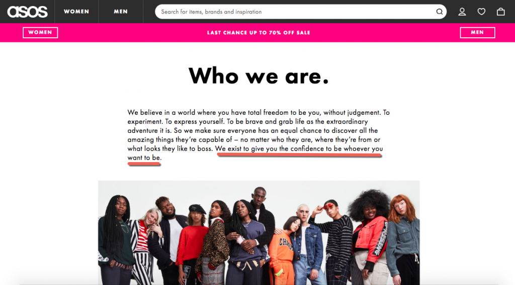
Here’s a fantastic example from Asos:

Notice how it’s all about “you”, the customer?
Mistake 3. You go on (and on and on…)
I’m a big fan of storytelling. It helps to pull the reader in and it engages like nothing else. Stories are awesome, and yours probably is too. Unless it’s long and boring. Then it’s not awesome.
So if you’re going to tell readers the story of how your business came to be:
- Make it interesting
- Be inspiring, be impactful, be motivating
- Know when to stop!
You don’t need to (and shouldn’t) outline every step or event in your history and how you built your business from the ground up. Do you think your prospects are interested in that? Do you think they’ll keep reading 3,000 words as you drone on and on about your business? They’ll most likely leave after the first two paragraphs.
While you want to tell your story, it’s best to keep it short and sweet. Fill your page with only the essential details in your story, those that would make it interesting to your readers.
Mistake 4. No pictures
Stories are great. But even the best stories won’t make up for a lack of pictures on your About page.
Want to gain people’s trust? Want them to get to know you and to see that you’re human, just like them? Then show off a picture or a video of yourself and/or your team. It’ll help make your company more approachable and trustworthy.
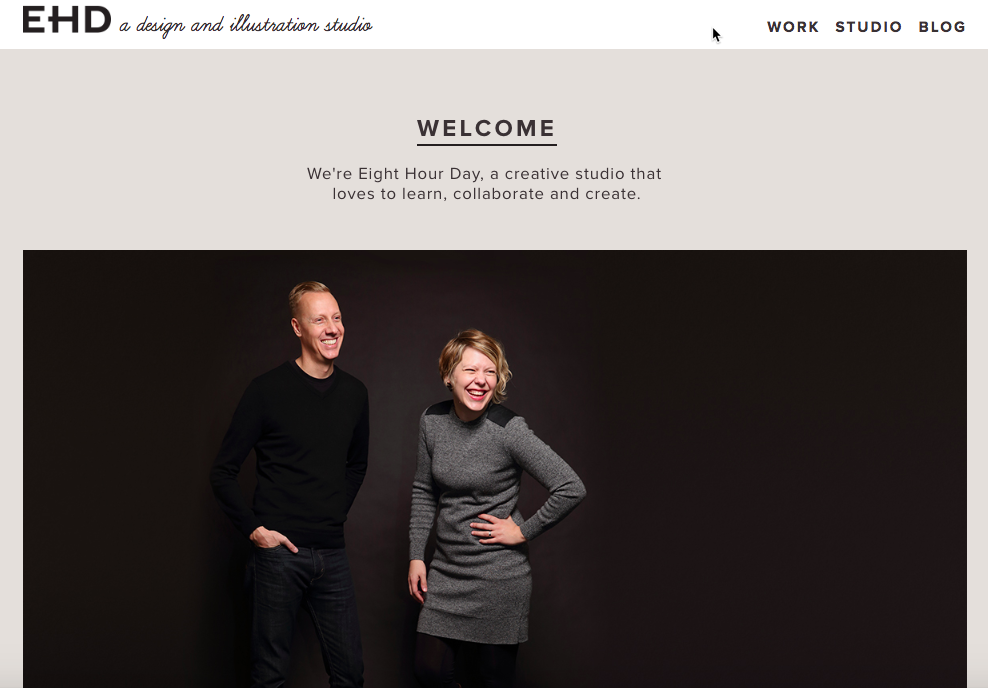
Check out this example from Eight Hour Day:

By featuring a photo of them on their About page, the founders – Nathan and Katie – drive home the point that they’re not only real but friendly and fun too.
Mistake 5. No call-to-action
By far, this is the most significant About page blunder.
So you’ve made a great first impression with your About page. Visitors love your story, your personality, your business. Now what?
If you leave it up to them to decide what the next step is, don’t be surprised if they decide to leave. How can you expect them to know what action to take next if you didn’t tell them to join your mailing list, download the report, have a look at your products or services, or sign up for a free trial?
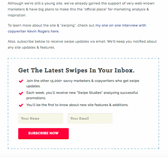
Check out this simple example from Swiped.co where they ask readers to subscribe to their emails:

Just like any other page on your site, you need to have a call-to-action (CTA) so visitors know what to do next. Read our article to learn more about the importance of CTAs and how to create a powerful one for your About page.
Mistake 6. No social proof
Social proof is one of the most effective ways to build authority, credibility and trust. So if you have customer testimonials, logos of companies you’ve worked with or links to publications where you’ve been mentioned, make sure you add them to your About page.
This is no place to be shy. If other people think you’re incredible, helpful, an authority in your industry, why hide it?
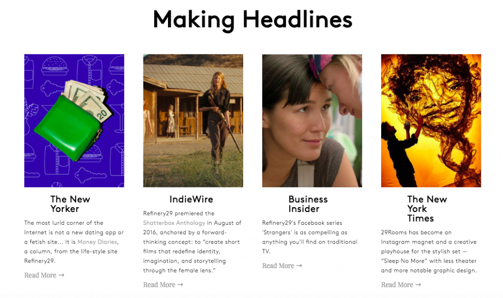
Here’s an example from Refinery29:

If you need more tips and advice, this guide explains how you can gather customer testimonials so you can use them to convince prospects to spend their cash on your product or service.
Wrapping up
If you don’t already have an About page, you’re missing out on the opportunity to make a great impression with first-time visitors on your site. And if you do but you’ve made one (or more) of the above mistakes, make sure you fix them as soon as possible.
Any other mistakes that frustrate you about the About pages you’re seeing around the web? Tweet us your comments @123Reg.
