A testimonials page is one of the most powerful parts of your website, no matter if you sell plumbing services or online courses. Sure, you can use your homepage to tell visitors about what makes your business unique and the many benefits of using your products and services. But the truth is, people are more likely to take action if those benefits are reinforced by rave reviews from real customers.
This is where a testimonial page comes in handy. It’s an effective way to display reviews from customers and show visitors and prospects how your products and services have benefitted others. With customer feedback displayed on a single page, people who are new to your business will feel more confident taking that next step and booking an appointment or buying from you.
But what’s the best way to organise and display all your customer testimonials on this dedicated page? And should you use images or will text do? Read on as we look at the key elements of an engaging testimonials page.
Use compelling headlines
A good headline should stand out on the page both in terms of style and content. This means that it should use bold or have a larger font than the body of the testimonial and it should be compelling while summarising the key idea in the testimonial. An even better approach is to use a customer quote as the headline.
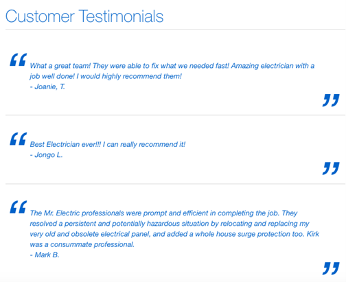
Here’s a good example:

Include as many customer descriptors as possible
When putting together a testimonial, you should include as many details as possible about each customer. For example, you could try including their names, age, location, titles, and the companies they work for, where applicable. If they don’t feel comfortable sharing their names on your site, you could use their initials instead, rather than making up a name.
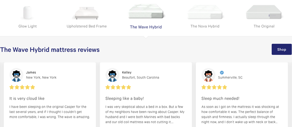
You could also include the name of the product or service they purchased from you. This way, prospects can quickly look at testimonials for the specific products or services they’re interested in buying.
Check out this example from Casper where you can select to view testimonials by product:

Incorporate pictures and videos where possible
A picture is always a powerful way to reinforce the qualities of your products and services, as well as to build trust with prospects. So, try adding customer headshots or pictures of them using their purchase. This is not just an effective way to show visitors who your customers really are but it also helps to build trust, proving these customers exist.
Here’s a great example where the company decided to include before and after pictures of customers to show off the results.

And here’s another great example from eHarmony:

If your customers are willing, you could also try adding video testimonials. Videos are an extremely powerful way to leverage storytelling. In fact, there’s nothing more powerful than having a happy customer talk about their experience with your business.
Emphasize key benefits using pull quotes
We all skim when reading online, so make sure you use pull quotes to emphasize important points about customers’ experience with your business.
Take time to carefully choose the quotes that highlight the benefits of doing business with you. Think about what prospects are usually interested in learning, which usually is the problem they’re struggling with, how it was solved, how fast, and how the customer feels now that they’ve solved it.

One key recommendation here is to try to keep your testimonials short – no more than four or five sentences.
Highlight the most powerful testimonial
When you have a dedicated testimonials page, you can organise it so that it draws people’s attention to one of your most stellar testimonials. Make sure you choose a great one and place it at the top of the page where visitors can’t miss it.
This is a great technique to reinforce the value you provide, how customers have benefitted from their purchase, and their overall experience with you.
Check out this example from Dribble:

Make use of white space
Have lots of customer testimonials to display on your page? That’s fantastic. While you should proudly display all of them, you need to make sure they’re properly organised, easy to scan and read. This is where white space comes in. White space is a key design element that helps make your page less busy and more pleasant to browse.

So, feel free to display all the testimonials that you gather from customers. Just make sure there’s enough white space to allow visitors to browse through them with ease.
Wrapping up
These days, a testimonials page is a must-have for any business that wants to build customer trust and entice more visitors to take action. Use this post to guide you as you improve your page with the key elements to make it successful. Hopefully, once visitors read through your testimonials, they’ll feel compelled to do business with you now and in the future.


