How to create a charity website: Best practices and examples
What’s your passion? Save the world? End poverty? Save the whales?
Whatever your mission, the best way to raise awareness of your cause, get people involved, attract volunteers and online donations, is to create an online identity that clearly communicates your value proposition.
Charity websites share many of the same practices as any website. They need to have a clear message, be user-friendly and easy to navigate. But often a non-profit website needs to offer more than your typical corporate site.
In this post, we’ll look at some easy steps to start your charity website, plus six basic principles that you should follow to increase donations and volunteering.
Let’s start with some simple steps to get your non-profit website up and running.
Develop your mission and goals
The mission describes the purpose and intent of your charity: what it does, how and for whom. When it comes to your goals, these need to be big, bold and obvious for your site’s visitors. You might be looking to:
- Raise awareness of your cause
- Increase donations
- Grow your supporter base and get more volunteers
- Communicate the impact of your work
Knowing what you want to achieve is also important when designing your site as it will help you create a better user journey, making it more likely people will engage with the site in the way you want.
Choose a name
People like to donate to people, so you might want to name your charity site in memory of a specific person but with a mission to help others (eg Barnardo’s: Children’s charities). Or you can choose a name that describes what you do such as Cancer Research UK or Shelter UK.
Whatever name you choose, make sure it’s easy to remember (and type for when you register it as a domain name) and also that it’s not already being used by someone else as a trademark or domain name. Use the 123 Reg Domain Name Search tool to see if the name you have in mind is still available.
Here are two good resources on choosing a name for your charity:
Identify your users and their objectives
There are generally two types of users on a charity website:
- Those who are looking for help
- Those who are looking to help
The first group will be seeking information about how you can help them and how to get in touch with you to ask for help.
The second group includes donors and volunteers. Donors will be looking to learn about the impact of your organisation, how to donate and how their money has helped while volunteers will want to find out how they can help and how to get started. Make sure you have these two audiences in mind when creating your website and make it easier for them to find the information they need.
Get your website up and running
All charity organisations want to raise money and awareness for their particular good cause and one of the most effective ways to do that is by having a non-profit website. Build a non-profit site and create a place that can not only provide information on your latest fund raisers and events but also let people know how they can sponsor an event and how their donations can make a difference.
Once you get your domain and UK web hosting in order, buy a template or have a web designer draw one for you. Or you could get our Website Builder and choose a professional one from our collection of pre-designed, ready-to-go charity website templates. The great thing about using our website builder is that you don’t need any programming skills and it includes everything you need to create your charity site.
If you need extra help getting your site online, 123 Reg offer a free training course to teach you how to get your site up and running. It’s primarily aimed at businesses, but a lot of the advice also applies to charities.
Now let’s look at the six basic things you need to have on your charity website to build trust and convince people to donate and contribute.
What makes a good charity website?
Here are a few things you can do to ensure you have a great charity website that encourages donations and volunteering.
1. Clearly explain what your organisation does
Non-profits would get much more from their websites if only they’d clearly state what they are about. This is the most important piece of information that people need to know before they decide to make a donation so make sure you put it on your homepage where it’s easy to find, as well as in a dedicated About Us page.
If you describe what you do and how you do it in a clear, concise and easy-to-understand manner you will have an easier time convincing people to make a donation.Whether you include this information in your tagline or anywhere else on the homepage, make sure it’s easy to find so people know exactly what your organisation does.
Here is an example from savethechildren.org.uk:
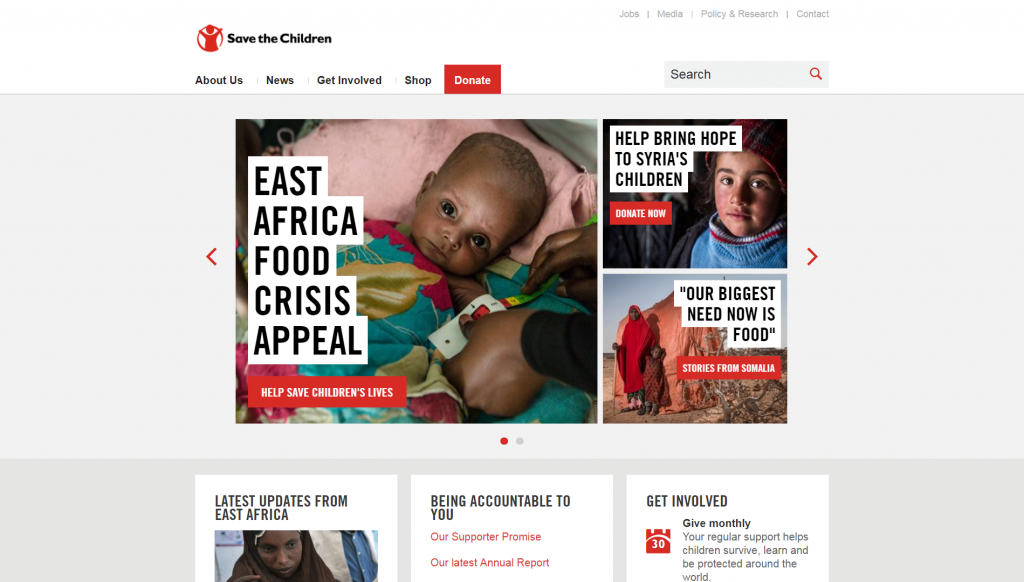
In this case, you can tell what they do right from the domain name. In addition, you can also see which causes they are currently raising money for.
2. Tell them how their donations will be used
Help people understand how you’ll be using their money if they decide to donate. They’ll want to know how their contribution will be used and how they’re making a difference to someone’s life.
Don’t bury this information in your website as users won’t waste their time hunting for it. If they can’t find this information easily, they’ll be unsure as to whether they can trust you, which means you’ll lose their donation.
When you disclose this information for your visitors to read, they will feel more confident that your organisation isn’t hiding anything from them.
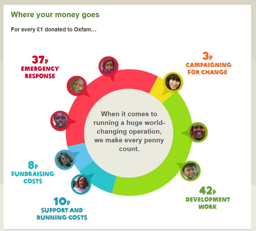
For example, Oxfam has a dedicated page where they explain how every £ is spent:
3. Show you can be trusted
Today, more than ever, people need proof that you can be trusted before making a donation. To prove that your organisation is credible and reliable and show you are worthy of their donation, you might consider adding trust and social proof elements when you create your charity website such as:
- High ratings from watchdog organisations
- High profile endorsements
- Testimonials
- Number of years in operation
- Links to social networks or feeds
People will look for this information to see if you’re legitimate and trustworthy before donating so if you have this type of information, it’s important to tout it.
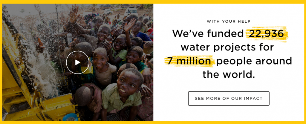
Charity: Water is doing a great job at building trust by showing how many projects they’ve funded so far:
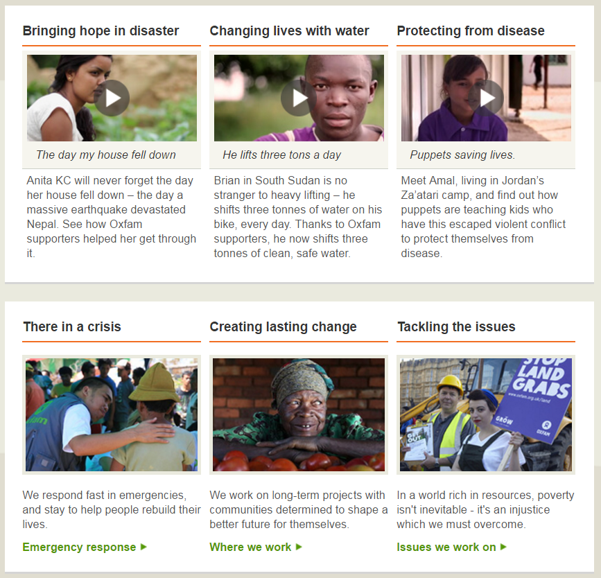
Here is another good example from Oxfam.org.uk where they use video to build credibility by showing the stories of the people who were helped with money from donations:
4. Make donating obvious
If someone has decided to donate, don’t put them off by making them search for the “Donate” button. Users these days don’t have much patience so make sure you provide a quick, easy and secure method of donating.
A study by Nielsen Norman Group, a computer user interface and user experience consulting firm, revealed the major donation-killers that prevent users from donating:
- 47% were usability problems relating to page and site design, including cluttered pages, and confusing workflow. On 17% of these charity websites, users couldn’t find where to make a donation!
- 53% were content issues related to writing for the Web, including unclear or missing information and confusing terms.
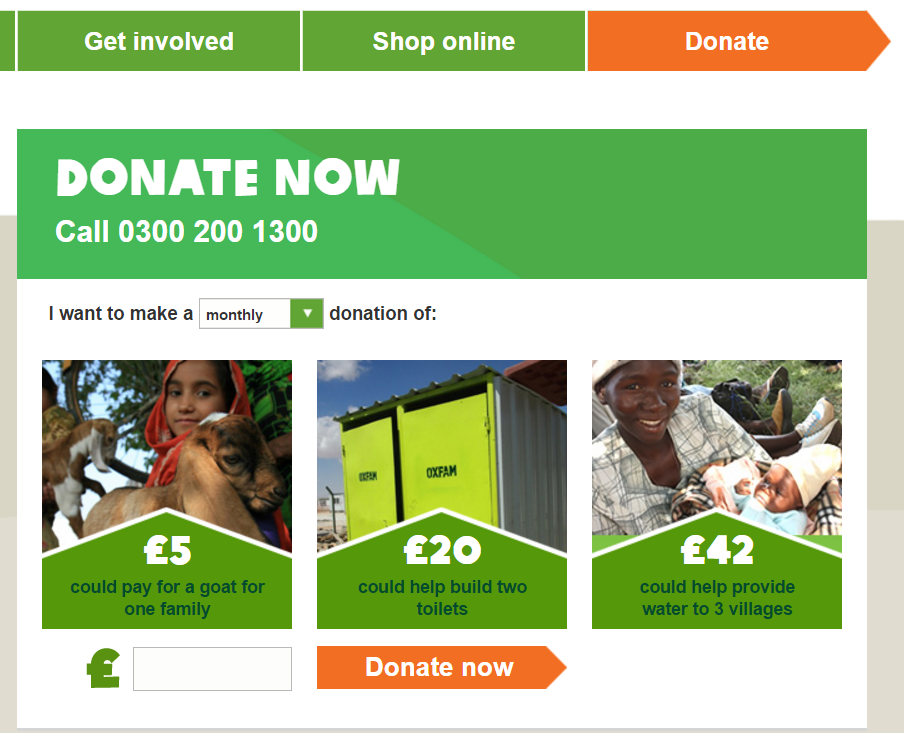
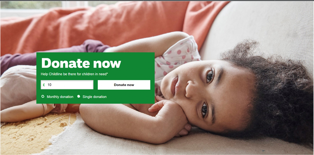
The donate button is the most important element on a charity website so the call-to-action should be straightforward and noticeable on every page of the website. Keep that in mind when building your charity website.
Also, when it comes to the copy, it’s best to use clear, concise words such as “Donate Now” or “Donate Today” so users understand that it’s about a monetary donation.
Check out these two examples:
I also recommend reading this excellent blog post on how to improve your call-to-action copy to get more donations online.
5. Highlight other ways people can help
While donating money is the obvious way for people to help, you should also make it clear that they can help in other ways as well, either by volunteering, by promoting your charity site on social networks to help spread the word about your cause, and more.
Here is a good example of how you can make it easy for users to find information about ways to get involved:
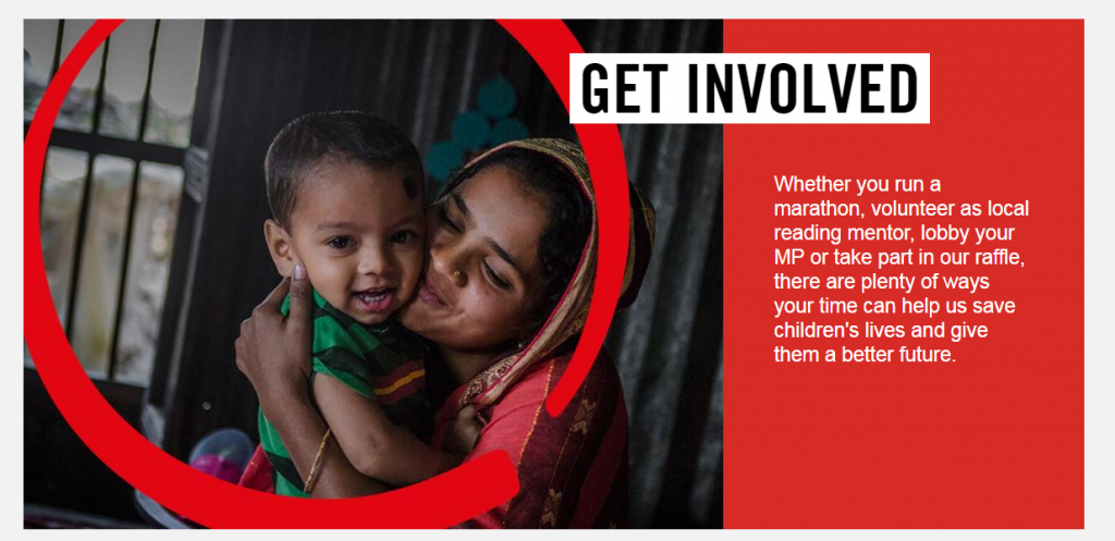
As you can see, the savethechildren.org.uk has an entire page with various ways to help out.
A great website can increase donations
As a charity or non-profit organisation, you should never underestimate the impact of your website. Providing clear information about what you do, for whom and how you’re using donations can help convince more people to donate and get involved.
