Google searches could soon look very different. The search engine giant has been testing and making several changes to its search engine results page (SERP) in its continuous attempt to make the search experience better.
In this post we’ll walk you through the latest changes that Google has been testing and how these might affect your listings in the SERPs.
Related topics in the featured snippets
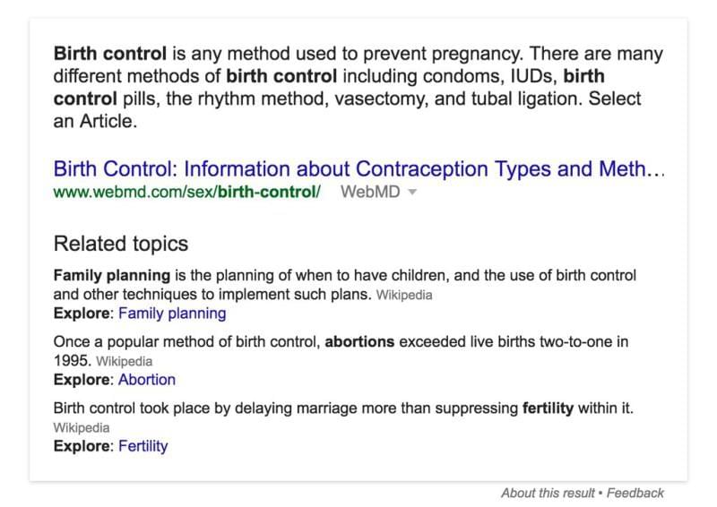
Google has expanded the instant answer snippets to also include related results. These featured snippets usually show up in the search results when Google is confident that they are relevant and good enough to answer a user’s query.
Now it seems that Google is displaying extended featured snippets which also include “related topics” with links to additional queries in Google.
Here is an example:


This is a great opportunity for those who work hard at creating high quality content that answers users’ questions. For more on how to create high quality content that Google will love, check out our post on what Google consider ‘quality content’ and how you can produce it.
Larger margins and spaces between search snippets
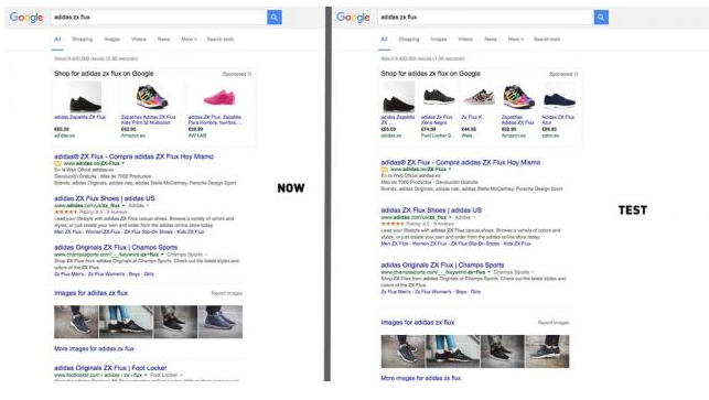
Google is also testing using wider, larger, bigger margins and spaces between the search result snippets.


By the looks of it, the first link also gets pushed further down by half a snippet.
Small businesses that have invested the time and effort to use markup to make their content more search engine friendly, may find that their snippets get more clicks than they used to. If you want to learn more about using markup, check out this guide. https://www.123-reg.co.uk/blog/search-engines/boost-organic-traffic-with-google-listings-even-if-you-re-not-ranking-number-one/
Four ads on top
Another significant change is adding a fourth ad at the top of the SERPs. Previously, you would see a maximum of three ads in the top ad block in the search results. The ad blocks look the same as before, but there’s now a fourth listing.
What’s important to notice is that the ads in the top ad block still include features like site links, ratings and location enhancements.
The changes don’t stop here. Looking at the carousel results below, it seems that with all these changes desktop organic results get even less visibility on page load. While there are some positive changes to the SERPs, it seems that ads are pushing organic listings lower, especially on small screens. This raises the possibility that sites that rank highly in organic search may see a fall in traffic. It might be the only way to counter this will be by using AdWords.
If you’re interested in running a Google AdWords campaign but don’t know how to get started, make sure to go through our step-by-step guide to setting up your first AdWords campaign. It’ll explain what AdWords is and how you can use it to promote your business.
Longer titles and descriptions
Google is also testing longer titles and descriptions in the search results. This is a significant change as they’re looking into extending the length of titles and descriptions as follows:
• Title tags have been increased to 70-71 characters from the previous 50-60 characters
• Meta descriptions have, in some cases, been increased by 100 characters per line, and extended from two to three lines, coming at a total of 278 characters per line.
Here is an example of how it looks:
On mobile, titles can be even longer. So make sure you know where your traffic is coming from and optimise your titles based on whether you’re getting visits from mobile or desktop search.
Source
This is positive news as it gives business owners the opportunity to squeeze in even more information about the business and products they’re selling. In fact, you can use this to help you target longtail keywords in search. We have a guide to keyword research here.
Check out our beginner’s guide to writing title tags and meta descriptions for some good tips on how to write them to get more prospects to click on your links in the search engine results.
A new look for sitelinks on mobile
Lastly, one another important thing that Google is testing is a carousel that features individual cards that link to separate landing pages.
Check out this example featuring an Airbnb ad:
As you can see, the sitelink cards appear in a swipeable carousel just below the ad copy. You can’t help but notice the larger font used for the pricing which makes it particularly prominent.
Wrapping up
All these changes may seem overwhelming. However if you’ve been focusing your efforts on providing a great experience for your visitors and answering their questions and concerns with quality content, then you’re already ahead of the competition.
If you haven’t been focused on these things, then you’ll be playing catch up. The first step is to read this guide to creating quality content.
