Seven features a new business website must have
About to go live with your new website? We know how stressful the whole experience can be. To make things easier, here are some features we believe are a must-have for any new business website.
So, take a deep breath and start checking off these essentials.
1. Social media buttons
If you have a presence on social networks like Facebook, Twitter or Instagram, make sure you let people know where they can connect with you.
By placing social media buttons on your website, you’re helping to:
- Create visibility for your social media accounts
- Extend your reach and generate more fans and followers for those particular accounts
It’s also not uncommon for potential customers to want to check out a business’s social profiles before deciding whether they can trust that business. So don’t just add those social media buttons to your site. Also work on being active on those platforms.
So where should you place these buttons on your site?
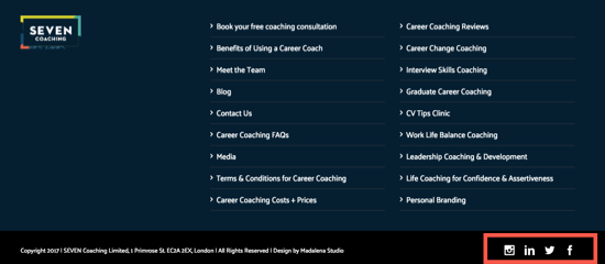
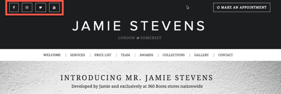
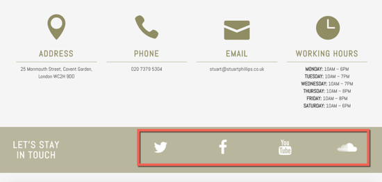
You can put them anywhere you like, but at a minimum they should be visible on your homepage and ‘Contact Us’ page.
Here are a few examples:
So how do you add these buttons to your site?
If you have a WordPress site, there are lots of plugins you can use to quickly add social media buttons to your sites.
You can try:
This way you won’t need to upload any images or write any code.
If you’ve opted for the 123 Reg Website Builder, then you can add social buttons from the “Widgets” section of the editor.
2. Email sign up forms
Many first-time visitors won’t be ready to purchase from you. They may just be researching products and providers, or have only just stumbled upon your site and are curious to learn more.
Now, while they’re not ready to give you their hard-earned cash, they might be open to giving you their name and email address to keep in touch and receive news and advice from you.
So make sure you have a subscribe form on your site. This allows you to extend your marketing window, and to continue promoting your business and products through email until they’re ready to buy from you.
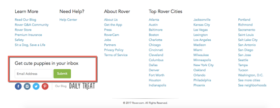
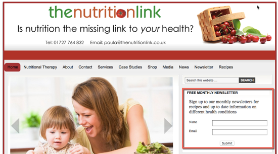
You can either include a permanent sign up form on your site, whether in the footer or top bar, like in these examples:
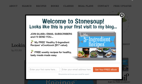
Or you can use pop-up triggers that show up on the screen when a visitor reads your content and reaches the bottom of a page or signals an intention to exit your site, like in this example:
A word of advice: if you go with pop-ups, make sure they’re not intrusive, meaning they shouldn’t show up the second a user enters the site or be so big that they take up a user’s entire screen, preventing them from reading the content.
This won’t just upset visitors but also Google. In fact, the search engine giant has decided to penalise sites that use excessive pop-ups by lowering their rankings in the mobile search results, so make sure you use pop-ups with caution.
If you’re new at this, make sure you take our free email marketing course to learn more about email marketing, and how to use it to grow your subscribers list and to turn visitors into customers.
3. Contact information
How many times have you visited a website and thought: “how in the world do I contact this company?” There’s nothing more frustrating than not being able to get in touch with a business.
So make sure you have your contact information – such as phone number and email address -visible and easily accessible.
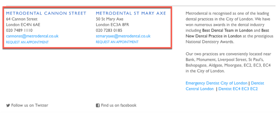
The best places to add it are in the header, footer, and obviously, your dedicated Contact Us page. Check out these examples for your inspiration:
Apart from phone number and email address, you should also add your physical address and business hours so visitors know where and when they can visit.
4. Contact form
Not everyone will want to give you a call. Some people prefer to communicate via email. So you need to have a contact form on your website to give visitors another quick and easy option to get in touch with you.
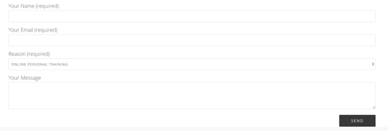
You can place your contact form on the homepage, on sales pages and on your dedicated Contact Us page. Just make sure you keep your form short and only ask for the information you need, and nothing extra.
This is the first point of interaction so do you really need more than they name, email address and enquiry to get back to them?
For more in-depth information, read our beginner’s guide to creating contact forms that generate leads. In it you’ll learn what makes a good contact form, where it’s best to place it and which plugins you can use to add a form on your website, without having to get into the code.
5. Map and directions
Are you registered with Google My Business? You should be if you want potential customers to find your business online with ease in the search results.
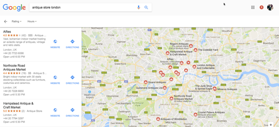
So if you own a pub, a jewellery store or any physical shop that customers can visit, it might be a good idea to include a map on your site as well. This way people will know exactly where your business is located and how to get there.
6. FAQ page
People have lots of questions and concerns. So if you want to overcome their objections and increase their confidence, the best thing you can do is to address those in a frequently asked questions (FAQ) section or dedicated page.
Potential customers often ask about product support or ingredients, shipping information, returns and warranty, lost account passwords. Make sure you address common customer problems in this section and provide the answers they need. By doing this you have a better chance of converting visitors into buyers without the assistance of a dedicated support team.
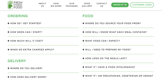
Here is an example of an FAQ for a meal delivery service:
7. Privacy and security features
Want visitors to trust that their activity on your site and the information they share with you is safe? Then add a privacy policy link in the footer where you address your site’s privacy policies and your promise that customer data will not be shared with third parties.
If you’re selling anything online, your visitors will need extra assurance that their information is safe and secure with you. This means you should show proof that your site is protected with an SSL certificate. The SSL will encrypt communications between you and your customers (i.e. a credit card number), which will allay their fears of providing such information.
Find out more about the importance of security for small businesses, and if you need SSL to secure your site, just head to our website.
Wrapping up
Every business is different. So make sure you tailor your site so that it provides the features and information that your visitors are likely to be looking for.
For example, a personal trainer’s website could use testimonials where customers talk about their experience and results. Pubs and restaurants need a menu, a map with directions and a phone number. Makeup artists and hairstylists need photos and videos to show off their skills.
So try to think like your customers and see what features they expect to find on your site.
What are your website must-haves? Tweet us your answers at @123reg.

