Four kinds of web pages every community website needs
While you’re not selling anything per se, you are trying to sell your mission and cause to donors, volunteers, members and anyone else who wants to get involved. And you can’t do that without a website.
You also can’t do that without a few specific web pages that are essential at helping you to persuade people of the value of your community or the change you want to create in the world.
Sure, your community site can’t do well without a home page, an About page, and a Contact page. But there are other less obvious kinds of pages that can hugely benefit your charity, support group or sports club.
Here are four we believe your site shouldn’t be without:
Impact pages
It’s essential for your community to share successes publicly and compellingly. Why? Because people love to hear success stories, and they especially love to be part of them.
So dedicate a page to the stories of people you’ve helped, the lives you’ve changed, and the impact you’re having in the community. Think of this as a portfolio or a testimonials page for business sites.
By displaying testimonials or sharing the success stories of the people you’ve aided, you’re not only showing that your work helps and matters a great deal, but you’re also building trust in you and your organisation, thus encouraging others to get involved.
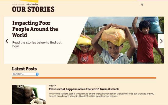
Here’s a good example from Care.org:
The non-profit has a nice page where they outline the work they do around the world and the people they’re trying to help. They’re broken down by project type so site visitors can click to learn more about the ones they’re most interested in.
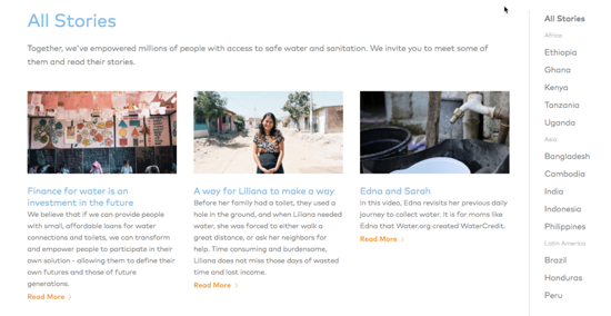
And here’s another example from Water.org:
Now, these impactful stories don’t have to come only from people you’ve helped. They can also come from volunteers or anyone who has been involved in your cause and has experienced the impact of what you do. By displaying their positive feedback, you’re more likely to convince others to get involved as well.
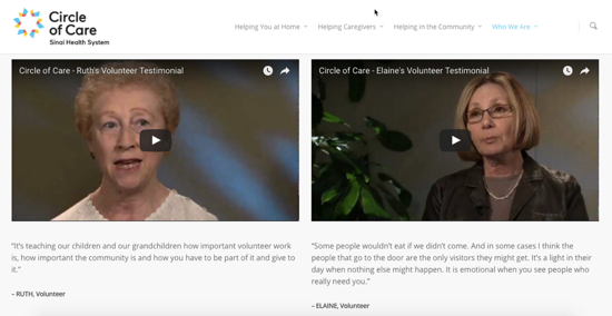
Here’s an example from Circle of Care where they chose to go with video testimonials from volunteers for a greater impact:
You can name this page whatever you like, from “Impact” and “Success stories” to “What our volunteers/ members say”.
Just make sure the title of the page is self-explanatory as well as visible on the site and easy to find in the navigation so people can see it the second they land on your site.
“How to help” page
Whether you run a charity or a sports club, you’re likely on the lookout for more people to get involved. You want to encourage them to donate, to volunteer, to become members.
A good way to do this is to have a dedicated page where you outline the various ways for them to help out. By giving them more options to participate you can increase the likelihood they’ll find one that suits them.
For example, some may be too busy to volunteer so they’ll be more inclined to donate. Others might not be ready to click that “Donate” button just yet so they’ll want to explore other options for support before they’re comfortable with the decision to donate.
While outlining the options, make sure you detail each one so people know exactly what steps to take in order to participate.
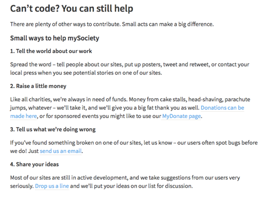
Check out this example from mySociety, a not-for-profit social enterprise:
While they’re on the search for volunteers who know how to write code, they don’t exclude others who may be too busy or don’t have the skills to help out.
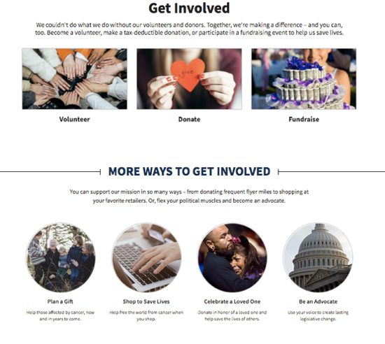
Here’s another example from Cancer.org:
This is a nice page outlining all the ways one can get involved. From simply donating to becoming an advocate, the non-profit offers a variety of options that appeal to a wide range of visitors. Each option, when clicked, send visitors to individual pages where they find more information as well as how to take action.
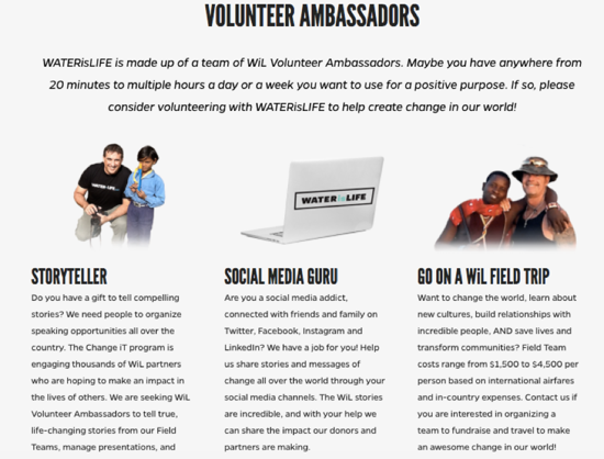
And here’s another one from Water is Life that’s unique in its approach to persuade more people to volunteer.
The reason this works is because they’re specific when it comes to the type of volunteers that are most in-need to help them succeed. They’re looking for volunteers, and anyone is welcome, but if you have these skills, you can make a huge impact if you get involved.
Staff pages
If you have a big team of members, it might be time-consuming to create an individual page for each one. However, you can create a single page where each member can share a bit about themselves and why they’re supporting the organisation or why they’re involved.
There are two key reasons why a founders/ members/ volunteers page is beneficial to your organisation or community:
- It proves you’re a real organisation with real people behind it. Your site’s visitors want to see the faces of the people involved so they know they’re dealing with a legit organisation that they can trust.
They also want to get to know who these members are as a person, what their passions and values are, and how what they’re doing adds meaning to their life and gives them a sense of fulfilment. Having your members answer these questions can help show off your community’s values and what you all stand for.
- It enables people to connect with other people, instead of an official social media account of an organisation or a group. So have each member add links to their social media accounts to allow people to connect with them individually. Why? Because lots of people prefer to connect with individuals as opposed to organisations on social media. So providing links to individual social media accounts makes you seem more accessible and approachable.
Here are a few examples of how you can do this.
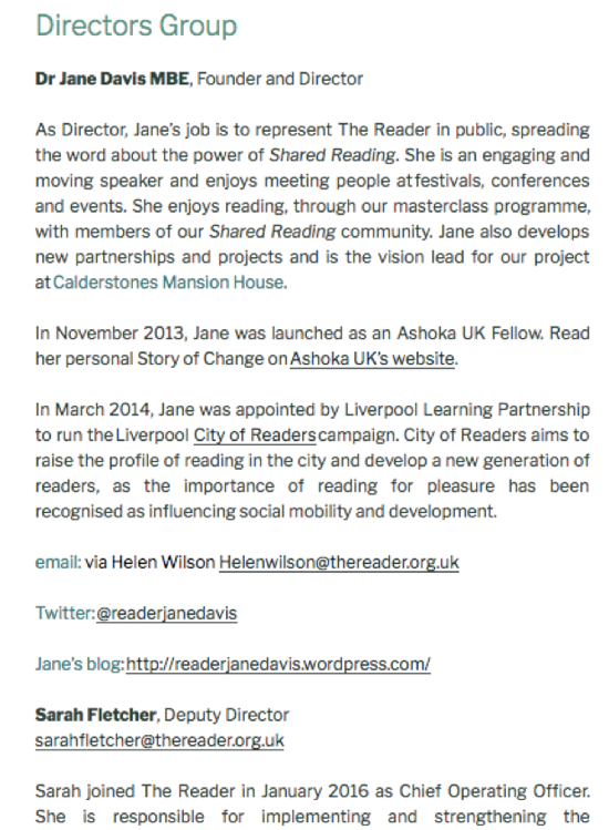
One is from The Reader, a national charity:
The page is simple in design and descriptions but it does include a variety of contact information, from email and blog to Twitter account.
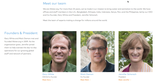
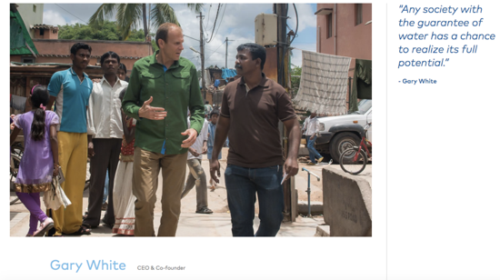
Here’s another one from Water.org:
When you click on the profile page, you’re taken to an individual page with more information.
As you scroll down the page, you’ll find galleries of photos and other names of the board and team members involved.
Financials page
Many people are hesitant or wary to donate if they’re not given exact information on where and how their donations will be used. In fact, one study revealed that “financials” are the number one piece of information they look for prior to making the decision to donate.
So if you’re asking people to donate, make sure you have a Financials page on your website where you include information on how you’re using supporters’ donations to support your cause and organisation.
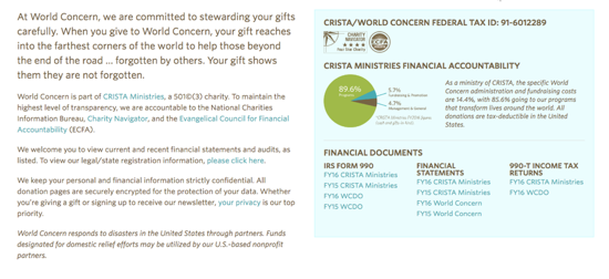
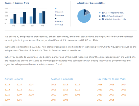
Being transparent about how the money is being used, and displaying information like annual reports and financial documentation and forms can go a long way in building trust with potential donors, as well as volunteers.
Design this page as simple as possible and link to your important financial documents like in these examples:
Wrapping up
While there’s lots of other information and web pages that you can add to your website to persuade people to take action and get involved, make sure you don’t skip on the ones above.
If you’re using our Website Builder, you’ll be able to add these pages to your website in minutes, even if you have no coding skills.
But if you’re just now building your site, make sure you read our guide on how to create a charity website because it’s filled with lots of examples and useful advice to help get yours online with ease.
And if you need extra help, 123 Reg offer a free training course to teach you how to get your site up and running. It’s primarily aimed at businesses, but a lot of the advice also applies to charities and community sites.
Are there any other pages that you think community websites can’t be without? Tweet us @123Reg.

