6 MORE design mistakes that can kill your sales
You love your website but are you sure your visitors love it too?
In a previous blog post I presented six web design mistakes that can kill your sales but since there are probably tens or hundreds more deadly mistakes in web design, here are six more that might be driving customers away. Avoid these gaffes and your site will be far better than much of the competition.
1. Content that is difficult to scan
Good design guides your visitors through the website, focuses their attention on the things that matter and helps them make sense of information. If the text on your site is laid out poorly, then it will be much harder for people to understand what you’re saying and that will damage sales.
Before you can write good copy you need to understand how users read on the web.
People don’t read every single word on a web page, from top to bottom. They only read about 28% of the words on a page, starting with whatever pops out at them first and then moving to the next thing that catches their eye. Or they might not read at all if all they see is a wall of text – that’s boring, intimidating and painful to read.
Following are a few things you can do to make your copy easier to scan:
- Use descriptive yet concise headings and subheadings to help visitors understand what the next bit of content is about before they even starting reading it.
- Use images to break up the text.
- Structure your copy using bulleted lists, making it easier for visitors to digest the information.
- Highlight important keywords to grab their attention.
- Use short paragraphs as people are put off by long paragraphs.
- Use a simple writing style, devoid of jargon.
- Cut your copy down until you’re only left with the essentials that can get your message across.
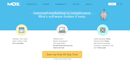
Moz.com is a good example of content that is easy to scan:
The layout is simple: a heading that explains what their software is about, three blocks of text that describe the three most important things you can achieve with the software, and a call-to-action button that tells visitors what to do next.
2. Auto-playing video and music
Automatically playing audio or videos is obnoxious for so many reasons.
Let’s start with the fact that it’s jarring. So you land on a site and suddenly you hear sounds coming out of your speakers. Your first instinct is to press the “back” or “X” button to make it go away, especially if you’re at the office and have no headphones on.
But what if you have ten windows open in your browser and have to go through all of them to figure out where that noise is coming from. It’s frustrating because you can’t find it. And then you start closing the windows one by one and by the sixth you figure out which one it is. But there is no button or option to pause or stop the audio or video on that page, like on this website:
So what do you do then? Most likely you decide to leave the website.
This practice is not only unprofessional but also disrespectful as the visitor should be the one deciding whether they want to play the audio or video, not you.
The solution is very simple: If you absolutely need to include audio or video clips on your website, either give users the choice to hit the “play” button or mute the audio so they choose whether or not they want to hear it.
3. Pop-ups or anything that looks like an ad
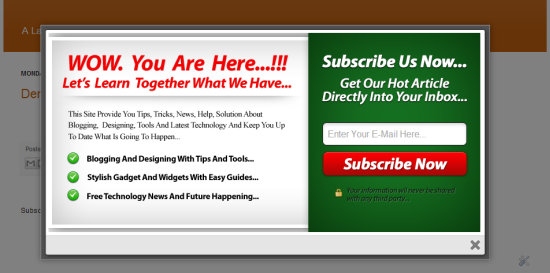
Imagine you’re two seconds into an article, and then a pop-up shows up telling you to sign up for a newsletter or to buy a product. That’s disruptive and unnecessary. In addition, many of us associate advertisements and spam with pop-ups.
According to Nielsen, a user experience consulting firm, users ignore legitimate design elements that look like prevalent forms of advertising. After all, when you ignore something, you don’t study it in detail to find out what it is.
So it’s best to avoid pop-ups or designs that look like advertisements. The exact implications will vary depending on the design but it’s best to follow these guidelines:
- Banner blindness means that users ignore anything that looks like a banner ad due to shape or position on the page
- Animation avoidance makes users ignore areas with blinking or flashing text or other aggressive animations
- Pop-up purges makes users close pop-ups before they have even fully rendered.
4. No prices
One of the biggest mistakes of a website is failing to provide the information users are looking for – and pricing is one of them. While business-to-consumer (B2C) ecommerce sites don’t usually make this mistake, most business-to-business (B2B) sites don’t show prices for enterprise solutions.
“Price is the most specific piece of info customers use to understand the nature of an offering, and not providing it makes people feel lost and reduces their understanding of a product line. We have miles of videotape of users asking ‘Where’s the price?’ while tearing their hair out.”
But what if you can’t show exact prices? It’s understandable as many B2B products and services are complex and the pricing varies for each client depending on their needs. However, you should still provide some basic information regarding your pricing so potential customers can use it during the initial research phase. For example, you can provide an estimate, a price range or show prices for typical scenarios.
5. No phone number and physical address
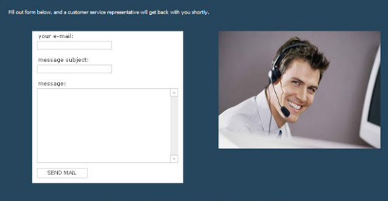
You would think providing your contact information would be a no-brainer but you’d be surprised how many companies leave this information out. Instead, they use a simple contact form like this one:
Even though email addresses and phone numbers are the most requested forms of contact information, having a physical address on the website might be more important as it’s one of the key credibility markers. A company with no address is not one you want to give your money to, right?
If you have an ecommerce website, it’s important to give your potential customers multiple ways to contact you. A phone number or an email address should be on each and every page of your website. Even if nobody ever calls, the presence of this information adds transparency and real-world legitimacy to your site and comforts your target audience.
6. Forgetting mobile users
Your site looks great on your computer and maybe on your tablet too. But have you tested it on smartphone as well and on other different devices?
Look at your analytics and see what percentage of your visitors used mobile devices to access your site. And then think of how many customers you would lose if your website is not mobile-friendly. So make sure you keep responsive design in mind and test on a variety of different devices to ensure your site looks good on most of them.
In conclusion
In terms of design, you need to keep your site simple and usable if you don’t want visitors to leave just seconds after they land on your site. By simply avoiding those six mistakes you have a better chance at keeping visitors on your site and turning them into customers.
What other design mistakes have you discovered were driving your customers away?


