Eight tips to make your website easy to use
If your visitors have questions from the second they land on your site, such as: “am I on the right website, where do I go from here, how do I go back, where is the Contact page, is this site trustworthy?” – then your site is in trouble.
We’ll get straight to the point – if your website isn’t easy to use, it will never succeed. Why? Because users today don’t want to and shouldn’t have to think too hard to figure out what to do once they’re on your website.
Users today aren’t impatient. If they can’t find what they they’re looking for, and fast, they’ll just go back to the search engine results and find another site to meet their needs. It’s that simple.
And once they’ve had a bad experience and leave, 88% of them are unlikely to return.
Obviously, no website owner wants to make things difficult for their visitors and customers. It’s just not that easy to make a website that’s easy to use.
Need some pointers? In this post we’ll share eight tips that you can apply to your website to ensure you’re making it easy for visitors and prospects to figure out what to do from the second they land on your site.
1. Speed it up
Does your website take more than three seconds to load? Then you need to take the necessary steps to speed it up. Don’t and you risk losing 40% of your visitors who are unlikely to revisit your site and give it a second chance.
Don’t know how to check your site’s speed? Use Google’s PageSpeed Insights tool to see where you stand and what you can do to address the issues on your site.

You can also read our post to learn more about how you can get your website up to speed.
2. Make it obvious what your site is about
When a visitor lands on your site, can they immediately tell what it’s about or whether they’ve arrived in the right place?
To achieve this goal, you need to make sure your most important information is prominently displayed “above the fold”. This refers to the upper half of the page that is visible in a browser window when the page first loads.
So what information should you place above the fold? At the very least you should include:
- Your logo and your name or business name, usually in the top-left corner.
- Your offering. This can include your most popular products and/or services if you’re a business; your latest project if you’re a freelancer, or your current cause if you’re a non-profit organisation.
- A compelling and prominent call-to-action that tells visitors what to do next.
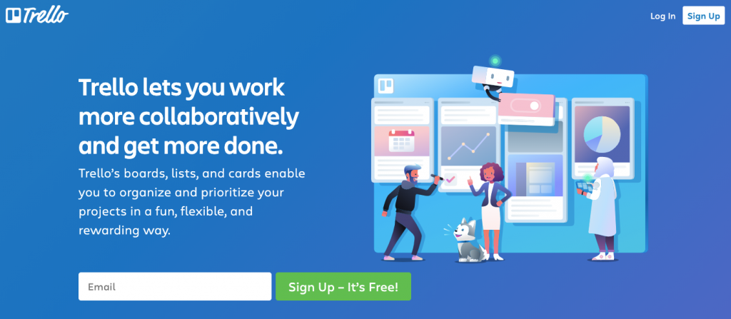
Here’s a good example from Trello:

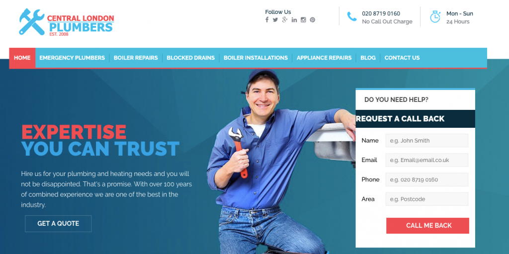
And here’s another one from an emergency plumber:

3. Ensure they know what to do next (and how)
When visitors land on your homepage or any page on your site, do they know exactly what to do next and how?
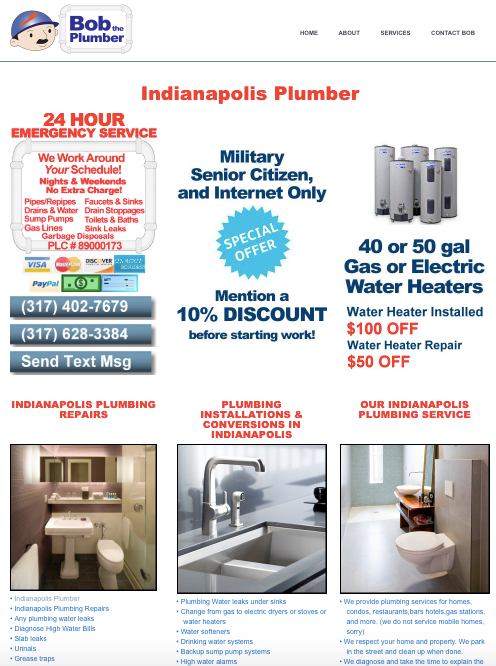
For example, imagine you’re looking for a plumber and you land on this page. Would you say it’s easy to figure out what you should do next?

Yes, if that next step is to hit the back button to the search engine results and onto another website.
This page is so crowded with so many elements that it’s not only tiring to the eye but also extremely difficult to figure out where to look or what to do next to accomplish your goal: which is to book or call a plumber.
So you hit the back button and next you land on this page:

Is it obvious what you should do next?
Yes, because it’s the most prominent element on the page. You need to fill in the form and click the “Call me back” button to request a call back and book a plumber. It’s that simple.
Go through your entire website to make sure that no matter which page your visitors land on, they know exactly what to do next, and how. If that next step isn’t obvious, fix it.
4. Simplify your navigation
You know what’s one of the key features of an easy-to-use website? It’s navigation.
Simple, intuitive navigation makes is easy for people to find what they’re looking for. The problem is that figuring out how to organise and structure your entire content so that it makes sense for your users is no easy task.
The best advice we can give you is to avoid reinventing the wheel. Stick with what’s familiar and common knowledge to users when it comes to navigation and menus.
If your navigation is unintuitive or unconventional, you’ll not only confuse visitors but also force them to work harder to do what should be simple a task like buying a product or filling out a contact form.
So try to put your customer hat on and try to create a map or a route of how they would navigate through your site to accomplish a task, whether that’s to find out more about your business, buy a product or a service, or get in touch with you.
Think about the most important information that you want to highlight. What piece of information, message or product on a web page do you want users to see first? And what action do you want them to take next?
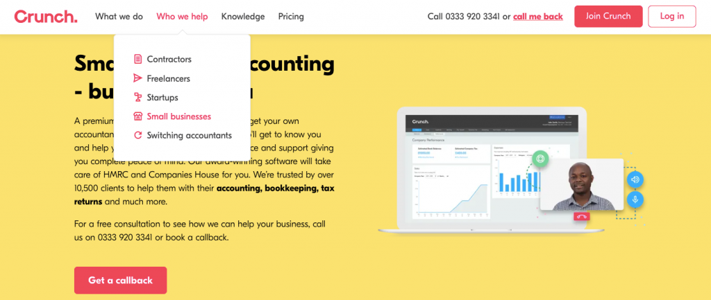
Take a look at this page from Crunch:

The navigation menu is simple, visible, jargon-free, and users can quickly tell what the page is about, which option to choose from the menu and what the next step is.
The most important thing to remember is that users want a few key things from navigation:
Knowledge of where they are on the site
- How to get from point A to point B
- The next step they need to take to complete an action (whether it’s to buy a product, sign up for a newsletter or get in touch with you)
- A way to go back (or to the homepage). That’s why it’s key to link your logo to the homepage, which is something users expect you to do.
The easier it is for your visitors to do these things, the quicker they’ll complete their desired action and the more likely they are to come back.
5. Make your content easy to read and scan
Is the text on your site easy to read and scan?
If you’re using too many different fonts or if visitors need to squint to be able to read the text because there’s just not enough colour contrast, you need to do better.
This means:
- Using three or fewer easy-to-read typefaces
- A high-contrast text to background colour combination so that the message is easy to read
- Making sure links are easily distinguishable from regular text
- Using headers and subheaders, short paragraphs, as well as bullet points to break your content down into manageable chunks. This way you visitors can quickly scan your page and find the information they’re looking for instead of staring at a wall of text.
6. Fix all broken links
Broken links drive visitors away. It makes them think they’ve arrived in the wrong place or that your site isn’t working. It also makes your website look untrustworthy, and no one wants to do business with a company they don’t trust.
So if you have broken links on your site, do yourself a favour and read this guide to learn how to find and fix broken links quickly.
You can quickly easy find broken links if you’re using Search Engine Optimiser from 123 Reg.
7. Put your contact info where users can see it
You have no reason to hide your contact information from your potential customers.
So if you want them to get in touch with you to ask a pressing question or to request an estimate, you need to make it easy for them to reach out to you.
How? By making sure that:
- You have a Contact page that’s visible in your top navigation menu.
- Your key contact information is visible on every page of your website. Depending on the type of site or business you run, this can be your email address, phone number, physical address and map, or social media accounts.
8. Make sure your site looks and work great on all devices
This may seem obvious but there are still lots of sites that don’t look good or perform well on all devices – smartphones, tablets, desktop.
You can be sure your target audience is visiting your website using their smartphone. What is their experience like? Do they have to pinch, zoom or swipe just to view the content? Or are they having a pleasant experience where they can browse around and find what they’re looking for with ease?
If your site isn’t mobile-friendly, you’ll not only frustrate and drive prospects away but you’ll also hurt your visibility in the search engine results since this is a Google ranking factor.
So if your site isn’t mobile-ready, you need to make the switch as soon as possible. When you use our Website Builder solution, this is something you won’t need to worry about. That’s because all templates are not only easy to use since they’re designed by experts, but they also look and perform beautifully on mobile and all other devices.
Wrapping up
Customer experience, user experience, intuitive design. All these buzzwords you keep stumbling upon while educating yourself on how to improve your website want to communicate the same key message: if your website isn’t easy to use, it will never succeed.
So, take a closer look at your site and see what you can improve based on the tips in this post so your visitors have a pleasant experience on your website.
