Five website mistakes that can cost you leads
You have a nice-looking site and when you look at your traffic, the numbers look great.
The problem is no one or very few of those tens or hundreds of visitors are taking that next step you’d like them to take, whether it’s to buy form you, fill out a contact form, or subscribe to your email newsletter.
This can be incredibly frustrating, especially when you don’t know exactly what’s driving visitors away or preventing them from taking that next step.
If this is you, don’t fret as we’re here to help. In this post, we’ll look at five mistakes you’re probably making on your site that are causing you to lose valuable leads. We’ll also share some tips and advice on how to fix them to motivate your visitors to move forward.
1. Your site takes too long to load
If you think your visitors will wait ten seconds for your website to load, think again. Studies show that 47% of people expect a site to load in two seconds or less, and 40% of people leave a site that takes more than three seconds to load.
This means that if your site takes more than three seconds to load, you can lose almost half of your visitors before they even get a chance to check out your site.
The same study found that just a one-second delay in loading could trigger a 7% drop in conversions. Depending on your total sales volume, this could be a significant part of your yearly revenue.
To make things even worse, a slow site can also make it harder for people to find your online business in Google’s search results. Why? Because site speed is a Google ranking factor, which means that if your site takes too long to load, the chances of it showing up at the top of the search results are slim.
Not sure if site speed is an issue that’s driving your visitors away? A simple way to find out is to use Google’s PageSpeed Insights tool to check your site’s speed.
Enter your website address and click “Analyze” to see how well your site is performing. The tool will display a page with lots of useful information on your site’s speed. Scroll down to the “Opportunities” section for suggestions on how you can help your site to load faster.
You can also find lots of great advice and tips to improve site speed in these posts:
2. You don’t make it clear what you do
This is one of the biggest and most common mistakes that site owners make.
The second they arrive on your site, whether it’s on your homepage, a product page or a Contact page, your visitors need to be able to tell what you do so they know they’ve arrived in the right place.
Why is it critical to fix this right away? Because most users are lazy and impatient. If they can’t figure out what your site is about or whether you have what they’re looking for within the first three seconds, they’ll hit that back button and go to another website.
Don’t lose leads through something as simple as not explaining what you do or what that page that they’ve landed on is about.
So, how can you fix this?
Use key elements such as your tagline or business statement, titles, headings and subheadings, as well as navigation to tell visitors what you do, which page on your site they’ve landed on and what it’s about. Make sure these elements are on every page on your website.
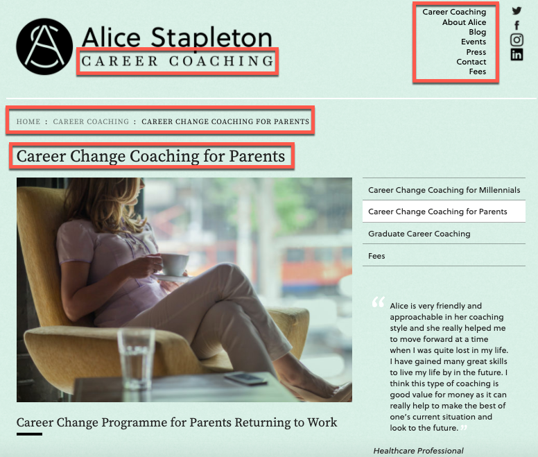
Take a look at this page from the site of career coach Alice Stapleton:

If this is the first page you land on, you can tell in an instant what it’s about and whether or not it’s relevant to what you searched for.
You have:
- A statement at the top that tells you that this is the site of Alice Stapleton who offers career coaching services.
- Breadcrumb navigation that tells you where you are on the site: Home > Career coaching > Career change coaching for parents.
- A page title that describes the information you can find on that page: “Career change coaching for parents”.
- A navigation menu at the top that you can use to visit other pages on the site.
If you go to another page on this site, you’ll find the same key elements present.
Now take a close look at the pages on your site. Are these elements present on your site as well? Can visitors tell in an instant what you do and what the page they’ve landed on is about? If they can’t, you need to fix it.
3. There’s no clear next step
Our brains are always on the lookout for instructions and signs – where to take a left turn to reach our destination, what key to press to get transferred to a customer support representative, what button to click to add the product to the shopping cart.
We’re instinctively looking to be told what to do next, and it’s the same with the visitors on your website. Once they’ve landed on one of your web pages, they’ll be looking for instructions on their next step.
Take a look at the pages on your site and ask yourself: is it obvious what a visitor needs to do next? If there’s no clear and obvious next step, don’t be surprised if visitors choose to do… nothing.
So, how do you fix this?
Simple. Make sure that every single page on your site has an enticing, clear and prominent call to action (CTA). Make it a button so visitors can’t miss it.
Here are some of the most common examples of CTAs:
- Buy now
- Try it now
- Find out more
- Request a quote
- Subscribe to our newsletter
- Download our ebook
- Read testimonials
- Get in touch with us today
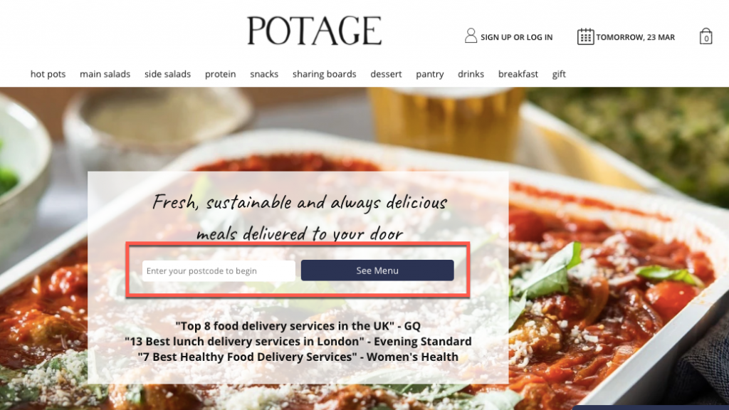
Check out these examples if you need more inspiration:


For more tips and examples, read our post on why calls to action are the most important words on your small business website and how to create yours.
4. You don’t talk about pricing
There are many businesses that avoid listing pricing on their websites. In some cases, it’s understandable, especially when the answer to “how much do your services cost?” is “it depends”.
The problem with that is that people are looking for and want to see your pricing information. They don’t want to email, call or submit a form with their personal information only to find out that they can’t afford your services. And it’s time-consuming and frustrating to have to contact two, three, five or more businesses just to get this information.
So most often, if visitors can’t find the pricing information on your site, they’ll leave and go elsewhere. This is a missed opportunity that can cost you many leads.
How can you fix it? Have pricing information or at least a price range on your website. It helps prospects get an idea of your pricing and determine whether or not they can afford your services.
Having pricing information on your site also helps establish trust with your prospects. If you’re not transparent about your pricing, people may assume that you charge as much as you can get away with.
So this is also an effective way to build trust with first-time visitors and entice them to get in touch with you.
5. Your site doesn’t work
Imagine a visitor arrives on your site, finds what they’re looking for and wants to book an appointment or ask for more information. They go to your Contact page, spend a few minutes filling out your contact form with their personal details and some questions and finally hit the “Submit” button.
Then they get this message:

You know what happens next? If you think they’re going to stick around to understand what happened or go through the entire process once again, think again. They’ll just assume your site doesn’t work. Then they’ll hit that back button and go to another site that works.
Here’s the thing: users these days expect websites to work. So if you want to make the best impression every time someone arrives on your site, you need to make sure your site works.
Wrapping up
Being a business and website owner is hard and time-consuming. There are lots of things you need to take care of so it’s easy to make mistakes. But now that you know which website mistakes are driving prospects away and holding your business back, you can fix them and provide a great experience to anyone who visits your site.
