How to choose the right template for your website
Have you ever stared hopelessly at a collection of template designs wondering, “How do I know which one to choose for my website?”. Do you feel like the more templates you look at, the more confused you get?
It’s easy to drown in a sea of seemingly endless options, especially if you’re not exactly sure what you should be looking for in a template or if you don’t have a sharp eye for design. The task of choosing a template for your website is even more overwhelming considering it’s the face of your business and plays an important role in how your audience as well as search engines perceive it.
In this post we’ll explain what you should look for in a template to ensure you pick the right one for your website and business.
Let’s get started.
Strive for simplicity
Many templates come with all the bells and whistles you could wish for – lots of colours, complex layout, flashy animations. Sometimes it’s nice to have (some of) those things, but the truth is in most cases you really don’t need them.
So, when choosing your template, look for one that helps you to support your goal – whether that’s to present your business in a professional manner, to entice visitors to contact you or to sell a product or a service. While your template should look nice it shouldn’t compromise on simplicity and usability.
The purpose of any good website design is to help users find the information they need quickly, without having to search for it through hidden menus or buttons. At the same time, if a template looks great but doesn’t actually help you get new business, then it’s not a good template.
Responsive is not optional anymore
Responsive design should be a priority when choosing a template that makes your website a success. People are increasingly using mobile and other handheld devices to navigate the web. If your site doesn’t look and work properly when viewed on a mobile device, you run the risk of losing out on sales.
Moreover, Google favours websites that are mobile-friendly, placing them higher in search results. In that way, you will not only provide your visitors with a more pleasant browsing experience, but also expand your reach online. Read more about the importance of responsive design and keep this one thing in mind – if you don’t have a responsive site, you’re running the risk of getting left behind.
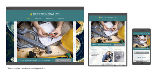
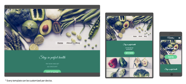
Until recently, getting a responsive website was a complex and fairly expensive endeavour. But not anymore. Leading website builders allow you to build responsive website without needing any technical skills. Here’s an example of a responsive site built with the 123 Reg Website Builder.
You can see how the same content is displayed differently across each platform. That’s the essence of responsive design.
Is the theme SEO-friendly and cross browser compatible?
Your website should be search engine optimisation (SEO)-friendly and should also run properly on any browser. But here’s the thing – not all themes out there are built with these key features in mind.
Don’t know what makes a template SEO-friendly? It’s all about the proper user of relevant keywords in titles, URLs, meta descriptions, headlines and more. If you have a WordPress website, plugins like Yoast and All in One SEO can help you to improve your site’s SEO.
Cross browser compatibility means that all pages show well in browsers like Google Chrome, Mozilla Firefox, Opera, Internet Explorer etc, regardless of the app your visitors use to access your website.
Make sure the template you choose includes these two key features.
Is the template related to your business?
As you consider different templates, make sure you’re clear on the goals you want to achieve. Once you know what you want to say and what you want your visitors to do, you’re ready to choose a theme and create a website.
Maybe you want to create a single page to present your small business or maybe you need a more complex ecommerce site to showcase hundreds of products? No matter what industry you’re in or what you’re looking to market online, you’ll notice that the templates included in most website builder collections or in third party marketplaces are organised into different categories.
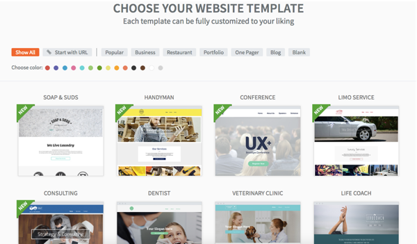
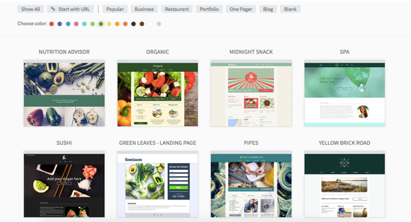
Here are just a few of the templates from our 123 Reg website builder collection:
You’ll find templates that are designed specifically for dentists, restaurants, veterinary clinics, consulting businesses and more. You’ll also notice they include niche-specific elements such as gallery pages for online portfolios for photographers and artists, booking forms for hotels, menus for coffee shops and restaurants etc.
These themes already take into account the particular needs of website owners and using a template that already matches your type of business saves you lots of valuable customisation time.
Consider the visual impact
First impressions matter, especially on the web where there is so much competition. You probably already know by now that you have only a few seconds to grab a visitor’s attention.
When considering a template, think about what will appeal to potential customers who are interested in your product, service or content. Will a few lines of sharp text at the top work best or maybe a big image at the top of your homepage like in the below example?
As soon as your page loads, the clock starts ticking. Make sure your site makes a statement and entices visitors to want to find out more.
What layout fits your needs?
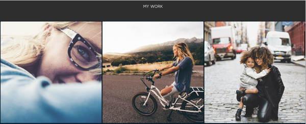
Different businesses need different content displayed in different formats: a news website needs space for longer text; a plumber needs a convenient way to display the services it offers and ways to be contacted; photographers need a nice-looking gallery for showcase their work while a filmmaker needs a good infrastructure for videos.
Let’s take a few examples from our 123 Reg website builder collection:
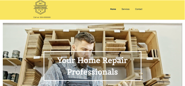
The website of a handyman needs to include information about the services it provides as well as contact details such as a photo number or a contact form so people can easily get in touch.
A photographer’s website can’t be without a gallery to showcase recent work.
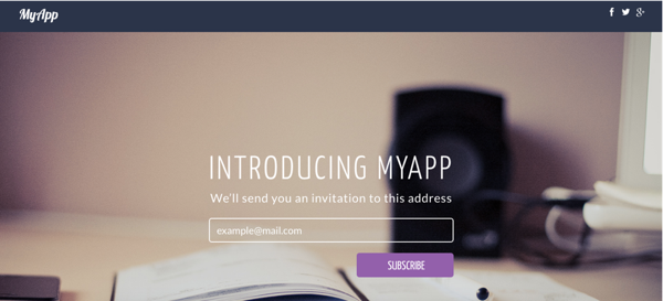
Launching an app? Allow visitors to add their email address so you can notify them the moment you release your app.
Aside from thinking about the way you want to present your content, you should also consider how you would like visitors to navigate their way through your site, and what you want the final outcome to be. This might involve them requesting further information, booking a consultation, purchasing a product, subscribing to your mailing list or downloading a resource from your website.
Whatever the action you want them to take, if your website is easy to navigate it’s far more likely to appeal to visitors, to get them to take the action you want them to take, and also to keep them on the website for longer.
Choosing the right colour scheme
Choosing a colour scheme can be difficult. When choosing yours, think about the impression you want to create. Bright colours will convey a sense of fun and joyfulness, while more conservative shades of grey, dark blue and white can be used to create a more corporate feel.
Can you imagine a bank’s website splashed with yellow and pink? Would a gardener’s website be likely to use lots of dark blue shades? Probably not. So think carefully about the type of impression you are looking to make and the overall theme of your site.
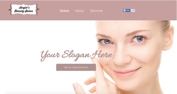
For example, if you’re a beautician, you might consider using a bright colour scheme similar to the one in this template from our website builder collection:
Fortunately, tools like Paletton allow you to quickly and easily develop a simple scheme of four colours that are perfectly matched. Once you’ve decided on a colour scheme that’s right for your business, a good website builder will let you quickly and easily create a website based on your new colour scheme.
If you’ve decided on the colour scheme you want to use for your site, you can even see the available templates in our collection based on your preferred colour.
Will the template require much customisation?
Most templates allow you to make changes in order to reflect your brand. Customisation ranges from colour and font selection all the way to moving elements around like text boxes and social media icons. So when choosing your template, make sure that it supports the degree of customisation that you require.
Will a support team be there to help?
No matter how “simple to use”, you should be able to get help if you run into any problems. Reliable support is invaluable when you create a website. If you’ve been up all night in a marathon effort to get your website up and running, it can be crushing to find you’ve skipped a simple step and can’t publish it online. Make sure you can reach someone via phone, email or online chat so that you really can get your live when you need to.
What next?
You can start experimenting with the 123 Reg Website Builder for free, so why not try it out to see how you can create a great looking site without any technical skills? You can even use your existing website as the basis for a new site, meaning you don’t have to start from scratch.
Have any other tips on how to choose the right template for a website? We’d love to read them in a comment below.

