How to pick the right fonts for your website and where to find them
Pairing fonts can be difficult. Finding two or more fonts that work well is one thing, but finding two that work well together to create visual interest and to establish information hierarchy may have you reaching for the aspirin.
While there are no absolute rules to follow, it’s important to first understand some of the best practices and typographic principles when combining fonts in a design.
This guide will help you get started with pairing fonts for the web so you can create great typeface combinations for your next web projects, whether it’s a website or an email. We’ll also share some great places to find quality free fonts.
Let’s jump in.
Top tips on how to pair fonts
The most effective font combinations usually rely on typographic principles. While they’re not fail-safe or scientific, and can all be broken, they should all be understood.
Choose complementary fonts
Different fonts have different personalities – casual, playful, elegant, formal. You want to make sure that the personality of your font choices matches the purpose of your design. For example, a rounded, bubbly typeface may be a great choice for a site dedicated to children, but it’s definitely not a good choice for a business site.
Also, if you go with a large font with a strong personality for your headings, make sure to pair it with something more neutral for your body copy to achieve a balanced design.
Establish a visual hierarchy
Newspapers and magazines are great examples of how to apply a visual hierarchy to fonts. They pair fonts in a way that visually separates headlines from sub-headlines, and from body copy and captions. Qualities like size, weight or boldness and spacing contribute to how a reader should navigate the page and what information should grab their attention first.
So when you pick your fonts, think about what exactly you’d like your visitors to look at first. What information is essential? Make it stand out using the proper fonts. Usually the most important text element on a web page should use the largest and the boldest font.
Consider context
Depending on your web project, whether it’s a landing page or an email newsletter, you’ll sometimes want something that pops, while other times you’ll need a font that’s not distracting (like when you have a lot of text).
So in addition to size, you should also think about picking and pairing fonts that are most appropriate for your project. For example, if you’re creating an email with a retro theme, the fonts you use must reflect that context.
Combine serifs and sans serifs
If you’re on a deadline and need to pick two fonts immediately, you can’t go wrong with serif and sans serif combinations. They’re a very popular choice because they tend to work well together, particularly at contrasting sizes.
Create contrast
Typeface combinations based on contrast allow you to clearly establish hierarchy and to make the most important information stand out. Using contrasting typefaces makes it clear which paragraphs are headings and subheads, and which are body copy. You can achieve contract through:
- Style: Take a look at any font resource site and you’ll see them categorised as Blackletter, Monospace, Script, Slab Serif etc. Fonts of different styles will often contrast.
- Size: Big, small.
- Weight: Varying the weight of fonts is a common way to establish visual hierarchy.
- Form: Consider the length, the curvature, the direction of the movement.
- Colour: This can also determine whether two fonts work well together.
Steer clear of conflict
While you want contrast to help individual pieces of information to stand out, you don’t want conflict. Just because you’re using different fonts, that doesn’t mean that they’re work well together. Here’s an important thing to consider when choosing your fonts: go with typefaces that share a few qualities like similar proportions or same height (known as “x-height”) for the lowercase letters.
Vive la différence
Choosing fonts that are too similar is also not a good idea. Not only can it look like a mistake rather than a purposeful choice, the reader won’t know where to look because they’ll have trouble establishing a visual hierarchy. A quick way to test whether two or more fonts are too similar is to place them side or side and squint. If you notice that the fonts look the same or very similar, then you should consider turning up the contract between your typeface choices.
Stick with a single typeface family
This is another good rule to harmonious type combos and it’s always a safe bet. However, make sure that you go with a typeface family that comes in a variety of weights, styles and widths. This way you can use different font sizes, weights (light, regular, bold) and cases (lower, upper, small caps) to create contrast and to easily differentiate one level of hierarchy from the next.
When picking one font family you’ll also save a lot of time since you won’t have to waste hours deciding on the perfect fonts to combine. Plus, it helps to create a more cohesive look.
Go with the same designer
Try combining typefaces from the same designer because they will likely have a similar aesthetic, which means they’ll most likely work well together. Don’t know who designed a typeface? It’s amazing what you can find out on Wikipedia.
Keep it simple
A good principle to live by is to keep it simple. In other words, don’t use too many fonts. Just as getting too many colours on your site will make everything confusing to your visitors, mixing too many fonts on a page will most likely result in a confused message as well. So try to stick to two typefaces at first.
These are just a few things that you should consider when pairing fonts for your next web project. You can find more tips in this article that covers the 29 principles for making great font combinations.
Want to see some great examples? Check out these resources:
- 10 useful Google font combinations for your next site
- 20 perfect font pairings
- 15 stunning font combinations for your inspiration
- 20 amazing free font pairings
How to find fonts that work well together
There are lots of resources and articles where you can find inspiration on which fonts work well together. Following are some fantastic sites that feature unusual or visually interesting font pairings for your inspiration:
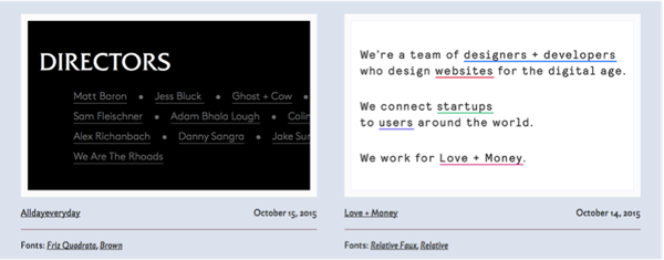
Typewolf showcases a nice gallery of web screen shots cropped to highlight interesting pairings. They also have a blog where you can find some useful resources about fonts.
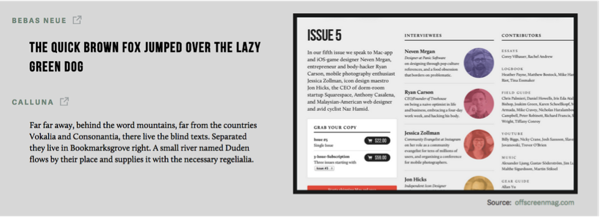
Similar to Typewolf, Typ.io features examples of creative font pairings. Go to the Recommendations section to get inspired.
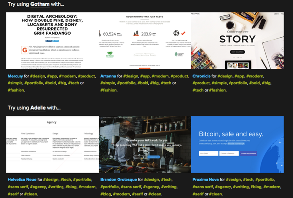
Type Genius allows you to select a pro font from a dropdown and then returns matches that use it. This way you can see examples of how that font combo looks.
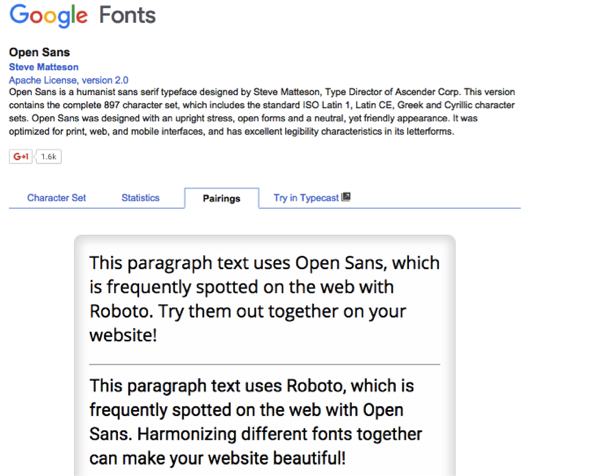
Let’s not forget the Google Fonts directory that not only gives you access to lots of free fonts but you’ll also find pairing suggestions for each font that you can try.
Where to find good fonts
Here are a few sites where you can find free, quality fonts to use in your web projects:
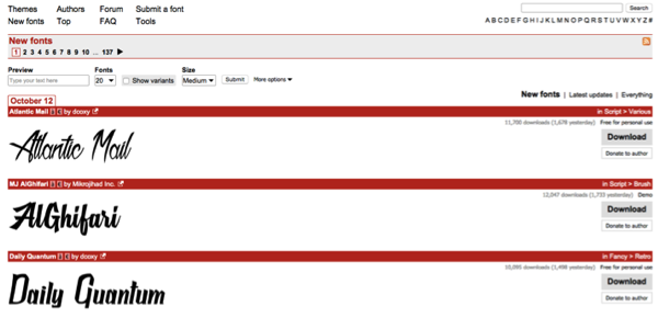
Dafont.com is a massive archive of free fonts. You can browse the collection alphabetically, by listing, style, author or popularity. While there are plenty of unprofessional fonts, you can also find some original ones.
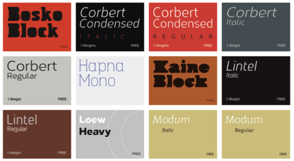
Want to download free fonts for commercial use? Then Font Squirrel is the place to go. The quality of the fonts is high, plus it’s got a very nicely designed website into the bargain.
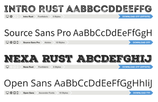
This site features a nice collection of free fonts. From stencil and bold to modern and geometric designs, you’re sure to find something suitable for your project here.
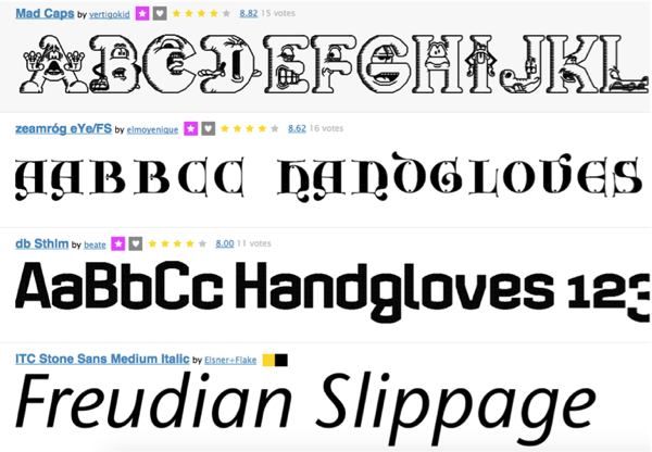
This site includes fonts designed by the community. The collection is pretty generous and more fonts are added every day. The best fonts are picked for the Fonstruct gallery.
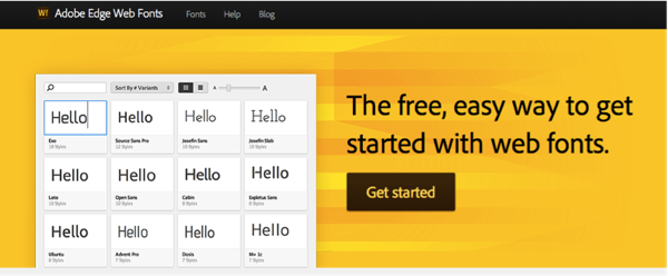
This is a fantastic resource from Adobe that includes free fonts contributed by Adobe, Google and designers around the world.
Wrapping up
There is no golden rule to assure great font combinations. That means that you need to experiment and to take risks. Sometimes you’ll have the feeling that a certain combination works, even if it technically shouldn’t, according to the “rules”.
So take this short guide as a starting point, and if the tips and advice serve you well, use them – if not, don’t let them get in the way of your creativity and intuition.
Have any other useful tips on how to pick fonts that work well together?

