How to Use Seasonal Web Design to Spruce Up Your Site
If you run a business, the weeks leading up to the holidays present a don’t-miss opportunity to skyrocket your sales. With a growing number of online shoppers looking for deals and gifts, simply having a website is not enough if you want to compete against other businesses vying for those sales.
While promotional discounts and special offers are the core of your holiday sales, it’s the look of your site that creates the emotional desire to buy. This is where seasonal design comes in.
In this post we’ll explain why it’s important and how you can leverage the power of the festive colours to boost that seasonal feeling in customers and entice them to take action.
How can seasonal design benefit your business?
Why does seasonal design matter for your website? Think about it this way: why do stores put up Christmas trees in the middle of the store or globes and tinsel in the windows? Simple: because it creates the spirit of holidays and gets potential customers into the festive mood, which makes them more likely to buy something.
So, even if you have a nice-looking website, that doesn’t mean you should leave it untouched all year long. Special events and holidays like Halloween, Christmas and “Back to School” are great opportunities to give your site a small facelift to represent those seasons, events and holidays and what’s important to your business and your customers at various times of the year.
Seasonal design not only makes your site visually appealing. It also shows that your website is active, dynamic and fresh. So rather than having a straightforward theme all year round, seasonal design elements help you to resonate with your audience on a personal level.
And here’s how else seasonal design can also help you to increase sales: it creates a sense of urgency. You can use different elements and colours to direct visitors’ attention to the products on offer and convey the message that if they don’t hurry, they’ll miss out.
How to use seasonal design to make a bigger impact
If you’re feeling tempted to turn your site into a sea of Santas, Christmas trees, and snowflakes, think twice. There are lots of ways to create subtle changes without turning your site design into a cliché.
So next we’ll look at how you can add a little holiday spirit to your site without going overboard.
Logo
Revamping your logo for Christmas gives your business an even stronger presence during the holidays and it also allows you to connect with customers through the shared spirit of the holiday season.
Not only is a seasonal logo eye-catching, it also creates excitement and a desire to stick around to learn more. So it’s a great tool to advertise your promotions during the busiest time of the year.
Now, getting a seasonal logo doesn’t mean designing a completely different one. Your customers should still be able to recognise your brand. You’ll just need to add a few touches that set a holiday mood so your customers understand that you have some special offers and discounts in store for them.
These alterations can be anything from adding a snowflake or a Santa hat to your logo. Just make sure they’re noticeable enough to make an impact but no too much that they won’t be able to recognise your brand.
Here are a few examples:
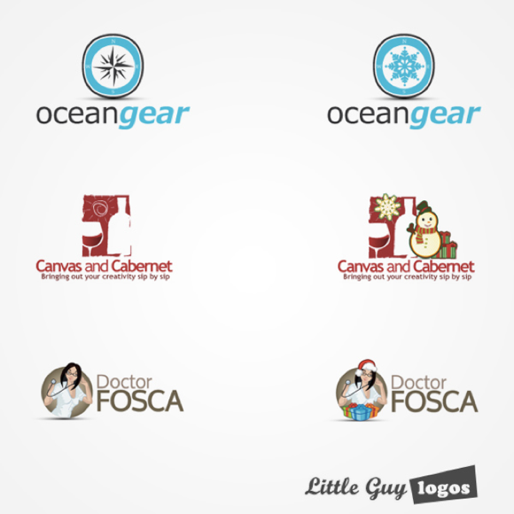
Also check out this cool comparison from Little Guy logos that shows how you can subtly alter your logo to reflect the winter holidays.
One final but important thing to consider is this: an altered logo should let your customers know you’re celebrating, but shouldn’t alienate those who don’t or those who celebrate it in a different way.
Menu
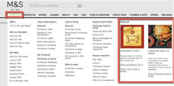
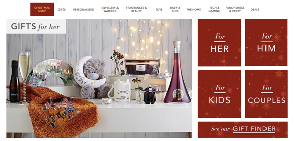
You can also add a little holiday magic to your menu buttons. For example, you could change the colour of your buttons or add a highlight to the “Holiday” part of your navigation menu. If you’re also running a sale, you can also add an extra button to point customers to your special offers.
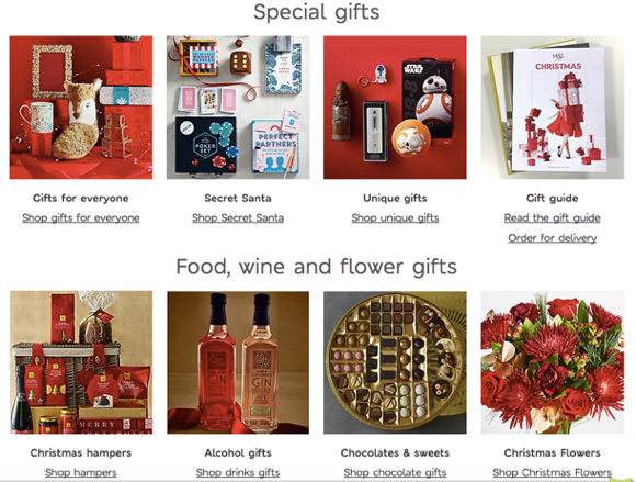
Check out this example from M&S:
Banners
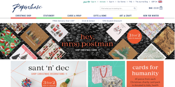
A banner on the homepage can also help to draw visitors’ attention to your special offers and discounts. So consider adding a Special Offers or Free Shipping banner on your homepage. If you’re not running a sale, you can simply use the banner to wish visitors Happy Holidays.
Images
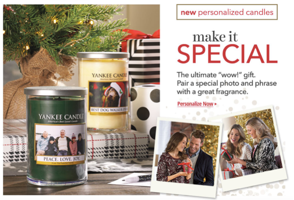
If you don’t have the time or resources to revamp your entire site, a simple idea would be to add a few holiday-themed images that include your products. For example, you can show your products under a Christmas tree or arrange them next to holiday ornaments, like in this example:
This method is easy to implement, and it allows you to show the holiday season without having to redesign your site.
One word of advice though: try to avoid using stock images if you can. So many sites end up using the same images, and this can make your site feel less unique and special, and can also decrease brand recognition. So pay close attention to the holiday-themed images you’re planning to use on your site.
Colours
You may be thinking about using a different colour scheme for the holiday season. If you’re looking for a more “wintery” feel, you can go with cool tones such as blue, green or purple.
Then again, you can always go with the classical festive colour – red. This is an often used colour due to a number of reasons:
- It expresses urgency, making it ideal for promoting sales and limited-time offers
- It’s bold and attention-grabbing
- It stands for excitement and celebration
Want to experiment with other colour schemes? The following articles are filled with great ideas on colour combos you can try:
- Fresh Christmas colours: 12 combos you’ve never tried
- The ultimate guide to using colour psychology in marketing
Now, if you don’t have the resources to change your site’s colour scheme, there’s also a simpler way, which is to add images to your site where you show products that use those colours.
As you can see, this is a great way to show your site in a way that represents the season subtly.
Other small decorations
While some site owners are so excited about Christmas that they end up adding (too) many design elements, you shouldn’t. Your site doesn’t need to be flashy to grab visitors’ attention and entice them to buy from you.
So start by adding simple decorations like a few snowflakes in the header or footer, a Happy Holidays note in the header, or a string of lights around your logo. That can be enough to welcome visitors and let them know you’re joining the celebrations.
These small design effects are not only easy to implement, but they’re also unlikely to cause issues for mobile visitors. (Too many effects and design elements can slow down your site, and this is the worst possible time to have your customers wait for your site to load).
Wrapping up
Even with holiday design tweaks, the feel and look of your site shouldn’t be drastically different. You still want visitors to know that they came to the right place.
So, don’t get caught up in the holiday madness and start adding auto-play holiday music, clip art and overly clichéd imagery like Santas on every page and Christmas trees with annoying blinking lights. These will only drive visitors away, which is the opposite of what you’re looking to achieve.
Hopefully the tips and examples in this post helped clarify that when it comes to the holidays, simplicity is key in terms of successful web design

