The rise of cards
Cards are quickly becoming the best design pattern for mobile devices. We’re witnessing a redesign of the entire web towards a personalised experience built entirely on individual pieces of content. This leads to an unprecedented access to data pulled from millions of sources through APIs and SDKs. If the portable screen is the future, then the predominant design pattern will be cards.
Need proof?
Twitter has already moved to cards.
Check out the web and mobile examples below:
Twitter launched Cards which makes it possible to attach media experiences to Tweets that link to your content. This means next time you share content on Twitter you need to double check and see if it includes everything from title to a great description and an eye catching image.
Google has also moved to cards.

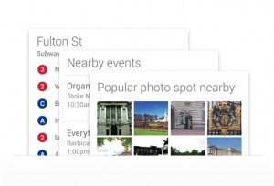
With Google Now, Google has rethought the whole information distribution journey by moving away from search and onto personalised information pushed to mobile devices. The design pattern? Cards!
Everyone else is moving to cards
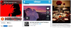
Pinterest, Soundcloud, Vimeo – they are all built around card. Not to mention Facebook which actually started using cards years ago.
And the list goes on and on. Cards are such an exciting and refreshing design pattern and I think we’re only getting started and we’ll see much more of them in the years to come.
Why? Because cards are the perfect medium to share quick stories. Each card tells a story and bursts of information but without tiring or boring the reader. It shares a personalised experience and it makes it easy to discover and distribute. It’s the natural evolution of social sharing, whether it’s a piece of news, a newly launched product or service. So, take advantage of that when designing for screens – use multimedia content, music, photos, and animations to attract your readers and tell them your story in a card.
With mobile devices becoming the heart and soul of the future of most businesses, cards are perfect to use – they can be arranged vertically or horizontally and designed at different sizes. Think about it – almost all content consumption on social media (Facebook, Twitter, Pinterest, Instagram, etc) is built on cards. And what’s more native to a mobile device than a piece of content the size and shape of a smartphone screen that can be discovered and redistributed anywhere?
Designers will soon start using cards heavily, if they haven’t already. And they won’t be the only ones. Marketers and creatives in advertising won’t be able to afford being left behind so they’ll jump in as well. In fact, there’s no getting away from it and it’s incredibly exciting.
Are you using cards to share your content? If not, are you planning to?


